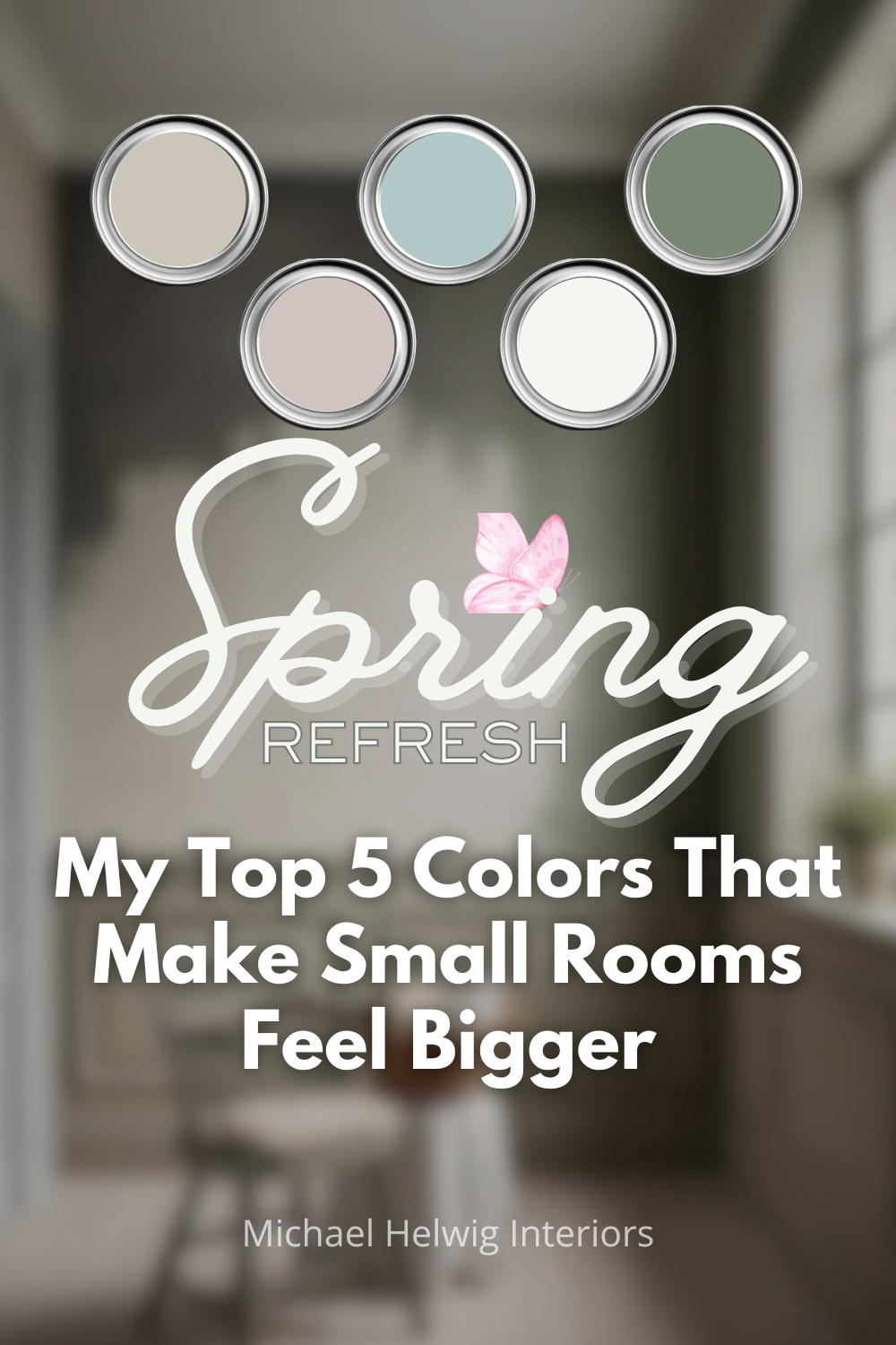
Every spring, people decide they want a room refresh. And nine times out of ten, the first move is paint.
That part I understand. Painting is the most affordable, most dramatic single thing you can do in a room. I'm not arguing against it.
What I am going to argue against is the color choices most people make when they're trying to make a small room feel bigger. Because the conventional wisdom on this topic is incomplete at best, and flat-out wrong at worst.
'Just paint it white and it'll feel bigger.' That's the advice you'll find everywhere. And it's not wrong — but it's not the whole story, and in tricky small rooms, it can actually backfire.
Here's what actually happens with color in a small or awkward room: the right color doesn't just reflect light, it manages perception. It changes how your eye moves through the space. It softens where the walls end and the ceiling begins. It makes you feel like you have more room, even when you don't.
The colors I'm recommending below aren't random. They're based on years of working with small rooms — narrow bedrooms, oddly shaped living rooms, studios, and apartments with awkward proportions. Each one works for a specific reason, and I'm going to tell you what that reason is.
First: What 'Makes a Room Feel Bigger' Actually Means
Before I give you the colors, let's talk about what we're actually solving for. A small room feels cramped for one or more of these reasons:
The walls feel close. Either they're physically close, or the contrast between walls and ceiling makes them feel like they're closing in.
There's no visual depth. The room looks flat because everything is the same tone and there's nothing to draw the eye back or forward.
The proportions are off. Low ceilings make a room feel like a box. Odd angles and corners create dead zones.
A color that 'makes a room feel bigger' is doing one or more of these things: softening the walls-meet-ceiling transition, creating subtle depth, or improving the perception of proportion. Keep that framework in mind as we go through the five.
Color 1: Pale Warm Gray — The Workhorse
I know. Gray has been everywhere for the last decade and you're tired of seeing it. I understand. But I'm not recommending trendy gray — I'm recommending a very specific kind of pale warm gray that earns its place in small rooms.
The key word is warm. Cool grays can feel clinical and flat in small spaces, which makes the walls feel closer rather than farther. A warm gray — one with beige or greige undertones — behaves like a neutral that actually does something.
In natural light, a warm pale gray reads almost white. In lamplight, it deepens just enough to feel cozy rather than claustrophobic. That flexibility is exactly what you need in a small room that must do multiple jobs.
What this color is doing: softening the contrast between walls and ceiling, making edges feel less defined, which visually expands the room. It also works with almost every furniture color and finish, which matters because in a small room, your furniture is close to the walls — color clashes are unavoidable if your wall color fights with the room's contents.
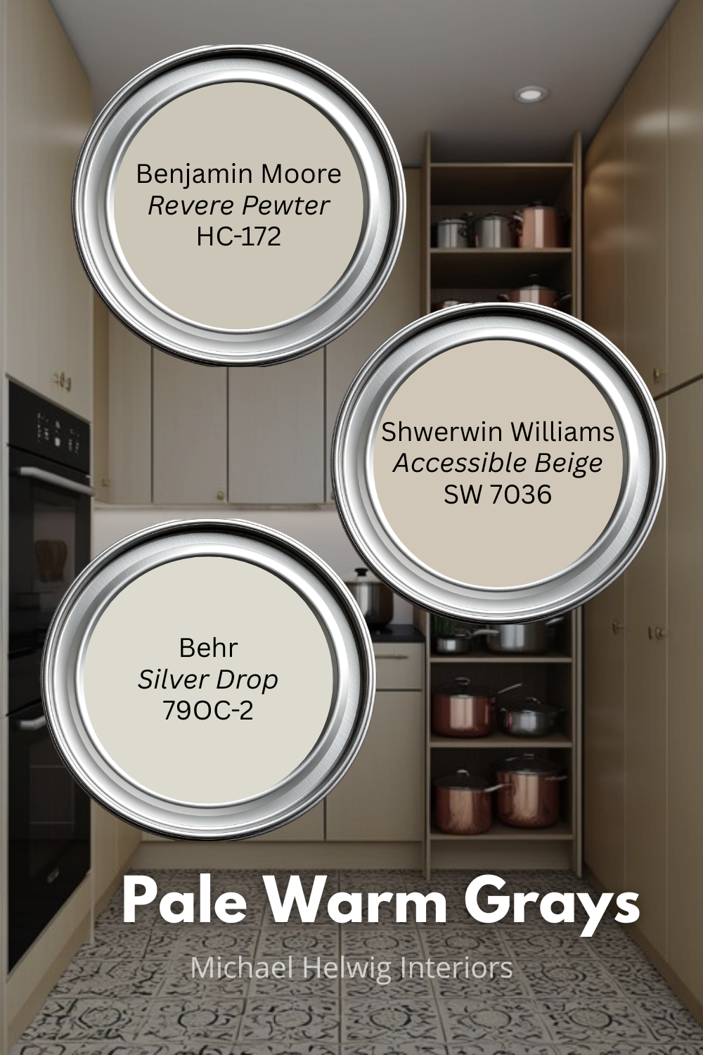
Colors to look at: Benjamin Moore Revere Pewter (HC-172), Sherwin-Williams Accessible Beige (SW 7036), or Behr Silver Drop. Approach this category by testing samples in your specific room — undertones shift dramatically based on your light source.
Best for: Rooms with mixed light sources, rooms that need to feel neutral without feeling sterile, spaces where you want the furniture and artwork to do the talking.
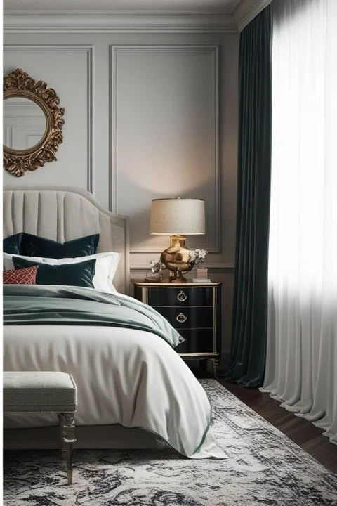
Color 2: Soft Blue-Green — The Depth Maker
Here's where I start to lose the people who are afraid of color in small rooms. But hear me out, because this one is counterintuitive and it works.
A soft blue-green — something in the range of seafoam, sage-leaning aqua, or muted celadon — creates visual depth in a way that neutrals simply can't. Your eye reads cool colors as receding. When you put a soft blue-green on the far wall of a narrow room, that wall appears to move away from you. The room reads as longer and deeper than it actually is.
This is especially useful in awkward narrow spaces — long and thin rooms, hallway-adjacent living areas, bedrooms that feel like corridors. In those spaces, a warm neutral just sits there. A soft blue-green actively tricks the eye.
The mistake people make with this color: going too saturated. You want soft, slightly grayed, almost like the color has been left in the sun for a season. Bold teal makes a room feel smaller. Muted, sophisticated blue-green makes it feel bigger.
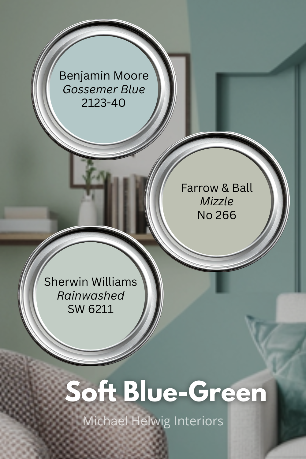
Colors to look at: Benjamin Moore Gossemer Blue (2123-40), Farrow & Ball Mizzle No.266, Sherwin-Williams Rainwashed (SW 6211). These are all different in character but all in the right neighborhood.
Best for: Narrow rooms that need to feel longer, bedrooms where you want calm without blandness, spaces with good natural light that can handle a hint of color.
Color 3: Creamy Off-White — Not the White You Think
I said conventional white advice is incomplete. Here's the nuance: bright, cool white — the kind that comes out of the can looking almost blue — often makes small rooms feel smaller. Why? Because high contrast. Every shadow, every corner, every imperfection reads sharply against true white. The room's edges become more visible, not less.
Creamy off-white — something with warm yellow or pink undertones — is different. It reads as light without the harshness. It makes ceilings feel higher (white ceilings against cream walls disappear upward rather than popping with contrast). And it plays beautifully with natural wood, warm metals, and linen — the textures that make small rooms feel rich rather than sparse.
If your small room gets morning sun from an east-facing window, creamy off-white is practically magic. The warm light hits warm paint and the room glows. The same room with bright cool white would look washed out and flat.
This is also the most forgiving color choice. If you get the undertone slightly wrong, you still have a room that functions. You don't have that safety net with saturated colors.
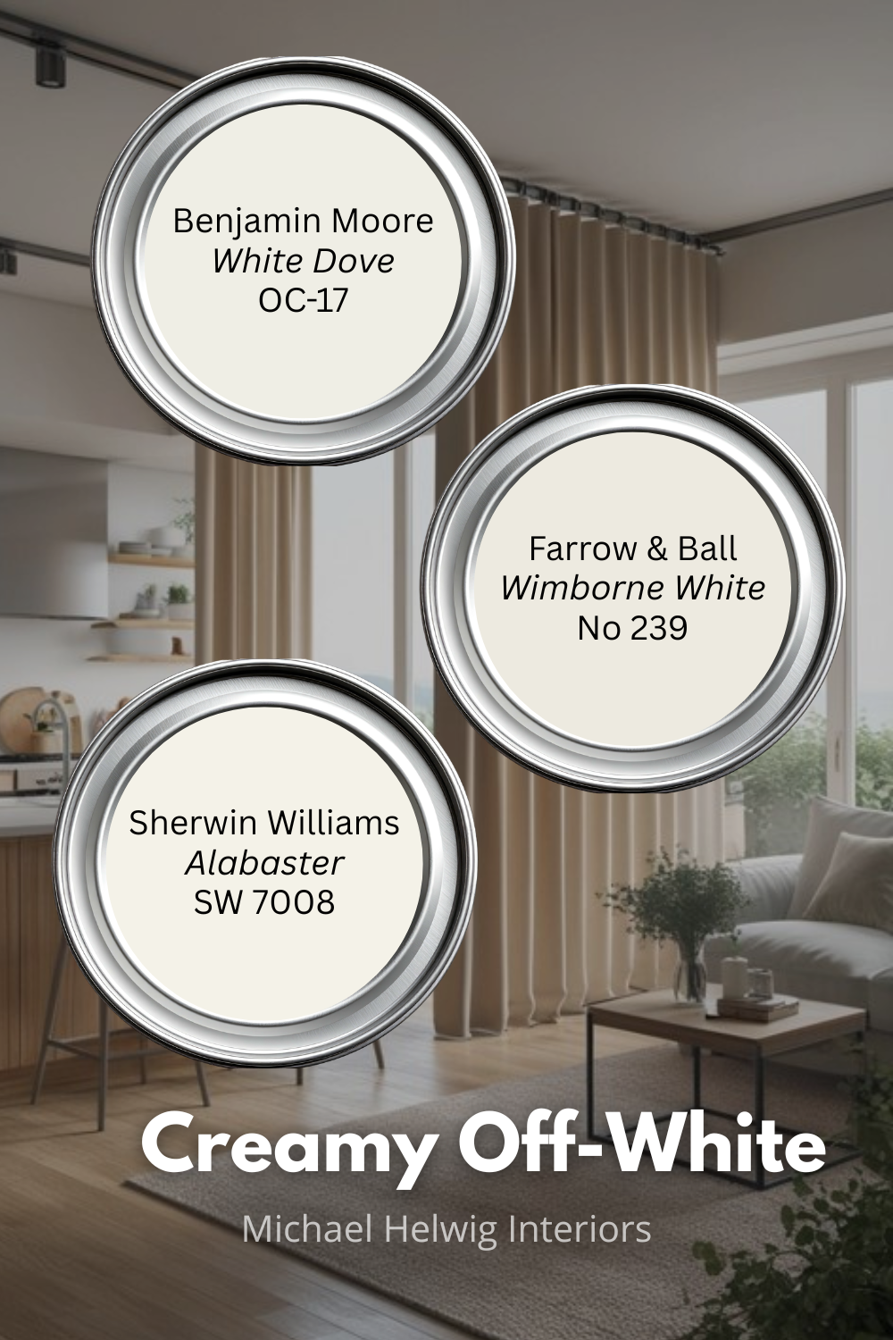
Colors to look at: Benjamin Moore White Dove (OC-17), Sherwin-Williams Alabaster (SW 7008), Farrow & Ball Wimborne White No.239. Each reads differently depending on your light — Alabaster leans more yellow, White Dove leans pink-cream, Wimborne White is almost invisible as a color until the light changes.
Best for: Rooms with warm light (east or west exposure), spaces with wood floors or warm-toned furniture, any room where you want the decoration to feel effortless rather than deliberate.
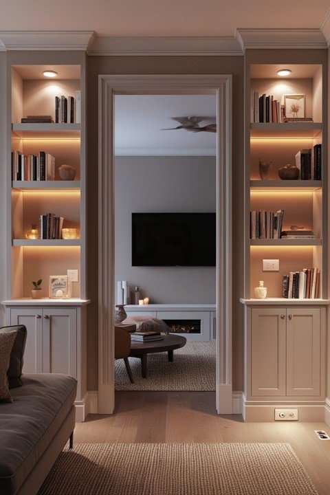
Color 4: Dusty Sage — The One That Grounds Your Space
Sage is having a moment, and unlike a lot of trends, this one makes sense for small spaces when used correctly.
The version of sage that works in a small room is dusty — grayed-down, muted, with more gray than green in its DNA. Think of a sage leaf that's been dried, not fresh. That desaturation is critical. A bright, leafy green reads as a statement color that brings the walls in. A dusty, dried sage reads almost like a neutral — but a neutral with warmth and character that a true gray can't replicate.
What dusty sage does especially well: it makes a room feel anchored and intentional. Rooms with this color don't feel like the paint is a placeholder until you figure out what you really want. It has enough personality to suggest that the room is designed, not just decorated.
In small awkward rooms specifically — the ones with weird angles or low ceilings — dusty sage can be a smart choice for a focal wall. It draws the eye away from proportional problems and toward the color itself. The room's awkwardness becomes less visible because there's something more interesting to look at.
Try dusty sage on one wall or on built-in shelves rather than all four walls. In a tiny room, an all-over sage can feel heavier than anticipated. One well-chosen wall reads as an intentional design decision. It also lets you test the color before you commit to the whole room.
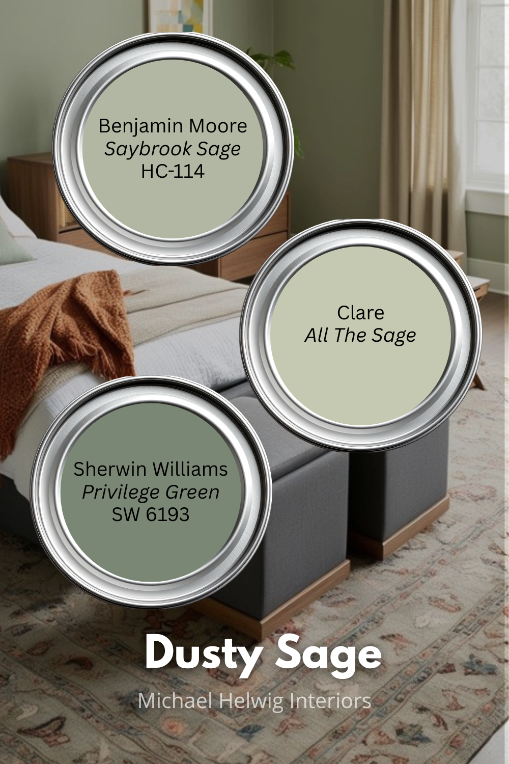
Colors to look at: Sherwin-Williams Privilege Green (SW 6193), Benjamin Moore Saybrook Sage (HC-114), Clare, All the Sage (a modern option with great online reviews for small spaces).
Best for: Rooms that need more warmth without going warm-neutral, spaces where an accent wall makes sense, bedrooms and living rooms where you want a cozy-but-airy feeling.
Color 5: Barely-There Blush — The Unexpected Space Expander
I'm going to lose some of you on this one, especially if you're designing for a household that's resistant to anything that reads as 'pink.' So let me frame it differently.
A barely-there blush — something so desaturated it reads as a warm white with the faintest suggestion of rose — does something in a small room that no other color on this list does: it makes the light itself feel warmer and more abundant. Rooms with blush undertones don't feel like the light is bouncing off the walls. They feel like the walls are generating light.
This is especially useful in small rooms that don't get much natural light — north-facing rooms, interior rooms, below-grade spaces. Where pale blue-green (Color 2) pulls the walls back, barely-there blush pushes light forward. The two work on completely different perceptual mechanisms, and knowing which problem you're solving tells you which color to reach for.
This is the color that looks wrong on the chip and right on the wall. If you see a sample card and think 'that looks like baby pink,' that's the wrong shade — too saturated. Look for something that makes you think 'is that white? Or is there something else going on?' That uncertainty is exactly right.
It also works beautifully in a room with other neutrals. Cream furniture, linen curtains, natural wood floors — barely-there blush ties everything together with warmth without competing for attention.
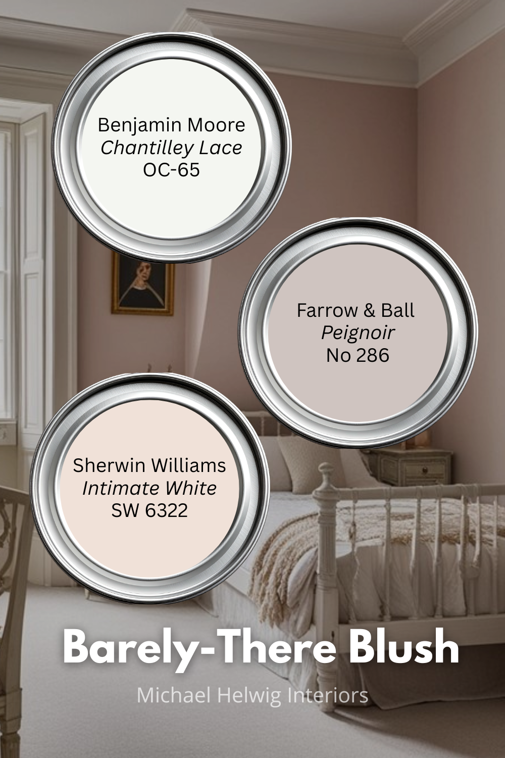
Colors to look at: Sherwin-Williams Intimate White (SW 6322), Benjamin Moore Chantilly Lace (OC-65) used as a base with a warm light source, or Farrow & Ball Peignoir No.286 for a more visible blush (works in larger small rooms).
Best for: Dark rooms with limited natural light, rooms where the goal is warmth over drama, spaces where you want a barely perceptible color story that photographs beautifully.
The Non-Negotiable: Sample on the Wall, Not the Chip
I've given you five colors and the reasoning behind each. But before you go any further, let me say the thing every designer says and nobody does consistently enough: sample them on your actual wall.
Paint chips are useless for making a final decision. They're too small to show how a color behaves in your room's light. They read differently against a white card than against your existing floors and furniture. And they're flat — they don't show how the color shifts from morning to afternoon to lamplight.
Buy the sample pot. Paint a 12x12 or larger swatch on two different walls (including the one that gets the most light and the one that gets the least). Live with it for two or three days. Look at it at different times of day. Then decide.
That process will save you from a color that looked right in the store and wrong in your room. Which is the most common and most preventable painting mistake there is.
The goal isn't a perfectly coordinated room straight out of a catalog. The goal is a room that feels like there's more of it — and that it's been thoughtfully put together. Color is the fastest way to get there.
What color surprises have you found in your own small spaces? Tell me in the comments — I read every one.
Read Next:"
Elevate Your Space: Exploring 2024's Top Paint Trends
Elevate your space in 2024 with the hottest paint trends! Get into moody greens, embrace the chic return of hazelnut beige, and discover grown-up vibes with pink, purple, and bold cobalt blue. Don't miss the granmillennial twist on burgundy! Ready to transform your home? Explore "What's Hot in Paint for 2024!"
Michael is Principal designer and blogger at Michael Helwig Interiors in beautiful Buffalo, New York. Since 2011, he’s a space planning expert, offering online interior e-design services for folks living in small homes, or for those with awkward and tricky layouts. He’s a frequent expert contributor to many National media publications and news outlets on topics related to decorating, interior design, diy projects, and more. Michael happily shares his experience to help folks avoid expensive mistakes and decorating disappointments. You can follow him on Pinterest, Instagram and Facebook @interiorsmh.