Small rooms can be tricky to decorate.
If your goal is to make your small living room look expensive, packing it with too much stuff can make it feel cramped and cluttered.
More stuff doesn’t equal “expensive”.
On the other hand, not having enough stuff can make small spaces feel sparse or unfinished and that doesn’t say expensive either.
How do you achieve a balanced look without spending your life’s savings to get it?
There’s 4 categories to focus on when you want to create an “expensive” look in a small living room.
Call them secrets, tips, hacks… Any way you slice ‘em, they’re 4 categories that will make the biggest impact in small living rooms.
First, size matters and larger furnishings and décor will go a long way to up the perceived value in smaller spaces.
Second, the right balance and symmetry of decorative items will do a LOT for an expensive look.
Third, having a lighting plan will make your small room look posh and polished.
Fourth, knowing what to spend your cold hard cash on will bring that pricy look to life.
There’s plenty of nuances pertaining to each of these 4 secrets, but if you want your friends think you dropped some serious coin on your decorating scheme, here’s how to make your small living room look expensive.
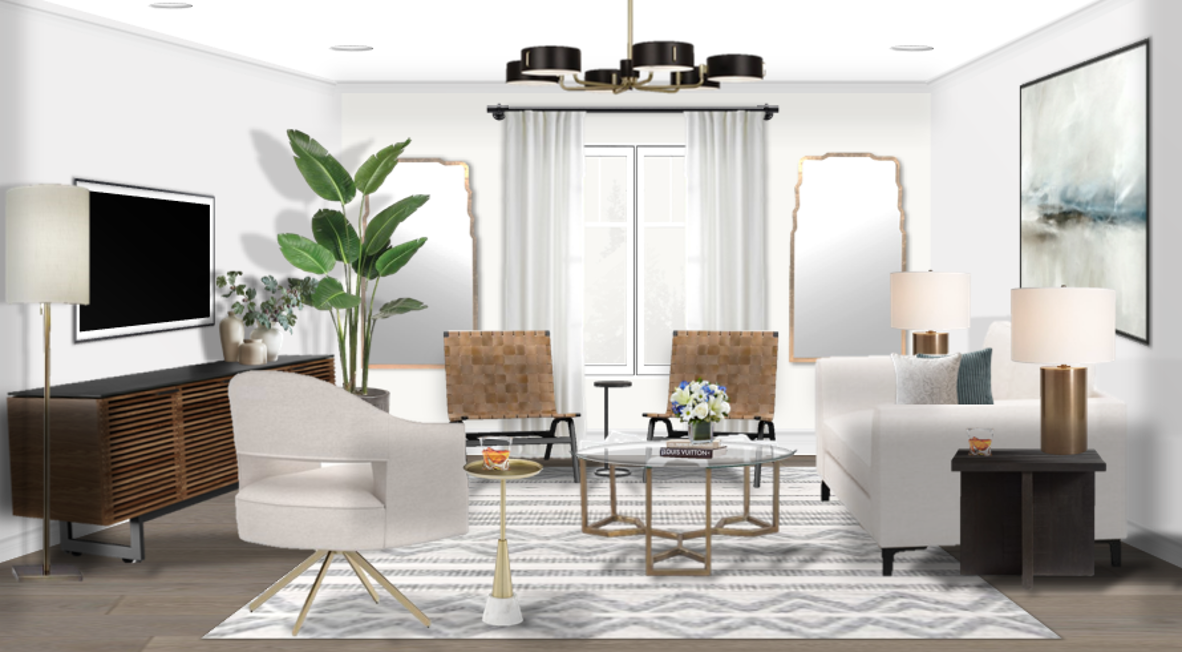
Source: Michael Helwig Interiors for Pottery Barn
Size Matters
Oversize Ceiling Lights and Lamps
Source: Pottery Barn
Stay away from dinky table lamps.
Get something with visual impact and weight. Vivid Lightworks has lots of unique and impactful lighting choices.
If your ceiling is low, look for flush mount fixtures in a larger scale.
Source: Pottery Barn
You don’t have to have a giant chandelier, dipping with crystal pendants to make a statement.
Put the TV on the Wall
A lot of us small home dwellers don’t have the space to enclose the TV or to hide it in inconspicuous ways.
However, what we can do is to get it up on the wall and off the furniture.
Seriously, a giant flat screen on a way too small table will make a small living room feel cheap.
Source: Nick Romanov, Unsplash
Get the TV mounted on the wall and hide those cords!
Get a simple conduit to channel the wires in the wall.
Source: Amazon
Get an exterior cord cover to conceal the wires on top of the wall.
Source: Amazon
Even if you have an appropriate size piece of furniture for your TV to be on, your room will get an instant boost in perceived “expensiveness” when you create the separation of space between the TV and the furniture beneath it.
Get Large Furniture
Get the biggest sofa and accent pieces that will fit.
Source: Pottery Barn
Placing larger items in a smaller room makes the space feel grand.
Always go for one large functional sofa over a smaller sofa, loveseat and/or chairs.
One large and amazing sofa will make your small living room look more expensive than crowding it with small and unimpressive furniture.
2. Balance & Symmetry
Keep Décor Minimal and Curated
Don’t overload shelves or surfaces with too much stuff.
Keep your décor similar in color to avoid making the space feel busy.
Source: Pottery Barn
Display items that have texture, shape, and size rather than small, dissimilar items.
Add in touches of black to break things up.
If using small to medium sized decorative accessories, display them in groups of 3 or 5.
Vary the height and shape in grouped items so that there’s fluidity as you glance around the room.
Avoid Feature Walls
You don’t need one raspberry accent wall when all the others are builder beige.
Feature walls draw attention to one area. Unless that area needs to be a dramatic focal point because of a competing opposite focal point, feature walls will pull a small room out of balance.
Source: Acentondesign
Keep the paint color the same, with little contrast between walls and ceiling and let a large statement piece of art be the accent. Do this and you’ll dramatically increase your room’s perceived value.
I’m a big fan of bright white rooms but, if you love dark wall color, go all in. That means walls, trim, ceiling.
Source: Olena Sergienko, Unsplash
Monochromatic looks expensive.
Dark walls with stark white trim is a no go because it creates unnecessary contrast that distracts your attention away from the furniture and décor.
Source: Utah Parade of Homes
The bright white trim molding create separation that that interrupts visual flow.
Instead of glancing effortlessly around a room, your gaze is stopped by the trim around the windows, doors, ceiling and anywhere else it appears.
Contrasting trim is fun and cheeky in larger spaces like stores or restaurants, but it doesn’t work the same way in small rooms.
Don’t Match All Your Furniture
You do not want to buy matching upholstery set because it’s unimaginative.
Source: Pixabay
You do, however, want to buy things like accent chairs in pairs if you have the space.
Two matching accent chairs creates symmetry and balance and that always looks more expensive.
Source: Pottery Barn
Having an eclectic group of furniture is interesting.
It shows that thought and planning went into the furnishings. That perception is valuable and directly translates to an expensive feel.
3. The Right Light
Install Accent Light
Skip the strings of fairy lights everywhere. Yes, they’re whimsical. They also scream juvenile.
Source: Diego PH
There’s lots of options for more sophisticated budget friendly accent lighting with way more impact:
Picture lights that highlight art.
Source: Pottery Barn
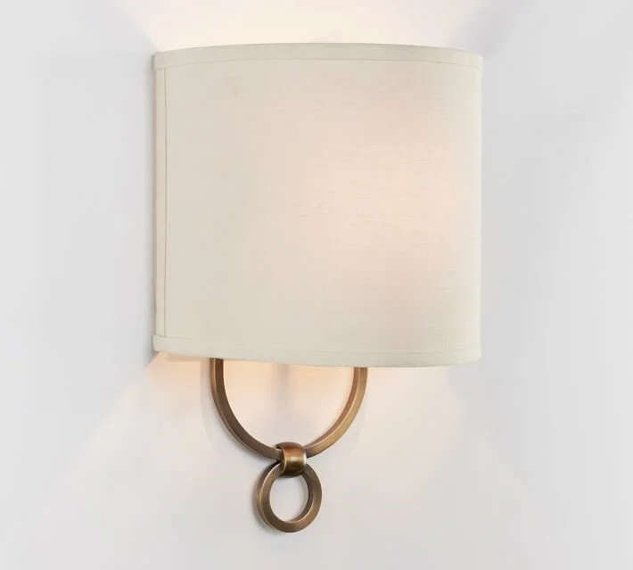
Wall sconces that shine light up, down or both to play with shadows and create depth.
Source: Pottery Barn
Source: Pottery Barn
Create shadows and depth with up lights on the floor behind sculptures or potted plants.
Source: Amazon
Light defines objects. When used in creative ways, it provides focus and draws attention intentionally.
There are options for these types of accent lights that don’t require hardwiring by an electrician.
Look for plug in accent lights to give your small living room an expensive looking lift.
Source: Pottery Barn
You need general ambient light as well.
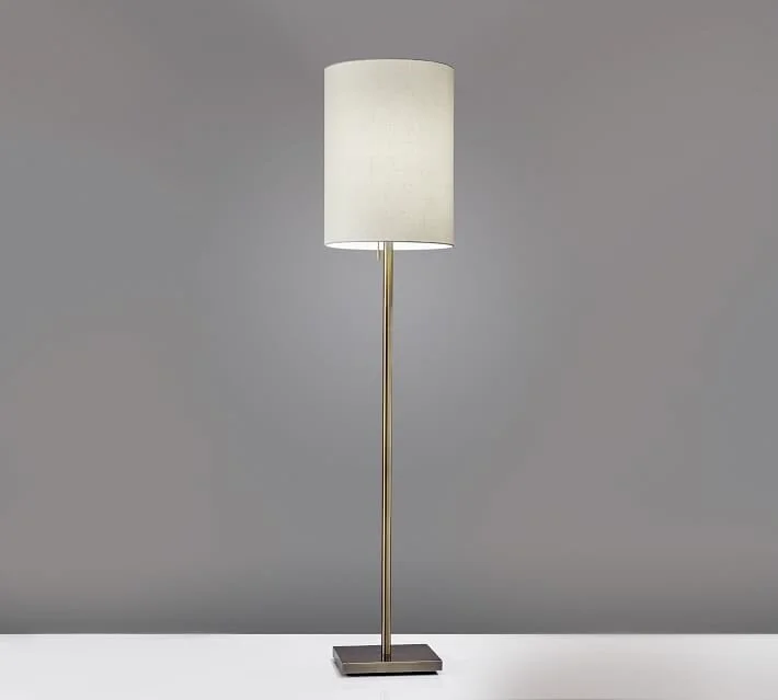
Table and floor lamps provide task lighting.
Source: Pottery Barn
They also help you illuminate surfaces and feature items purposefully placed to support your ‘expensive room’ narrative.
4. What to Spend Money On
Lamp Shades
While we’re on the subject of lamps, a good place to spend money is on lamp shades.
Source: Pottery Barn
Shape, size, color, opacity, lamp shades are a perfect accent to show off.
They can be plain so the lamp is the star or they can be embellished to create a moment all by themselves.
Glass or Acrylic Coffee Table
Go for this option over a solid wood coffee table.
Source: Pottery Barn
The transparency will do double duty: It gives you the functionality of a surface to put stuff on and, because it’s transparent, you open up the visual field making a small room appear larger.
Just be mindful to minimize clutter.
Glass and acrylic look more expensive if kept tidy and clean.
Plants and Flowers
A large floor plant or tropical potted tree will give a small room dimension.
Source: Bloomscape
Flowers in a vase or are natural attention grabbers.
Source: FTD
Flowers especially feel celebratory and special.
They’re extra without being over the top and they convey a message that details matter and that amps up the grandeur in small living rooms.
Put another way, fresh flowers help a room feel expensive.
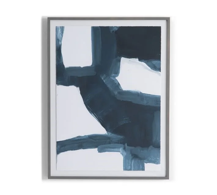
Buy Large Art
Skip a bunch of random, mismatched frames or lots of small wall décor clustered together.
Large art is a statement.
Source: Pottery Barn
Lot’s of small frames and mismatched shapes on a wall look chaotic.
Source: Joyce McCown, Unsplash
Instead of different size and shapes, unify your art inside frames that are all the same size and shape. It looks curated and thoughtful.
Source: Pottery Barn
Installations that feel planned out and cohesive will 100% look more expensive.
Avoid Small Mirrors
A pair of medium size mirrors is better than a group of small ones.
Again, pairs will give you the opportunity to create symmetry and balance.
Source: Pottery Barn
Mirrors help to reflect light in small spaces and that works both day and night.
Small bright spaces feel more luxe and mirrors will get you there fast!
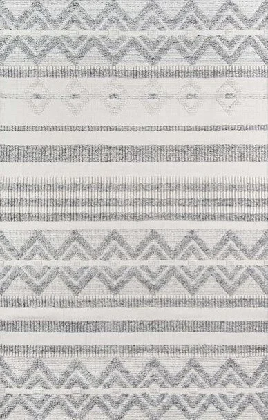
Buy Large Area Rugs
Area rugs are meant to anchor seating arrangements, not just anchor the coffee table.
Trust me, your small room can handle a big rug.
Source: Pottery Barn
Get a rug that fits at least under the two front legs of the sofa and chairs and allows you to fit 4 legs of end tables on it too.
You can coordinate a unified color scheme from rugs.
A rug can inform everything from upholstery and accent fabrics to art.
Keep bold accents to a minimum and instead feature a bold piece of art.
Source: Pottery Barn
When you allow the accent fabrics and area rug be more muted, the focus shifts to that statement piece of art.
If you want your room to look expensive, minimize saturated color that competes for attention.
Treat Those Windows!
Hang your curtain rods high. Go up just beneath the ceiling or trim.
Get the longest panels you can find so they just touch the floor, not pool.
Go for pleated curtains instead of rod pockets or grommet style curtains. Those styles scream ‘casual’.
Source: Indulgence Fabric, Etsy
Pleats will elevate the look without being too formal.
Extend the rod beyond the width of the window and double up your curtain panels, especially if you have a lot of wall on either side of the window. Full looking curtain panels look way more expensive than one skimpy panel.
Avoid ‘bling’ like crystal drapery rod finials or tons of detail on the drapery rod itself.
Source: Pottery Barn
Instead, go simple. Curtain rods should support your window treatments but not steal the focus from them.
Your Small Room Needs Shine!
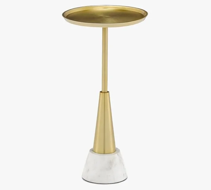
Use polished metal finishes.
There’s something about the shine of a polished chrome or brass metal that gives a small room a lift.
Source: Pottery Barn
They attract and reflect light and that is important for making small spaces feel luxurious.
Source: Pottery Barn
Reflective metals always look expensive.
There you have it, my favorite secrets to make your small living room look expensive. They’re not big changes. We’re not knocking down walls or building an addition. Sometimes a few conscious changes to a small space can make a world of difference.
Concentrating on:
the size of things you put in the space
knowing how to work with balance and symmetry
and, how to use light to capitalize on the native parameters of your room will get you an expensive looking living room.
Last, and most important, being smart about what to buy to create your expensive looking room will ensure your success!
I’d love to hear what you think. Is there anything else you’d add to the list? Leave me a comment below and tell me all about it!
Join the Fun!
If you enjoyed this post and you want to keep seeing my weekly blog, the best way to do that is to subscribe.
You can subscribe by downloading my 11 Secrets Only Designers Know to Make Your Space Rock. If you’re curious about how decorators and designers make a home look magazine ready, you’ll love taking a gander at these 11 secrets. You’ll learn how to style your room from the floor up and it will work for ANY space you have.
I write about small space design and decorating, sustainable furniture options, positive self care and a variety of do-it-yourself home décor.
I’d love to connect with you!
“Michael Helwig was top-notch, very professional and responsive to my needs. He allowed me time to explore ideas and try out a variety of combinations until we found the perfect fit. Michael provided detailed information and offered beautiful ideas to make my dream living room become a reality. The furniture he sourced has totally transformed my living room space. Everyone that has seen my new living room has one word, WOW! A special thank you to Michael for a wonderful experience.”
“Michael was very knowledgeable and guided us, with great patience and good humor, through the process of designing our dining room and helping us find the perfect sleeper sofa. He offered really helpful advice when we asked questions - which was often - but at no time did we ever feel pushed. He helped me when I felt like I couldn’t make one more decision. When my new furniture finally arrived I realized everything down to the pillows was perfect. I couldn’t be happier!”
Michael is Principal designer and blogger at Michael Helwig Interiors in beautiful Buffalo, New York. Since 2011, he’s a space planning expert, offering online interior e-design services for folks living in small homes, or for those with awkward and tricky layouts. He’s a frequent expert contributor to many National media publications and news outlets on topics related to decorating, interior design, diy projects, and more. Michael happily shares his experience to help folks avoid expensive mistakes and decorating disappointments. You can follow him on Pinterest, Instagram and Facebook @interiorsmh.


