Each year I do a post talking about the color trends for the year ahead. Since we’re already one month into 2024, I figured I’d better get a move on.
I want to focus on some color trends that have staying power and the ones on this year’s list are keepers for sure.
There are picks in here for everyone, whether you like neutrals or saturated hues with a lot of moodiness and depth.
Let’s get into 2024 home color trends.
Your Walls are the biggest expanse of spaces in your home, and they need your consideration to make an impact.
When I design a room, or connected rooms, in my client’s homes, I’ll always pick the paint color last.
Why’s that you ask? Well, I like to pick an inspiration piece first that informs my decisions for everything else in their space.
I’ll choose something like an area rug with a colorful pattern and use it as the inspiration for everything from the accent fabrics, upholstery, art, pottery, accent pillows, and finally the wall color.
Alternatively, you can also use some customized props. For example, you can design some three-dimensional, multi-faceted, colorful Custom Pens, place them in the middle of the table, rotate them to get a color, and then use this color to be creative and design your space.
In short, colors and imagination are infinite, the key is how you use them.
You see, it’s easy to build on a color story when you have a parameter to start with.
In this way, the finite number of color choices from the inspo piece keeps you on track to pick the colors that will work for sure when fleshing out the rest of the design.
Even if the original rug pattern doesn’t pan out, often the color story gained from it sticks and we can move forward with a different rug pattern.
If you don’t want to use a rug, it’s easy to transfer this inspiration gathering mission to other things.
You can take inspiration from your favorite wall art or from pictures that have the mood and feeling you find on Pinterest.
So, before you pick your wall color on a whim, try this process to narrow down your choices. I’ll guarantee that you’ll make your paint color decisions faster and with less frustration.
Now, how about those paint color trends?
You got it!
This year I focused on my Benjamin Moore paint deck to narrow down my favorites. I love BM paint because the colors are true and the paint is excellent quality, providing great coverage.
All About Green
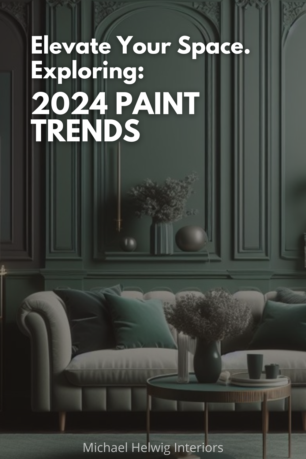
Well friends, if you’re a fan of moody, dark greens, 2024 is gonna be your year for paint choices!
This crop of greens is earthy and deep. Think about the colors you’d see in a nature walk, deep in a forest of woods. The canopy of the trees causes the light to be dim and thus all the colors of green get deep and inky.
These greens are certainly nature inspired and pair well with the dark academia trend that keeps getting more and more interesting.
Benjamin Moore Hunter Green is a dark blue green that feels earthy and full.
Maybe you want more gray/green, where there’s a hint of concrete gray. Then check out Terry-Town Green. It has a sophisticated “city” feel. Great if you want to achieve a NYC loft vibe, edgy and moodier.
If you want to lighten it up, you can pair it with mint green or a powdery teal.
A color that has that teal, middle tone green feeling is Fiddlehead Green.
On a related note, greens used to be tough to pair together because of the variation of light and dark hues of every color temperature.
However, in 2024, go ahead and mix those greens till your heart’s desire. Pair them in experimental ways and let your hair way down with them!
Matte black, or brushed brass looks fantastic with these dark moody greens, so don’t be afraid to mix up your metals if you want too!
And for wood tones, medium wood, like a walnut or grainy mid to dark tone oak will hit the spot!
Don’t Sleep on Beige
Yes friends, beige is back, and back strong!
This is excellent news for us neutral Nells!
The beige that’s making the most impact is the earthy, clay color beige tones, almost 1990’s pinky beige. However, this version is richer, think Hazelnut tones, creamy and dreamy.
On the light side of things, a color like Dusty Road, will bring your space a cozy but cheerful vibe.
If you need a tad more drama, then Dellwood Sand is a choice that will set the color temperature more in the taupe beige family.
There’s a healthy dose of brown in these neutrals that feels warm and enveloping. They’ll add a feeling of sophistication to your rooms. The vibe is loungey.
So, if that’s the feeling you’re seeking, then give Maple Shadows a try. It’s a true beige brown that has woody undertones and a definite hot cocoa look.
Speaking of browns, hazier chocolate shades of brown are big this year too. They add a secretive charm to rooms. Many of these beige and browns will give your rooms a cozy feeling. That home is a retreat from the stresses of the world, vibe. Sounds pretty good, huh?
For metals, try mixing on oil rubbed bronze to amp up the moody richness. Or, if you want a bit of glam, a super shiny chrome will sparkle like diamonds with these rich earthy browns and beiges.
For some contrast, try a light and natural wood tone paired with these deep rich colors.
Take a Swing at Pink and Purple
Yepper, these colors aren’t just for the nursery or playroom. They’re making a huge splash in the grown-up world, and I’m here for it!
And the hues and shades are vast for this trend. Every temperature of pink seems to be featured in some way, everywhere. From Barbie pink to mauve, there’s a hue for you.
Pale pink blended in with brown and mauve seems to be the mix for 2024. The look is a refined combination of satisfying shades that look rich and attractive.
Let’s start off with Hidden Sanctuary. This is a super light, pale pink. It’s mature, yet fun. I like the calmness with this color, good for living spaces, bedrooms, or a home office.
Still light pink, Silky Smooth, has a tad more saturation. It’s playful and would work great for both a youthful bedroom and it can also be paired with Mid-Century pieces for a timeless grown-up look in living or dining rooms.
Pale pink paint is seen with lavender as well as hazier shades of purple and green for an enchanting impact that feels restful and alive at once.
And if you want that Midnight lavender vibe, give Lazy Afternoon a try. It’s a true and deep lavender, dramatic and energetic.
And don’t be fooled, these pinks and purples aren’t juvenile in the least. They’re sophisticated and thoughtful.
As for metals you can pair with these colors, I’d say go for something fun, aged silver, mercury glass, or antique brass. If you want to go for more contrast and impact, try mixing in polished brass metals and glass.
For wood, you can’t beat a Mid Century walnut wood tone with these colors. I also like just natural, unfinished wood with this as well. Or be bold and daring and introduce painted woods for a more eclectic look.
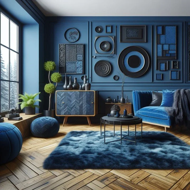
Cobalt, the New Blue
Everybody seems to be on this cobalt blue kick, and I have to agree.
It’s fresh, rich, and energetic. And it’s appearing inside from floor to ceiling and outside on front doors and whole houses.
As a matter of fact, 30 years ago, my mom painted the front door of our home cobalt blue after she had our house painted the most beautiful shade of yellow. The combination was a HUGE hit! Neighbors, friends, and total strangers would come by to ask her what the color was, if she was out watering the flowers or tending to her garden. Way to go mom!
This blue has history behind it. You can find references to the origins of it all the way back to the late 1700’s. This led to the commercial production of it for everything from ceramics to jewelry in the early 1800’s.
If you’re ready to take the plunge into blue, Champion Cobalt is one of the truest cobalt colors around. Deep, rich blue, almost electric.
If you need a more subdued variety, try Bella Blue. It has a lot of grays in it, and it would be calm and relaxing in a master bedroom, or bathroom. It would also look amazing on kitchen cabinets if you’re looking for a blue option.
If you want a full on dramatic blue, like deep and inky navy, then New York State of Mind is the one for you. It’s deep and rich, metropolitan, and sophisticated.
Just wanna dip your toe in the blue pool? Try adding bits and pieces of it to your décor through art, accessories, or accents, like rugs or pillows.
Otherwise, dive in and wash your walls with cobalt, it looks great with chocolate or ebony colored wood, dark or medium cherry wood too.
Bronze metal tones will be a hit if you want a deep and moody metal to pair. Otherwise, give brass a try. You can go shiny or matte brass but stick to one or the other for consistency.
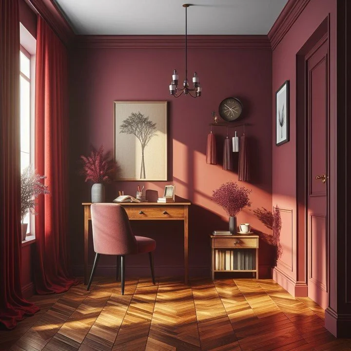
Not Your Grandma’s Burgundy
Unless you’re into the Grandmillennial style trend, then by all means it’s absolutely your grandma’s burgundy! And I love that for you.
Burgundy is another color steeped in history. It was favored in Renaissance Times. It took its name from the rich wine countries of Europe and has become associated with everything from nobility to the clergy, and folklore. It’s not surprising, with this wide history and appeal, that it has been a time-honored favorite color that comes back into favor time and again.
My grandmother was in LOVE with burgundy. I remember frilly pillows and bullion fringe with gold and burgundy accents on foot stools and tapestries. How’s about that for Grandmillennial? It was all so rich and tactile and I’m not mad that it’s back.
There’s sophistication to this color. It’s deep red; merlot and cabernet. Burgundy recalls old cash and old structural styles. It’s sumptuous and luxurious.
On the brighter side, Mauve Mist is lite and pinky. It has a rich hue that would be great in a powder room, maybe with some fun wallpaper to compliment the brightness.
For a more sophisticated option, I love Deep Mauve. It’s bordering on brown, with a definite purple-ish color. I can see it working very well in a living room, office, or den.
If you’re looking for a bold color, Ruby Dusk is rich, deep and saturated. I love this color for a library space, or in a media room, dimly lit for movie nights.
Pair burgundy with rich woods with red undertones or wicker and jute for a more earthy, boho vibe.
Try mixing in true copper metal tones for a fine metal pairing. Or gold is always a great compliment to burgundy for a rich - as in affluent- feeling.
I’m also a fan of natural stone with burgundy, so embrace stacked stone with lots of color variations: gray, copper, browns to pair with burgundy color stories.
There you have it, the top color trends of 2024, according to the interwebs and experts.
I hope I was able to offer a new take on what many others have been talking about so far. If nothing else, maybe had a chuckle.
Better yet, maybe you had a good think about incorporating some of these colors for your own home?
Read Next
Free Yourself From Paint Color Anxiety: How To Choose The Perfect Wall Color For Your Painting Project
Picking the right paint color for your living room is not a life altering decision. But it’s a decision that will affect the aesthetics of your home. Can color affect your happiness and enthusiasm for your home? Certainly. My goal here is to provide you with some good tools that will help you make the right wall color choices.
Join the Fun!
If you enjoyed this post and you want to keep seeing my weekly blog, the best way to do that is to subscribe.
You can subscribe by downloading my 11 Secrets Only Designers Know to Make Your Space Rock. If you’re curious about how decorators and designers make a home look magazine ready, you’ll love taking a gander at these 11 secrets. You’ll learn how to style your room from the floor up and it will work for ANY space you have.
I write about small space design and decorating, sustainable furniture options, positive self care and a variety of do-it-yourself home décor.
I’d love to connect with you!
“Michael Helwig was top-notch, very professional and responsive to my needs. He allowed me time to explore ideas and try out a variety of combinations until we found the perfect fit. Michael provided detailed information and offered beautiful ideas to make my dream living room become a reality. The furniture he sourced has totally transformed my living room space. Everyone that has seen my new living room has one word, WOW! A special thank you to Michael for a wonderful experience.”
“Michael was very knowledgeable and guided us, with great patience and good humor, through the process of designing our dining room and helping us find the perfect sleeper sofa. He offered really helpful advice when we asked questions - which was often - but at no time did we ever feel pushed. He helped me when I felt like I couldn’t make one more decision. When my new furniture finally arrived I realized everything down to the pillows was perfect. I couldn’t be happier!”
Michael is Principal designer and blogger at Michael Helwig Interiors in beautiful Buffalo, New York. Since 2011, he’s a space planning expert, offering online interior e-design services for folks living in small homes, or for those with awkward and tricky layouts. He’s a frequent expert contributor to many National media publications and news outlets on topics related to decorating, interior design, diy projects, and more. Michael happily shares his experience to help folks avoid expensive mistakes and decorating disappointments. You can follow him on Pinterest, Instagram and Facebook @interiorsmh.


