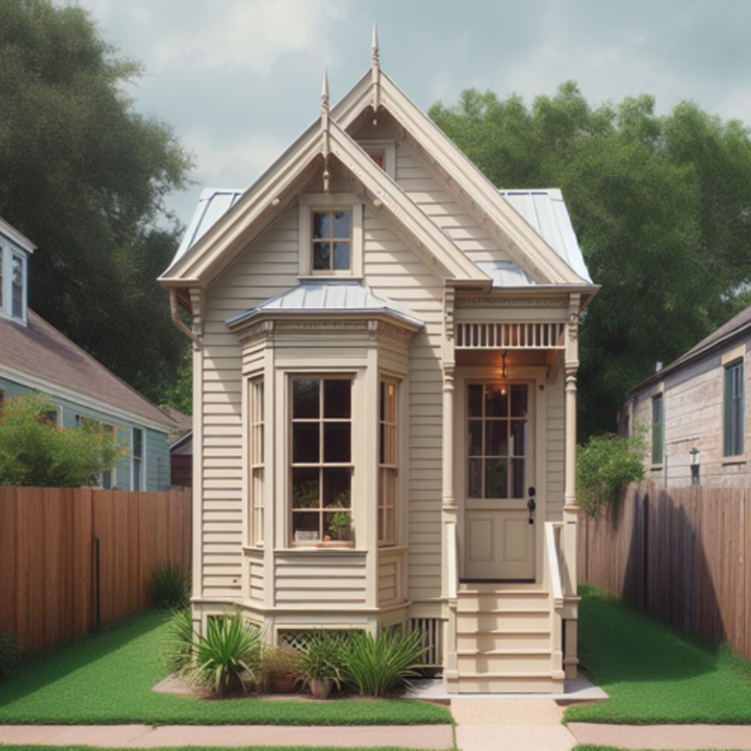
One of the more complicated floor plans in American architectural history is the “shotgun” or “railroad” style house. That’s because they’re long, narrow structures, where one room follows directly in line with the room proceeding it.
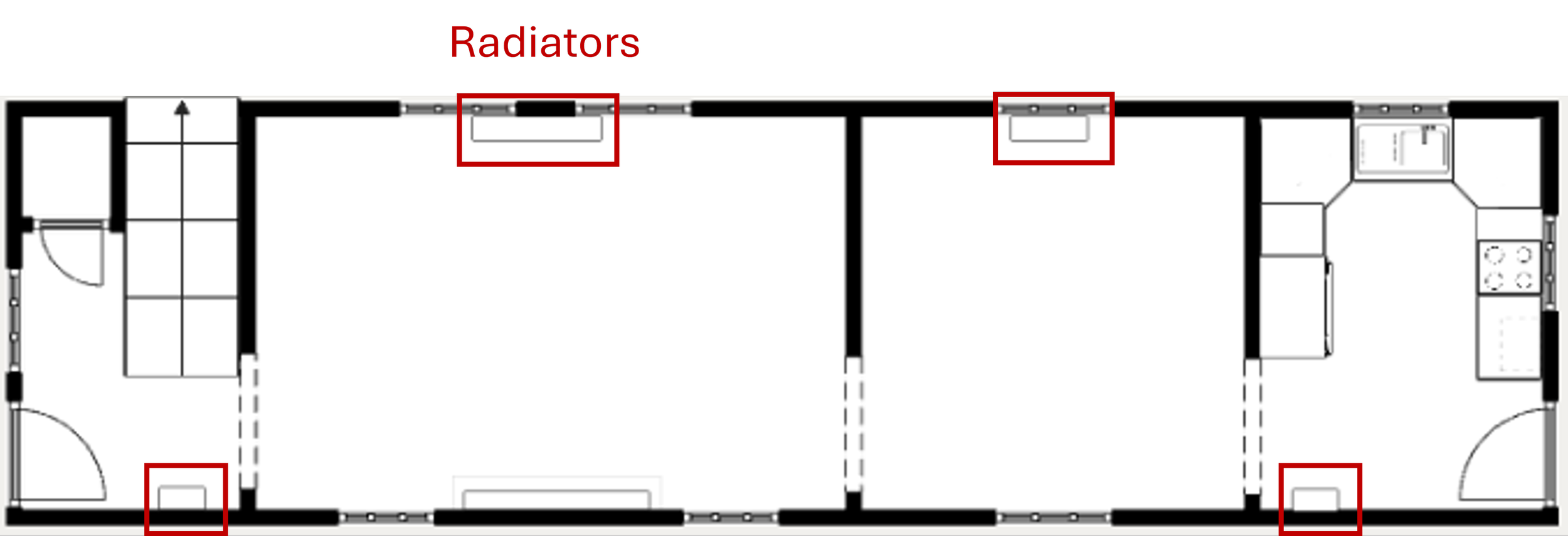
Typically, each room is the same width – around 12’ wide- and all the doors and doorways, from the front of the house to the back, are lined up on the same wall.
The term, “shotgun” allegedly came about because of how the house was laid out.
In theory, if you were to stand in the front door and fire a shotgun through each doorway, the bullet would pass straight through the house without hitting anything.
That might be a novel party trick, but as for arranging furniture in these narrow rooms, it was and remains tricky. (On a related note, I wonder who first had the idea to stand in the doorway and to fire a weapon through the house to test this theory? I can tell you, that person would not be invited to my next candlelight supper!)
Parallel doorways: The main reason why most shotgun style house owners have a bear of a time finding furniture to work in their rooms.
Usually, doors eat up 32” to 50” of interior space and that is a BIG deal when the rooms are around 12’ wide. It’s basic math, 12’ minus 4’ leaves 8’. That’s a quarter of the room occupied by doorways, and the pathways in between them must be kept clear to get from one room to another. So, furniture can’t be placed in these pathways.
A bit further down I’ll get into the particulars of this room more and explain why a few additional features make it even more tricky, but for now, let’s explore a little history about shotgun homes.
Where Did Shotgun Style Houses Come From?
They began being built in the United States, mostly in the Southern states, during the late 19th and early 20th centuries.
Shotgun houses were often quickly constructed, sometimes in a few days or weeks, and with simple materials like wood.
They were built for practical reasons, mostly by working-class families, and were more common in emerging cities and boom towns. (More on that is a second.)
Their narrow design made them affordable and easy to construct on small, narrow lots.
The design of shotgun houses allowed for natural ventilation, making them ideal for hot and humid climates.
A few “stylistic” changes could also be made to make them more ‘unique’, like adding side-gabled or hipped roofs, porches, and decorative detailing, if preferred.
How the Railroads Helped Expand Shotgun Style Homes
Shotgun houses became a favorite for railroad workers in the early 1900s because they were practical, affordable, and adaptable to transient lifestyles.
As the expansion of railroads grew across the United States, railroad workers often found themselves moving a lot to follow job opportunities.
The simple and compact design of shotgun houses made them easy to build in railroad boom towns and industrial areas. Their narrow footprint suited the narrow lots often available near railroad tracks in newly growing urban centers.
And the low cost of construction and maintenance made shotgun houses accessible to workers with modest incomes.
Combined, these factors made shotgun houses very attractive to railroad workers because they were functional and economical housing options during a time of great industrial and demographic change.
In cities with significant historical significance, like New Orleans and Charleston, shotgun houses remain prominent and protected structures. And pockets of shotgun houses can still be found in some Southern and Midwestern cities, remaindering us of their enduring legacy in American architectural history.
So, Why the Post on this Shotgun House?
A while back, I got a message from a reader of this blog reaching out about doing a post on railroad style houses. At that time, I didn’t have a project about such a house, but I said, stay tuned, because I knew eventually one would probably come my way.
Well, as luck would have it, my (now) client reached out to have me help her with this shotgun living room and dining room. It couldn’t have been timed better. (Funny how the Universe works, huh?)
My client travels a lot for work and has lived in a small apartment for years.
When her building was sold, she decided to buy a house rather than rent. Rents were going up in her city and she felt that she wanted to build equity in something she owned.
She soon encountered lots of competition for houses and no matter what, she kept getting outbid for every house she went after.
She was starting to feel defeated when her good friend, who happens to be a realtor in another city, said, Why don’t you look at railroad style houses?
After learning more about them, she decided to explore the option.
Soon, she and her agent found this house and she totally fell in love with its charm.
The house had been on the market for longer because it was smaller, and it was just ‘quirky’ enough to scare off competition who were intimidated by its layout.
After she won the bid, she immediately hired me to help with the living and dining.
The Goals for this Design:
Since my client isn’t a big TV watcher, she decided to only have a TV in her bedroom and to reserve the living room as a ‘formal’ sitting room space, without a TV.
There’s a lovely new(ish) gas fireplace on the long pathway wall, but since the house is in a warm Southern climate, it’s not used often but she does like having it for cooler nights. (All that means is the fireplace isn’t the preferred focal point.)
She prefers to visit and entertain in the room, so that meant that a cozy and functional ‘conversation’ furniture arrangement was the best option, and seating for around 4 or 5 people was the sweet spot.
In the dining room, she wanted seating for the same amount of people, but she wasn’t sure how to arrange the room. The dining room shape is square and that can be tricky to plan out. (We’ll get into that further down…)
Watch Video
Measure the Room
I always start with room measurements whenever I begin a new design. It’s crucial to know the room’s overall measurements and the measurements of each wall segment to know what will ultimately fit in the room.
The dimensions of the individual wall segments and the overall measurements should be about the same. (They won’t ever be exact, but more than two- or three-inches different means there’s a mistake somewhere.)
Planning out the functional zones of each room.
The most important first step is to keep about 3’ of clear pathway between all the doorways. (I knew it was going to be tough to keep this path wider than the 3’ but I knew the doorways were 50” wide, and that made the two shorter walls, the 12’ walls only have 8’ of usable space. That might seem like a lot, but you’d be surprised how little fits adequately in only 8’ of space.)
For example, a 72” sofa, which is studio size, is 6’. That leaves only 1’ on each side for end tables and that is taking up the entire 8’ of available space. Good luck finding 12” wide end tables, and more importantly, the furniture would be completely cramped anyway.
If you prefer an average size sofa, which is 85” to 92”, that will eat up even more of the available 8’.
You get the picture, 8’ isn’t as much space as you’d expect it to be for ‘average’ size furniture… And yes, there is a point to this further down.
Next, the size of the area rug was brought in to define the seating arrangement. I knew that I wanted to bring in the biggest rug possible, but I also didn’t want to block the pathway if I could avoid that. So, an 8’ x 10’ rug fits best.
This size was big enough to give the furniture an adequate anchor. Smaller than this would look awkward. You want your rug to be large enough so that all the main seating can be fully on it or at least the front legs of furniture can be on it.
The next step was finding a sofa that was long enough for 2 or 3 people, but also short enough to fit on one of the 12’ walls that have a doorway on it. You’ll recall that only leaves less than 8’ of actual space for the sofa. (All the interior doorways are 50” wide.)
As you can see, a sofa placed on this short wall would not be big enough for 3 people and more importantly, it would be very awkward crammed in this small space as well.
Tip: Avoid placing furniture in spaces that are the same size as the furniture because it will feel very cramped and look odd.
Now, the reason I can’t put the sofa in front of the windows, opposite the fireplace, is because there’s a radiator there.
The solution was to get a longer sofa and float it 3’ or more feet off the wall. This allowed me to place the sofa fully on the rug and still have a very comfortable amount of space to enter the living room from the dining room before encountering the back of the sofa.
That 3’ of walkable space is key.
As you will notice, the sofa does bump into the walkway about 1’ 6” or so. Sometimes that can’t be avoided. However, the 3’ 5” of space behind the sofa will feel like miles compared to pushing it back toward the wall and doorway.
After that the layout became very clear.
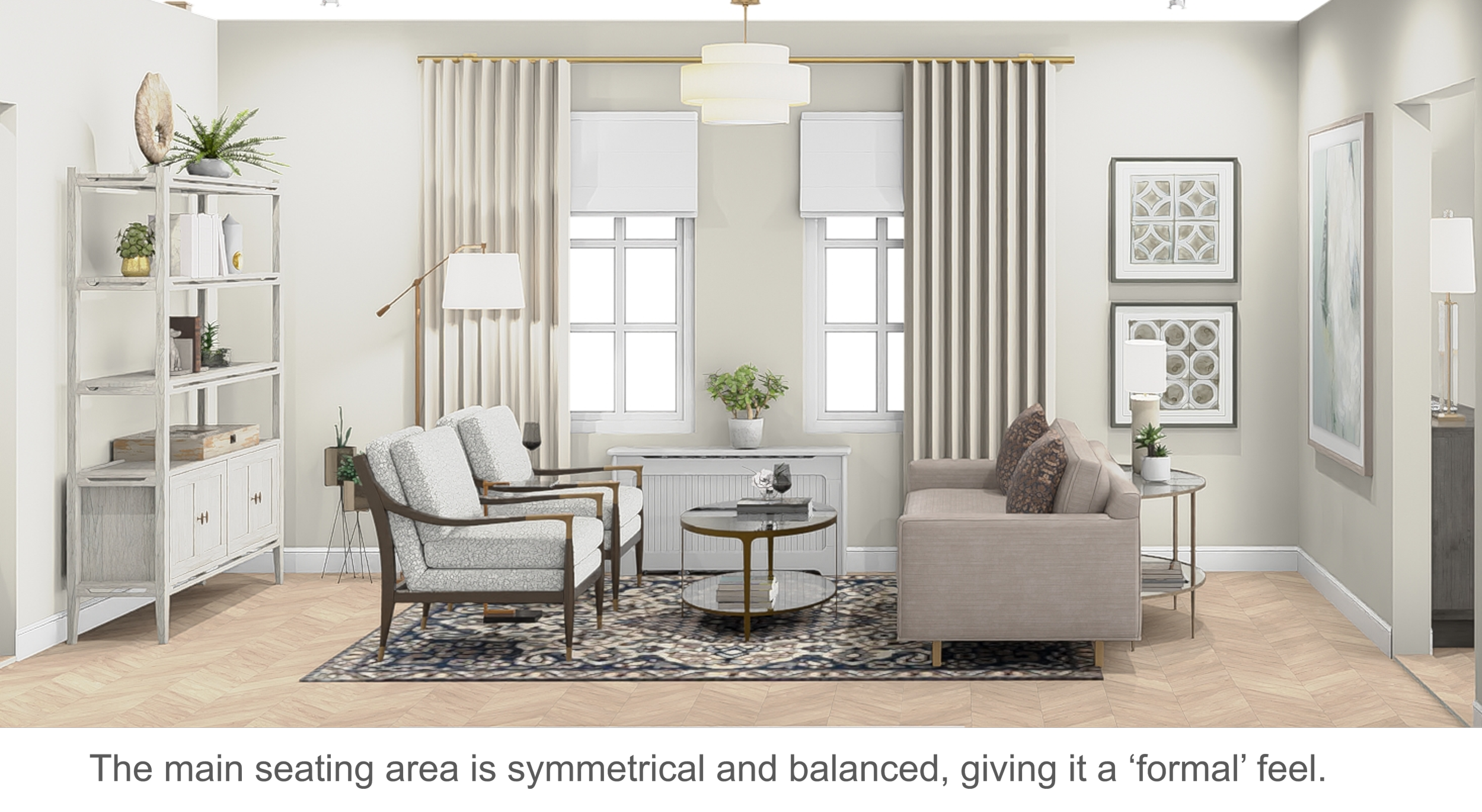
Since my client wanted a ‘formal’ arrangement, I knew that symmetry would play a big part in the for the remaining furniture. The options left was:
a matching sofa opposite the first sofa.
or a pair of matching chairs opposite the sofa.
Tip: If you want a more ‘formal’ feeling room, match two or more pieces of upholstered furniture.
I went with a pair of matching, open frame occasional chairs opposite the sofa. The open frames allow you to see around and through them easily and that makes a big difference to how the room will feel. That makes the room feel less crowded. The seating isn’t small, so capturing openness in this way keeps the space visually open.
I placed a small drink table in between the chairs to serve as a shared surface for both chairs.
I often say, think of your tricky, small, or awkward room as a blank puzzle board. Like a puzzle, you must find the right pieces to fit in. And like a puzzle, if the puzzle piece doesn’t fit, you can force it – but the picture at the end won’t look right…
So, the puzzle pieces that fit best in this room are rounded pieces.
I placed an oval, glass coffee table in between the sofa and chairs and a glass half-round, demilune table behind the sofa. (There isn’t enough room for end tables beside the sofa, so this half-round console is a place to put a table lamp and to use for convenience when sitting on the sofa.
I chose glass tables to keep the space visually open and spacious feeling.
If you were to place rectangular tables in place of these rounded ones, it would cut down in the usable pathways around the furniture.
The last piece of the puzzle was what to place on the wall opposite the sofa. I like varying the height of accent furniture in rooms, so the piece I placed on this wall is an etagere style shelf that has open sides and back. There are a couple of drawers on the bottom for storage as well.
Much like the open frame chairs, this etagere piece keeps the wall behind it visible and open, making the room feel less crowded and clunky.
The Dining Room
This room has a square shape, essentially 12’ x 12’. This is a generous size for a house of this size, but square rooms have their own set of tricky issues too.
For this room, the doorways form the living room and to the kitchen are parallel, so we’re back to nothing can be placed on that wall.
I chose to place a round, pedestal dining table in the center of the room.
I find that round dining tables are best for square dining rooms because you can easily navigate around them better than square or rectangle.
The chairs around a round table can also be angled toward the corners of the room, giving each more room to be pulled out further from the table, which is easier to take a seat – no walls or other furniture to get in the way.
The other benefit of round dining tables in square rooms is that you can usually fit other pieces like cabinets, server buffets, or console tables for storage and display. Adding in pieces like these fills out the room and provides more functionality.
If you were to place a square or rectangular dining table in the space it would eat up more floor space making it harder to navigate around the room and it would also limit the addition of accents like a server or console table.
The Floor Plans:
As you can see, the pathways are clear into and through each room and that is because of carefully considering each piece of furniture I chose to place in the rooms.
So, thinking about your room as a puzzle board will help you to think through the size, scale and shape of the pieces that will fit best.
Let’s look at how this room can look if you were to follow these suggestions.
To sum up
Shotgun style homes have many of the same challenges that small, awkward, or tricky rooms do.
There’s always going to be considerations for furniture placement, function, and flow.
But when you make careful furniture choices based on the size and scale of your room, you’ll find at least one option that will look great and give you all the functionality you’ll ever need.
Remember, think about your tricky rooms as puzzle pieces and work on getting the right shapes first. That alone will narrow your considerations down a lot.
Read Next:
How To Arrange A Square Living Room With Doors On 3 Walls And A Pass-Through
Drawing inspiration from a real-life room transformation, I provide practical tips to maximize space, improve flow, and create versatile layouts. From precise room measurements to the strategic placement of furniture and thoughtful editing of clutter, I guide you through a step-by-step process to make the most of your square living area. Whether it's optimizing pathways, rethinking accent walls, or designing functional zones, this post equips you with the tools to conquer the unique challenges of square room arrangement.
Join the Fun!
If you enjoyed this post and you want to keep seeing my weekly blog, the best way to do that is to subscribe.
You can subscribe by downloading my 11 Secrets Only Designers Know to Make Your Space Rock. If you’re curious about how decorators and designers make a home look magazine ready, you’ll love taking a gander at these 11 secrets. You’ll learn how to style your room from the floor up and it will work for ANY space you have.
I write about small space design and decorating, sustainable furniture options, positive self care and a variety of do-it-yourself home décor.
I’d love to connect with you!
“Michael Helwig was top-notch, very professional and responsive to my needs. He allowed me time to explore ideas and try out a variety of combinations until we found the perfect fit. Michael provided detailed information and offered beautiful ideas to make my dream living room become a reality. The furniture he sourced has totally transformed my living room space. Everyone that has seen my new living room has one word, WOW! A special thank you to Michael for a wonderful experience.”
“Michael was very knowledgeable and guided us, with great patience and good humor, through the process of designing our dining room and helping us find the perfect sleeper sofa. He offered really helpful advice when we asked questions - which was often - but at no time did we ever feel pushed. He helped me when I felt like I couldn’t make one more decision. When my new furniture finally arrived I realized everything down to the pillows was perfect. I couldn’t be happier!”
Michael is Principal designer and blogger at Michael Helwig Interiors in beautiful Buffalo, New York. Since 2011, he’s a space planning expert, offering online interior e-design services for folks living in small homes, or for those with awkward and tricky layouts. He’s a frequent expert contributor to many National media publications and news outlets on topics related to decorating, interior design, diy projects, and more. Michael happily shares his experience to help folks avoid expensive mistakes and decorating disappointments. You can follow him on Pinterest, Instagram and Facebook @interiorsmh.


