The pass-through living room is one that has multiple doorways that allow you to get from one area of the house to another. This room is not a one way in, one way out situation.
You may also hear this type of room referred to as a walk-through space.
It means the same thing. You’ll walk through it to get to other parts of the house.
Some pass-through rooms are small, and some are large.
The one thing they all have in common is that they can be challenging to arrange.
You must be mindful of not blocking the pathways to the other rooms.
When you think about arranging the furniture, keep in mind the purpose of the space. That purpose could be a single use room, like just a living room , but you may need multiple purposes like a living room dining room combo, or a living room office.
Whatever the case, a pass-through space will always have unavoidable limitations.
My goal here is to give you a few universal tips to help you find a layout that works the best for your walk through living room.
It’s about embracing those limitations because you can still have a beautiful room even if it’s a temporary stop along the way to the rest of the house.
This Room’s Parameters
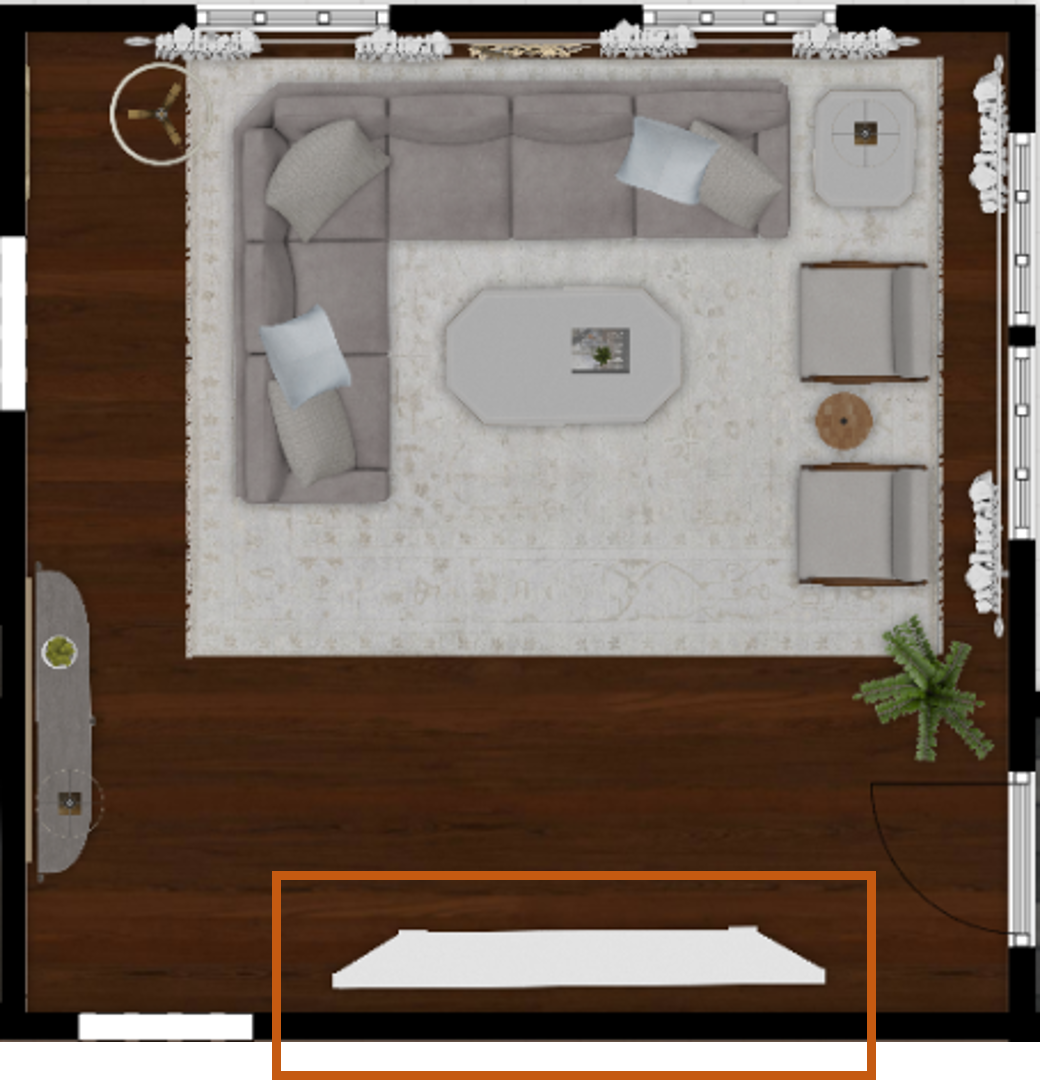
This room is 18’ x 18’, a perfect square.
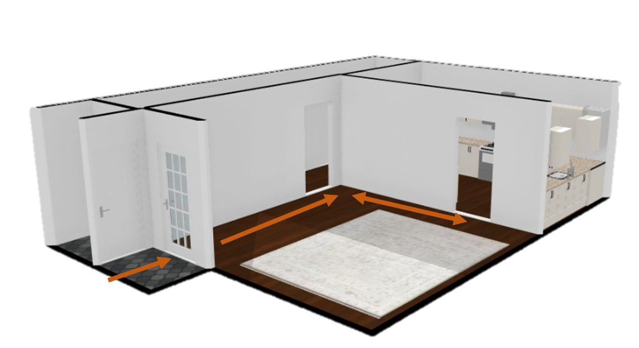
The thing that isn’t perfect about it is that it’s got 3 doorways on 3 different walls.
That will make it hard to fit certain kind of furniture, but it won’t be impossible.
It’s not a ‘small’ room, like a I usually talk about, but it’s a challenge, nonetheless.
Even being a slightly bigger space, the same issues pertain to it: lack of wall space and the need to have specific types of furniture to make it work the best way it can.
The Traffic Patterns
The first thing to do, after establishing the exact measurements of your space, is to think carefully about the traffic patterns before moving any furniture in or buying new pieces.
Here, we have a front door that opens directly into the space from a small foyer. It’s the second most used entrance and the one that all guests use. As the front door is a standard door size, you'll want to leave adequate clearance on both sides.
At the back, you have a doorway going to the hall and on the next perpendicular wall, the doorway into the kitchen.
So, this means you can’t have big furniture obstructing those pathways.
What you actually have here is a ‘L’ shaped pathway through the room.
That ‘L’ needs to stay open because you don’t want to scoot around or step awkwardly around bulky pieces as you walk through.
This is the first zone in your space.
It’s important to remember, you always want a clear path and visual clarity in pass-through rooms.
A well thought out arrangement in these types of spaces will save you from that feeling like there’s something off.
The next thing that happens after determining paths through the room is figuring out where the main seating will go. This is zone 2.
Define the space
My favorite way to define this zone is with an area rug.
It’s an easy way to indicate where the bulk of your furniture placement will go because area rugs can be thought of as an outline of space on the floor.
It also reinforces the traffic pattern you established first.
Notice that I’ve kept a straight shot from the front door and another straight shot from the hallway to the kitchen.
The ‘L’ is the way in and through the room.
Large Upholstery Goes on the Longest Unobstructed Wall
Unobstructed simply means the wall without a doorway.
Some designers will also advise against placing furniture in front of windows, but honestly that limits you completely.
So, this long wall with two windows, is the place to put the biggest upholstered furniture.
Center the Furniture on the Rug
Often, you’ll find that the main furniture grouping won’t fit in between windows.
Sometimes you won’t be able to center the furniture front of a fireplace, if you have one.
The point is, you’ll probably run into this situation from time to time and it’s best to use the area rug as the parameters for your seating area.
I also always advise using the largest rug you can fit in a space because that gives you the best outline for a comfortable seating arrangement.
This rug is large, 11’ x 14’. For an 18’ x 18’ room, this works well.
My go to size for pretty much ANY room is 8’ x 10’ or 8’ x 11’.
Place Second Largest Piece of Furniture
The second largest piece of furniture often coincides with the focal point in the room: the TV or Fireplace, etc.
It’s the main focus of the room, and I call it zone 3.
The space opposite the main seating in this room happens to be in the main pathway into the room from the front entry.
This immediately complicates things because
You can’t block the door that opens into the room.
Whatever you put here can’t be so deep that it impedes the pathway.
It needs to visually balance the large seating area and height of the windows on the opposite side.
The solution for the depth issue is using something that has a break-front profile. This is a piece that will angle back on the sides that are closest to the doorways. The center part is the deepest part but the sides taper in to make it easy to pass.
You’ll see in a moment that this pieces is tall too, which will balance out the height of the drapes on the opposite side.
Place Smaller, Accent Furniture Next
In order to give the room a secondary focal point, visual balance and another surface, I wanted a console directly across from the front entry. I call this space, zone 4.
It’s a secondary focal point because it’s not the thing you’re looking at all the time, but it plays the part of being the first impression as you enter the space.
It’s important because it’s a chance to crate a welcoming moment and it’s functional as a place to put a lamp, some décor and art above it.
Now, the issue is also that you can’t place a deep piece there because it’s in a main pathway and the doorway is only 10” from the corner of the room.
The solution is a shallow, demilune console. This is a piece that hugs the wall and has rounded ends that taper back to allow for comfortable passage around it.
I went for a long demilune table because the area isn’t small. There’s a lot of space between the hallway door and the kitchen door, and something dinky would get swallowed up by that expanse.
Here’s what the room looks like in 3D.
The main seating, zone 2, is positioned opposite the large, break front entertainment unit, zone 3. The long rounded demilune is perpendicular to the main seating and focal point, zone 4.
The pathways, zone 1, are open and there’s visual balance all around.
Your gaze around the room has lots of varied heights, nothing feels too big or too small.
The scale of the seating group balances the large focal point and the pathway from the foyer is comfortable and unobstructed.
The two accent chairs are in ‘conversation’ with the sofa and not centered in front of the windows and that’s okay.
Tip: If you want to visually extend a large seating group but the windows are close together or small, get a long drapery rod and extend it past the windows on either side.
A good rule of thumb is 12” past the window.
This will allow you to have the curtains or drapes to be double full and that will make the windows appear to be centered or in line with the seating group.
I brought the rod to the edge of the area rug which visually extended the width of the window and gave me that balance I needed behind the chairs.
It’s an illusion, but it works every time.
Defined Pathways are the Key to Pass-Through Rooms
When you determine the natural pathways, you will see layout options for your pass-through room.
You may not have the ability to flip your layout to different locations in the room but, it will become clear that you can arrange your furniture differently in the seating zone.
Here’s a classic sofa, loveseat, chair option.
The sofa and loveseat form a smaller ‘L’ shape opposite the pathway ‘L’ from zone 1.
This is essentially mimicking that pathway shape and condensing it into a smaller proportion.
Design pros do this often because it is a key practice in space planning.
It makes a room’s layout feel comfortable because the shape is repeated.
A swivel chair completes this conversation grouping and provides additional functionality.
It can swivel to watch TV and swivel to visit with others on the sofa and loveseat.
It’s not in the zone 1 ‘L’, so it won’t hinder traffic.
The small drink table provides a comfortable place to set a drink or phone down.
The seating zone can be more ‘formal’ by placing two sofas opposite one another.
They’re joined by a coffee table in between for a functional surface.
The sofa near the windows has the added functionality of a sofa table behind it. It’s the perfect spot for a table lamp, since this arrangement doesn’t leave room for end tables.
The sofa near the kitchen doorway only has the coffee table as a surface for use. That’s because it would be crowded to add another table behind it as it would interfere with the pathway behind the sofa.
Repeat Shapes
A good way to add comfortable consistency to a space to repeat shapes around the room.
This give a room variety and interest, but it also provides context which is naturally pleasing.
The mirror on the wall is a similar shape to the coffee table.
The entertainment unit, demilune console and sofa table all have similar shapes.
It’s a subtle trick, but the result is instant familiarity, which translates to ‘comfortable’.
Flexible Layouts
Like a lot of spaces, sometime the pass-through space needs to accommodate different activities in the same space.
By shifting the seating arrangement slightly, there is now room for a shallow sofa table behind the sofa.
It could be a convenient spot to pull up a chair and use it as a desk.
Opposite, I placed a couple of accent chairs on slight angles, positioned toward the sofa, a conversation grouping.
The chairs share one end table, which provides enough space for a drink and a table lamp.
All the seating is still within zone 2 and the pathway: zone 1, is unobstructed and balanced.
Dining Space Option
You may have the need for a dining space that doubles as a work area some days.
For this scenario, I chose a glass pedestal table and 4 chairs.
First, the glass top gives you a solid surface to work on but is transparent, so visually it doesn’t feel heavy, they disappear.
Second, a pedestal base will allow you to push the chairs all the way in, no legs to get in the way. You can access the chair from any direction. This makes it easy to get around in tight spaces.
I left out the coffee table from the seating group, which has been shifted down in the zone. There isn’t enough room for one and it’s not necessary.
To make up for an absent coffee table, I chose to place a sofa table console behind the sofa to act as a convenient spot to place a drink, hold some décor and a lamp for extra light.
5 Doors in a Pass-Through Room
What happens to this walk through room when you add two additional doorways?
That’s a lot of doors but not as uncommon as you might think.
In this case, you will almost always have to float your furniture arrangement.
The demilune table is now behind the sofa near the windows.
The pathway from the hall to the opposite new doorway is completely open.
And the second new doorway next to the entry door is also completely open and passable.
The centralized furniture layout is “formal” with the sofas opposite one another and a chair perpendicular for conversation.
The chair and sofa near the windows share an end table and the sofa near the kitchen has a couple of small nesting style tables to provide additional surface.
You can access the seating arrangement multiple ways, which is an important consideration.
There you have it, what you need to know when furnishing a pass-through living room.
To sum up:
Measure the room and know its parameters
Determine traffic patterns (Zone 1)
Use an area rug to define the seating area (Zone 2)
Largest upholstered piece goes on the longest unobstructed wall
Create a focal point (Zone 3)
Place accent furniture (Zone 4).
Pass through rooms preset as difficult to layout but when you keep these main points in mind, you’ll see that they really are no different than any room with 4 continual walls and one entrance.
I’d love to hear what your experience with pass through or walk through rooms is. Were you able to come up with a great layout or are you still struggling with it? Leave me a comment and tell me all about it!
“Michael Helwig was top-notch, very professional and responsive to my needs. He allowed me time to explore ideas and try out a variety of combinations until we found the perfect fit. Michael provided detailed information and offered beautiful ideas to make my dream living room become a reality. The furniture he sourced has totally transformed my living room space. Everyone that has seen my new living room has one word, WOW! A special thank you to Michael for a wonderful experience.”
“Michael was very knowledgeable and guided us, with great patience and good humor, through the process of designing our dining room and helping us find the perfect sleeper sofa. He offered really helpful advice when we asked questions - which was often - but at no time did we ever feel pushed. He helped me when I felt like I couldn’t make one more decision. When my new furniture finally arrived I realized everything down to the pillows was perfect. I couldn’t be happier!”
Michael is Principal designer and blogger at Michael Helwig Interiors in beautiful Buffalo, New York. Since 2011, he’s a space planning expert, offering online interior e-design services for folks living in small homes, or for those with awkward and tricky layouts. He’s a frequent expert contributor to many National media publications and news outlets on topics related to decorating, interior design, diy projects, and more. Michael happily shares his experience to help folks avoid expensive mistakes and decorating disappointments. You can follow him on Pinterest, Instagram and Facebook @interiorsmh.


