Have you ever looked around your bedroom and thought it just needs a little something? Maybe the furniture is perfectly fine, the room has plenty of potential, but somehow it doesn't feel as cozy, comfortable or pulled together as you'd like.
That's exactly the kind of opportunity I love when working on a bedroom design.
You don't always need to replace everything or make a bunch of big changes to get a completely different feel. Sometimes it's about looking at what you already have, figuring out how to make the room work a little better, and bringing in the right mix of colors, textures and accessories.
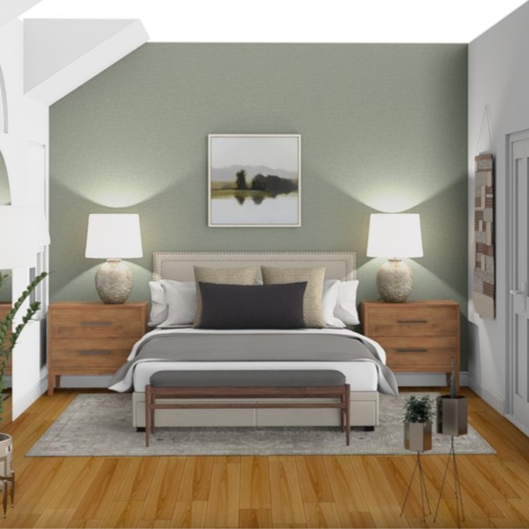
For this master bedroom project, the goal was to create a space that felt homey. My clients wanted a comfortable retreat for relaxing, reading, watching TV and winding down at the end of the day. Stylistically, they wanted something casual and eclectic, with earthy colors, sage greens, warm wood tones and plenty of soft, inviting textures.
And while the room had some layout challenges to work around, there were also some really nice things to build on.
Creating a Relaxed, Earthy Bedroom
When I think about a relaxing bedroom, I tend to gravitate toward softer colors and natural materials. There's just something about a combination of warm wood, creamy whites, muted greens and subtle patterns that makes a room feel comfortable without being overly decorated.
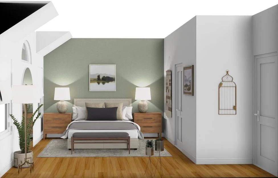
sage green textured wallpaper focal wall behind bed
For this bedroom, I wanted to bring in some sage green through the accessories and possibly even a focal wall. It's a great color for a bedroom because it has that connection to nature without feeling too green or overpowering. I also liked the idea of adding maybe a little rust or cocoa brown for warmth and depth.
The trick with a casual, eclectic look is getting the mix right. You want different textures and patterns, but you don't necessarily want anything shouting for attention. Think subtle contrasts, soft whites, creams, natural fibers and a few darker accents to keep things interesting.
I also liked the idea of using brass as an accent metal in this design. It added just enough shine without feeling too formal, and it works beautifully with earthy colors and medium wood tones.
For the floor, a slightly higher-contrast area rug with charcoal gray details was the perfect way to ground the space. The one I went with had a little texture and an abstract pattern that was the right choice.
The existing upholstered bed was another piece I wanted to keep. An upholstered headboard brings softness into a bedroom, and it helps create that comfortable, inviting feeling they were after. It's a great foundation for layering in different bedding and pillows.
Working With the Furniture You Already Have
One of the things I like about this project is that we didn't need to replace all the existing furniture to give the room a new look.
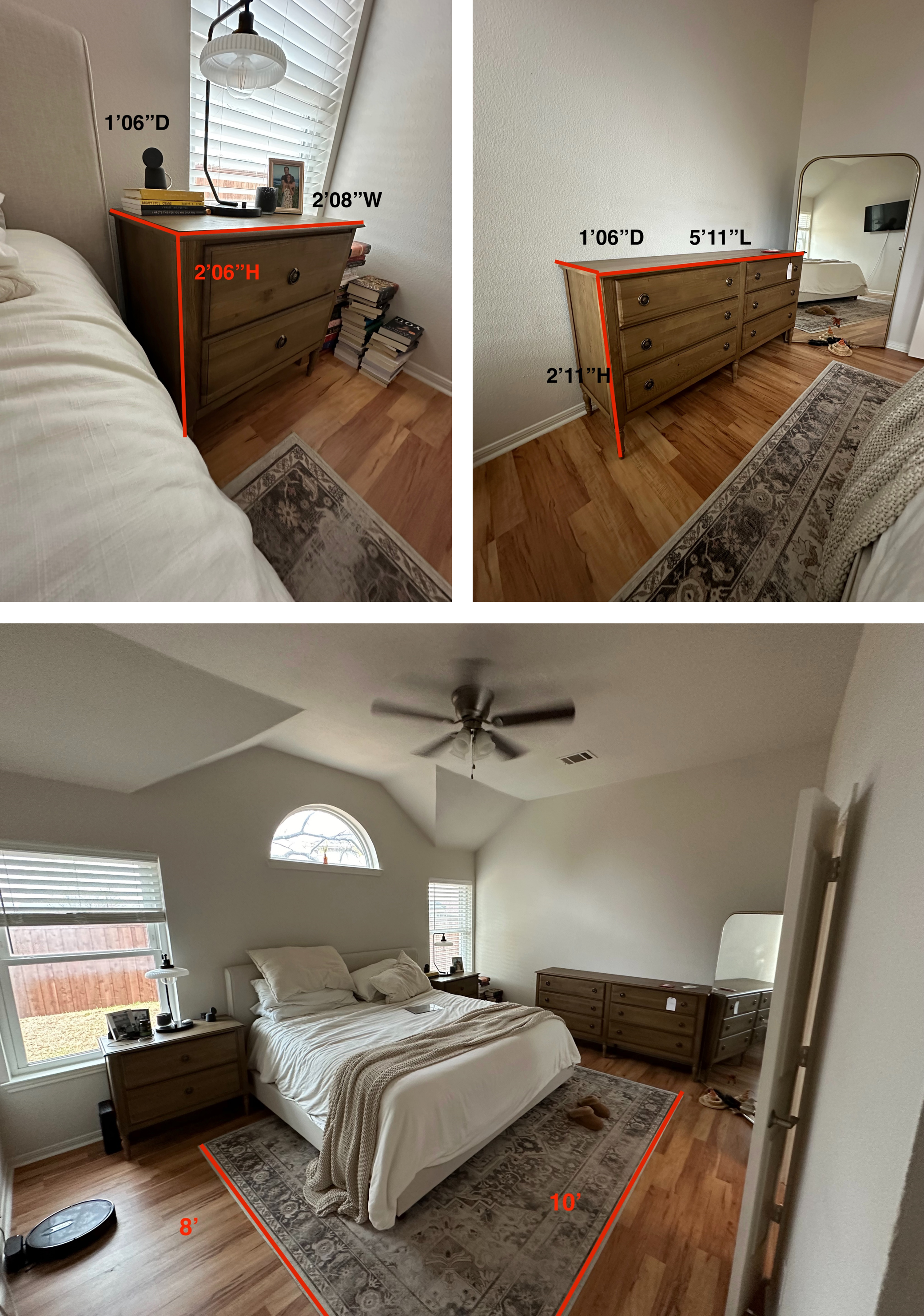
My client’s existing furniture
Both of the existing nightstands are staying, and I really like their medium wood tone. It's a versatile finish that works with just about everything, especially the softer colors we're bringing into this room.
The dresser is staying, too. In fact, I tend to like a little more “matchy-matchy” in a bedroom than I might in a living room or other shared spaces. You can certainly mix furniture styles and finishes, but having some consistency between the larger furniture pieces can make a bedroom feel a little more settled and relaxing.
The bed is a good size for the room, and more importantly, it's comfortable for the people using it. The husband is tall and knows this particular bed works for him, so there really wasn't a reason to change it.
That's something worth remembering when you're redesigning a room. Just because you're making changes doesn't mean you have to get rid of the things that are already working. Sometimes the best design decisions are about knowing what to keep and finding ways to make those pieces feel new again.
A fresh bedding combination and some well-chosen artwork can go a long way toward giving your existing bed a completely different look.
The Layout Challenges
Now, let's talk about the room itself.
On paper, this master bedroom seems like it should be easy to furnish. It's almost square, with one side being slightly longer than the other. That extra length is helpful when you're working with a king-size bed, but it can make fitting additional furniture and storage a little trickier.
There were a few other things to consider:
The French doors leading to the bathroom and closet are centered along one of the longer walls, so furniture can't block those openings.
There's really only one long, unobstructed wall for larger furniture placement.
The dormer vaults make placing taller furniture a bit more challenging too.
The room needs to accommodate a king bed, two nightstands, a dresser and maybe even some additional seating without feeling crowded.
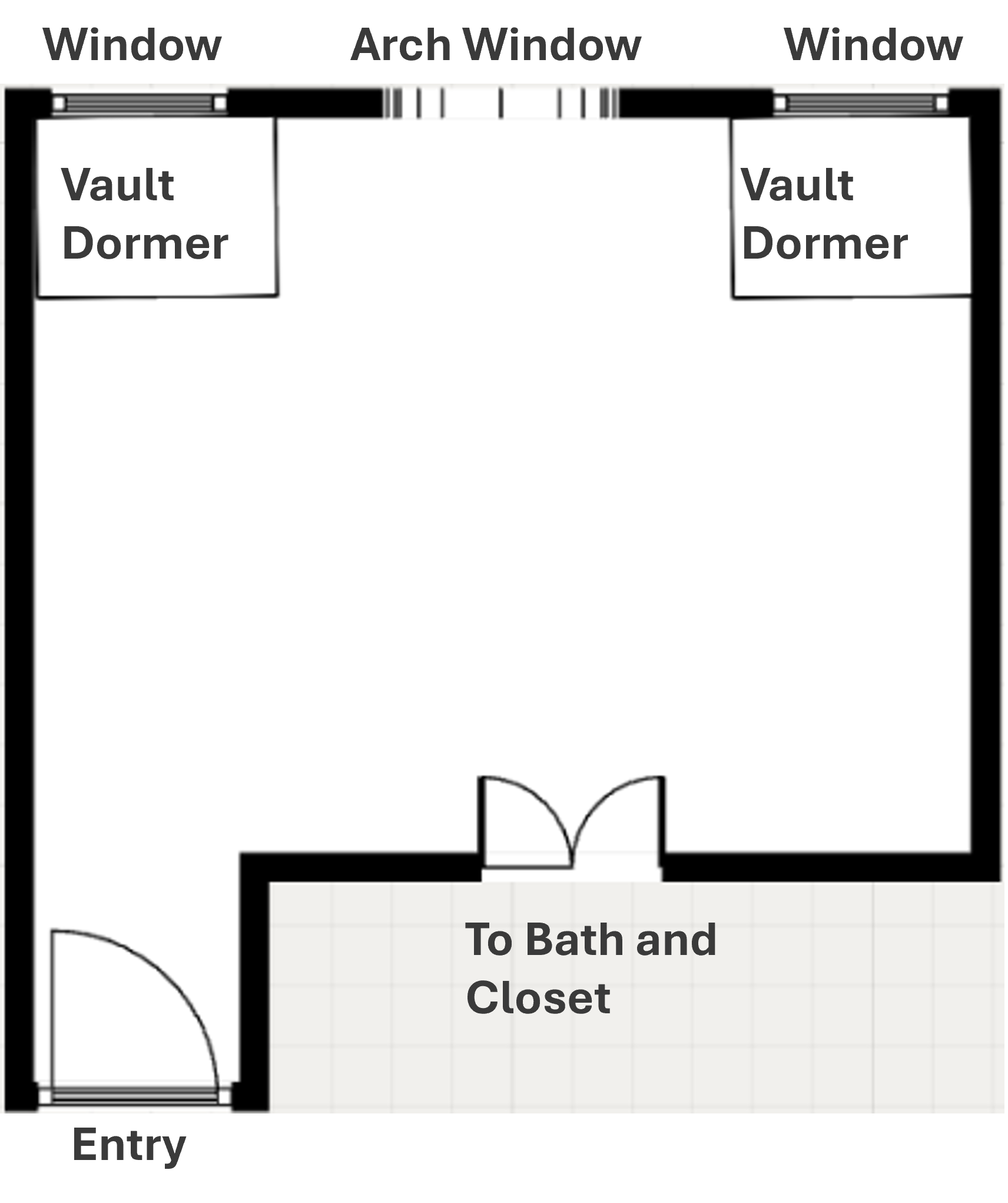
Their square bedroom with tricky architecture
This is where looking at the room as a whole becomes important. It's not just about finding a place for each piece of furniture. You need to think about how everything works together and how people will move through the room.
The main pathway into the bedroom needs to feel open and passable, especially with the bathroom and closet doors being used regularly. I shifted the bed slightly toward the window wall to make sure that pathway remained accessible.
It's a small adjustment, but sometimes moving a large piece of furniture just a few inches can make a noticeable difference in how functional a room will feel.
Making the Most of the Furniture Placement
Starting at the bedroom entrance, I moved the dresser closer to the window rather than centering it on the wall. This opens the entryway and gives you a little more space when walking into the room.
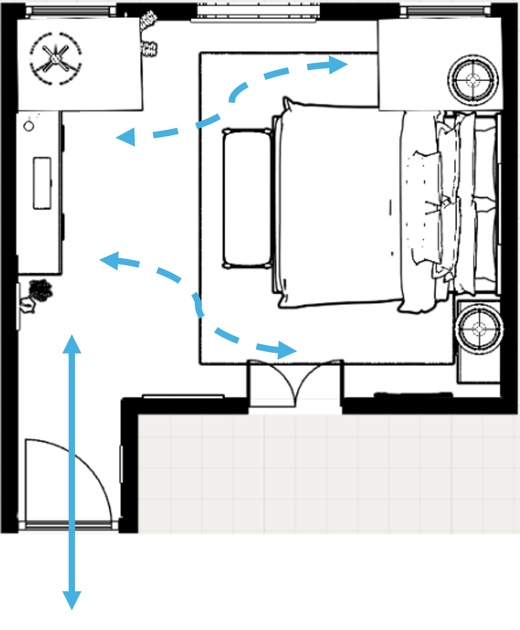
The proposed new pathways into and through the room
The TV stays above the dresser, and I used decorative accessories on either side to create some visual balance. Even though the dresser isn't centered on the wall, the overall arrangement still feels thought out.
The bed is positioned along the longer side of the room, which leaves more usable floor space at the foot of the bed. That extra space is important because it gives us room to add a bench without making the bedroom feel cramped.
Speaking of the bench, I noticed one of their Pinterest boards and thought it was a great idea to bring into the plan. It's a nice way to add a little extra seating without bringing in another bulky piece of furniture. It's also handy for sitting down to put on socks or shoes or just having somewhere to set things while getting dressed.
The rug underneath the bed anchors the furniture and helps to define the sleeping area. More importantly, the rug runs horizontally beneath the bed and stops just before the nightstands, leaving both nightstands completely off the rug.
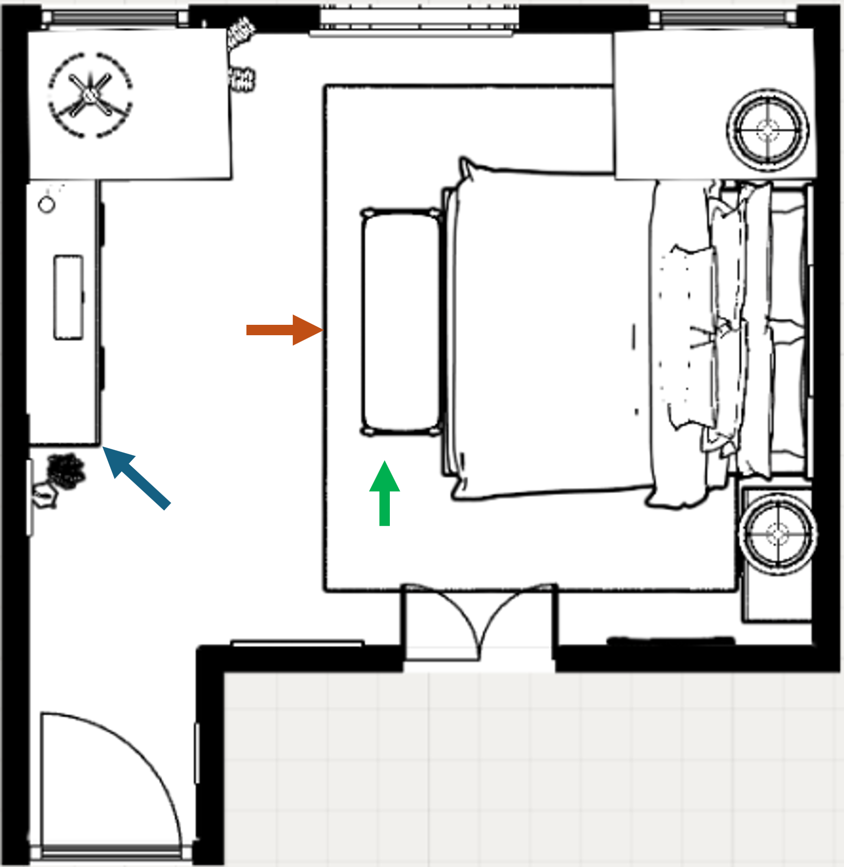
Main features of the new bedroom layout.
Rug placement like this is a design rug orientation classic because it allows for the most coverage on either side of the bed and at the bottom of the bed as well. It gives you the best views of the rug and provides the most coziness underfoot.
It's one of those pieces that looks good but also earns its place in the design.
Adding Details That Make the Room Feel Finished
One of my favorite details in this design is the arched mirror beneath the existing arched window.
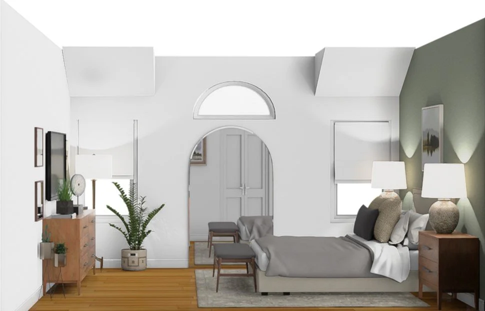
Arched mirror mimics the arched window above
This was a great opportunity to repeat a shape that's already part of the architecture. The mirror would be slightly taller than the one currently in the room, but not dramatically so.
Repeating architectural shapes in your furniture and accessories is a simple way to create continuity. It doesn't have to be obvious or overt even. In this case, the arched mirror quietly picks up on the shape of the window and makes the entire wall feel a little more intentional.
It's a small detail, but those are often the things that make a room feel thoughtfully designed.
For the wall behind the bed, I suggested a simple textured wallpaper. This was something I noticed in the client’s Pinterest inspiration too and thought it would work really great here.
A subtle wallpaper texture adds dimension without introducing another busy pattern. It also creates a nice backdrop for artwork above the bed, helping the bed feel like the focal point of the room.
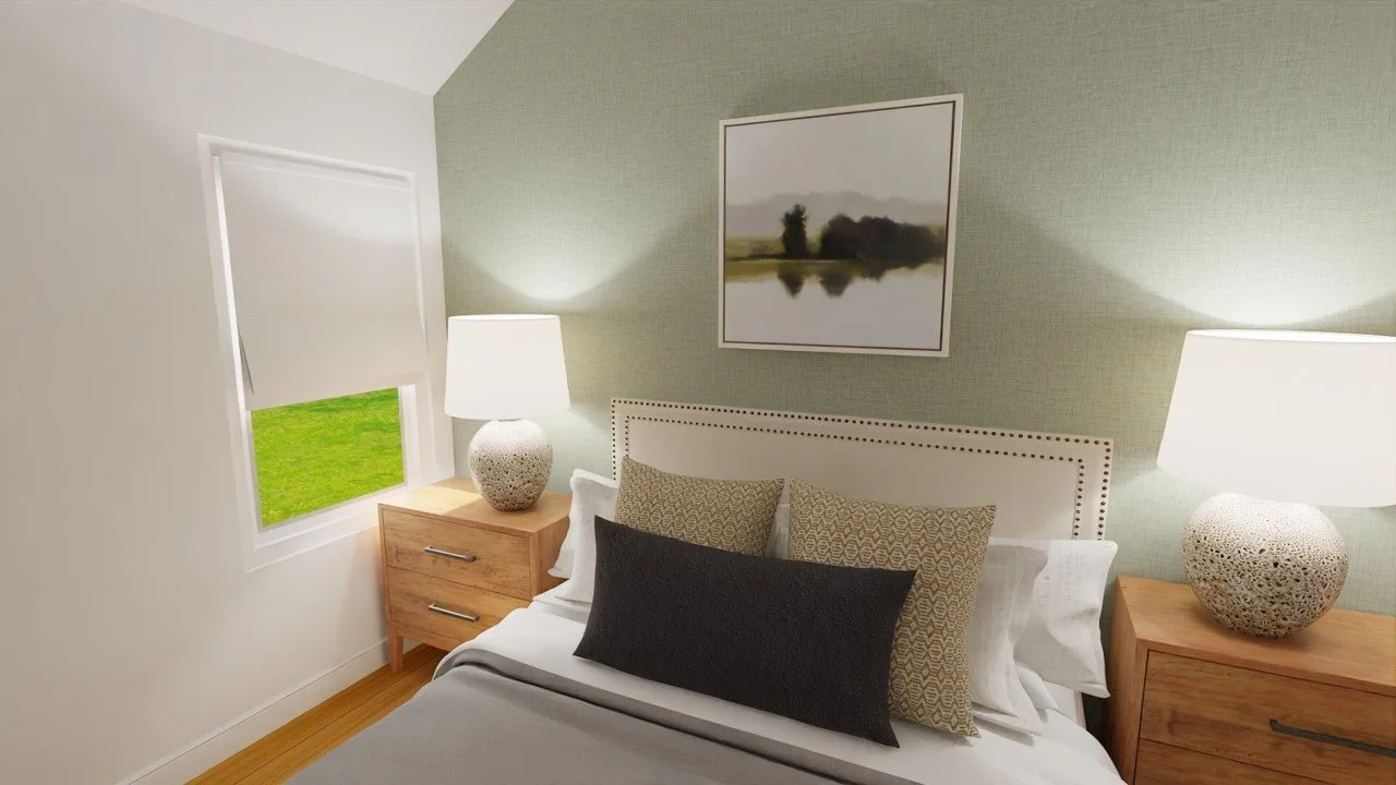
Sage green textured wallpaper on the bed focal wall
I love this idea for a bedroom because it gives you that extra layer of interest without having to rely on a bold paint color or an overly decorative wall treatment.
Looking toward the bathroom and closet wall, I kept things simple. A nice piece of artwork and a woven tapestry bring in a little color and visual texture without overwhelming the space.
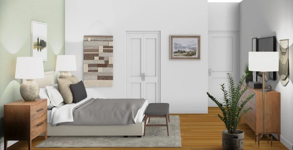
French doors leading into the walk-in closet and master bath
This is where layering becomes important. You can mix artwork, woven materials, soft bedding, textured wallpaper and patterned rugs, but the key is keeping the overall combination fairly subtle. You want to notice the different textures without feeling like there's too much going on.
A Little Styling Goes a Long Way
Since I moved the dresser closer to the window, I wanted to make sure the wall still felt balanced.
When you're styling a wall like this, it's helpful to think about the different shapes and lines you're introducing. You don't necessarily need matching accessories on both sides, but you do want a little visual balance.

Varying the lines of decor on the TV wall
I approached it much like styling a shelf. Mix up the heights, shapes and proportions so that everything isn't sitting at the same level. You can use artwork, lamps, decorative objects and other accessories to create a combination that feels balanced without being perfectly symmetrical.
This is especially helpful when you're working with a furniture arrangement that isn't centered on the wall. The dresser may be offset, but the accessories around it help give the entire area some context.
And there's another benefit to moving that dresser: it makes the entry into the bedroom feel more open. That's a practical improvement that you might not notice right away in a design rendering, but you'll certainly appreciate it when you're walking into the room every day.
Bringing It All Together
What I like most about this bedroom design is that it doesn't rely on one big dramatic change. It's really a combination of thoughtful furniture placement, warm and earthy colors, subtle patterns and layers of texture that work together to create a more inviting space.
The existing furniture gives us a comfortable foundation, while the updated bedding, artwork, wallpaper, rug and accessories bring in the personality and warmth that were missing.
And that's really what I want a bedroom to be. A place that feels comfortable, a little bit collected and completely suited to the people who live there.
You don't need a perfectly symmetrical room, matching everything or a whole new set of furniture to get there. Sometimes it's the little adjustments and the way you bring everything together that make the biggest difference.
After all, your bedroom should be more than just a place to sleep. It should be a room you actually enjoy spending time in.
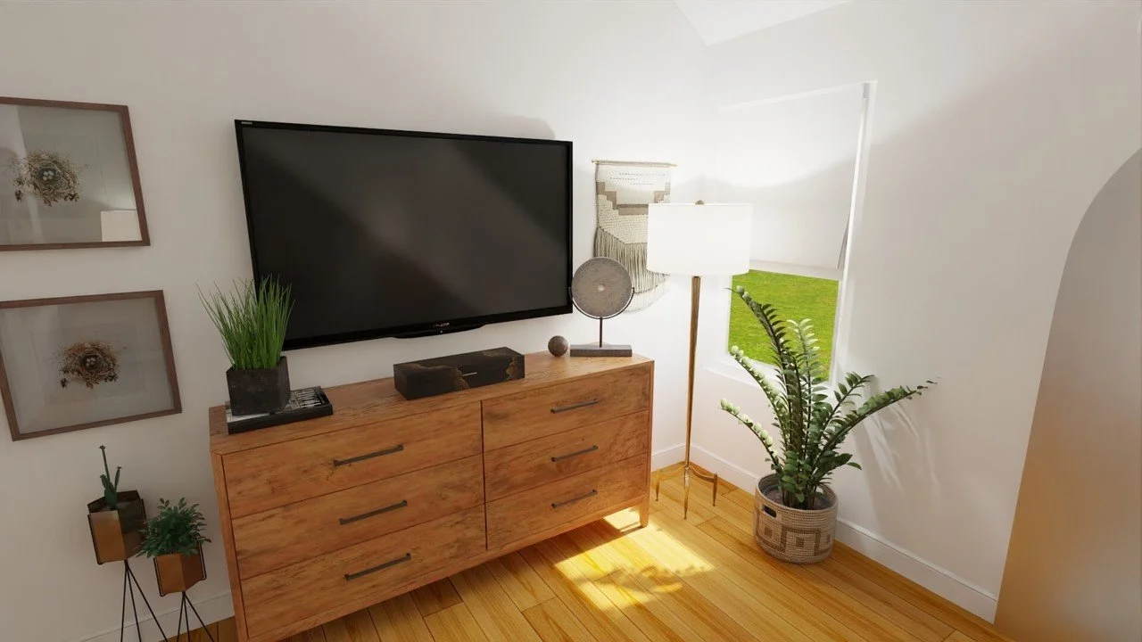
High resolution rendering of the TV focal wall
Read Next:
Creative Ways to Make a 10x10 Bedroom Work for Two
Trying to make a small 10' x 10' bedroom work for two people? These creative tips and space-saving ideas will have you maximizing storage, improving your layout, and making the most of every inch. Whether you need clever furniture choices or hidden storage, this post will help you create a cozy, functional bedroom that suits both your needs and your style.
Michael is Principal designer and blogger at Michael Helwig Interiors in beautiful Buffalo, New York. Since 2011, he’s a space planning expert, offering online interior e-design services for folks living in small homes, or for those with awkward and tricky layouts. He’s a frequent expert contributor to many National media publications and news outlets on topics related to decorating, interior design, diy projects, and more. Michael happily shares his experience to help folks avoid expensive mistakes and decorating disappointments. You can follow him on Pinterest, Instagram and Facebook @interiorsmh.