Let me start off by saying, I love a traditional red and green Christmas! It’s classic and reminds me of Burl Ives or “A Christmas Story.” I’ve also been seeing a ton of simple red and black Buffalo check themes on YouTube and lots of Ray Dunn inspired fonts on coffee mugs, signs and linens, so I know that traditional is alive and well.
I don’t think you can step foot inside a store without seeing a little red pick-up truck with a tree on the back of it adorning something. When a hot new holiday trend hits it’s everywhere, right? But; what if you want to decorate another way? What if you love your everyday décor and you want to make that work for the holidays?
That’s exactly my situation this year. I just got done putting a new spin on my living room décor: new pillows, a fresh paint job and I didn’t want to pull everything out and put in the reds, greens, silver and gold. I wanted to be able to use what I had just invested in to bring that holiday cheer. So, if you’re over the red and green decorations this Christmas, read on to put a new spin on your holiday decorations.
1. Choose inspiration piece:
I have been pulling my living room décor together piece by piece in between work, writing and other projects. So, I didn’t want to box up everything I’ve been working on for the last few months to drag out all the reds and greens. Instead, I decided to decorate around the accent colors I already have.
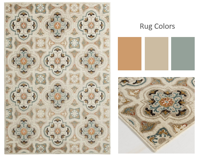
The inspiration for the coppers and gray blues came from my living room rug. When I saw it, I knew it would be the perfect rug because it looks great in the summer and winter.
I also wanted something to contrast the ebony dark floors that I have as well. The light, beige background was just the thing.
I don’t have a lot of pattern in my space so, I was happy to have a patterned rug on my floor. This is step one: finding you inspiration from a favorite piece of art or an accent pillow. It can really come from anywhere.
2. Choose Colors from the Inspiration Piece.
After you decide on your inspiration piece, study the colors. I love that this rug has a copper orange color in the small rosettes and that got me to my jumping off point. It’s a small accent in the rug but really like coppers and orange tones to begin with. Plus, I have quite a few copper colored ornaments already.
I love to mix metals and I often bling my holidays out in golds, silver and copper metal tone, so that was easy.
The next color I picked out was this taupe beige because I knew it would ground the metallic copper. It’s neutral and I have a lot of that color in my space in lamp shades and pillows.
Last, I pulled out this dusty blue gray that’s in the border of the rosettes. It was a great choice for the 10% portion of my color scheme. I’ve written a lot about the 60% 30% 10% rule in my posts and I think if you master this combination, you can always make a beautiful room composition.
For my holiday design my 60% is white/beige the 30% is copper and the 10% is the gray blue.
3. Create the Mood:
Ribbons, textures, details. Now on to the fun part. Once you have all your colors picked out from your inspiration piece, it’s time to start planning the tree.
I like to start with the tree because it’s the largest piece of holiday décor – usually – and that is a great place to start to lay the foundation for the rest of the space.
In other words, the tree sets the tone for everything else. You can take the same colors and ornaments that you used on the tree and translate them to the garland on the fireplace mantle or stairs, incorporate them into wreaths and shelves. I used the same colors on the inside and outside of my house to keep things simple.
Start compiling the look: create a mood board to outline the direction you want to go. With a mood board, you can easily swap pictures in and out to see what works and what doesn’t, so you don’t waste time or money on things that aren’t a good fit.
For my process, I’ll fuss with my mood board for about an hour. I’m usually referencing my color wheel to nail down my composition. Blue and orange are split complimentary colors, so I knew that they would work great together in copper and dusty blue tones.
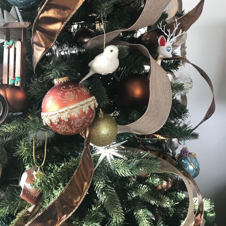
I found this neutral “burlap” ribbon last year and I loved the way it looked on my tree. Then, as I was out at the craft store, I came across this copper ribbon and it was the perfect match to the copper color in my rug.
It has some shine which is another thing I was after because I wanted a tiny bit of glitz to contrast the burlap.
Important: If you want to decorate with ribbon on your tree, always get wired ribbon so you can wrap around the branches. Unwired ribbon will not work because you won’t be able to create volume with it.
My 10% color was the blue-gray. It’s about 10% of the rug so I knew that it would provide the same effect to the color composition: subtle contrast. I scored a set of 6 vintage glass tear drop blue ornaments at a tag sale. I also had a box of newer blue ornaments to complete the look.
4. Keep your Inspiration Close:
When you have your mood board finished, snap a picture of it with your phone so you can reference it when you’re out looking for décor. This little hack is a life saver when you’re out and you find something that you think is perfect.
When you have the colors and objects neatly laid out together in a visual format, you can immediately see if what you’re considering will work.
It also keeps you on track with the actual pieces you want to incorporate. For example, I knew, from planning the mood board, that I wanted copper ribbon, not blue ribbon and I wanted to hunt down some different shaped blue ornaments. I also wanted to find some gold and copper picks for the top of the tree.
5. Implement Your Plan:
After the shopping is done and you’ve got the plan you want in place, it’s time to pull your look together.
• Start with the tree and place the ribbon first. I prefer the look of ribbon cascading vertically down the tree. I always place matching ribbon around my angel’s frock to tie in the theme of each year’s tree and make it all flow together nicely. She’s already wearing a combination of beige and white so I know I can mix in any color and it will look amazing. The effect that I go for is making it look like she’s flown up to the top of the tree and wound the ribbons all the way up on her way. It’s a very Cinderella meets Mary Poppins effect.
• After that I start placing my picks at the top to give it a bit more fullness. Sometimes you just have to add a little more bulk to the tree to make it really pop.
• Next, move on to the largest ornaments. Place them at the bottom and further inside the tree for depth. You always want to make sure you can see depth because it provides layers that make the tree look full and lavish.
• The last thing to go on is the small ornaments. I have a bunch of small and antique ornaments that I want to highlight and when I place them last, they usually end up in places that honor them.
My tree is on a rotating base, which I’ve linked below if you want to check it out. I use this exact base and I’ve had it for 10 plus years and it’s still going strong. A rotating base is great to display all your cherished ornaments and it is indispensable for helping me keep my ribbons straight.
After the tree is done, it’s easy to get the rest of the house pulled together. For me, I tied in the color theme with some small floral picks I attached to my geometric mirrors with suction cups.
I then added a small bow made from the copper ribbon I used on the tree.
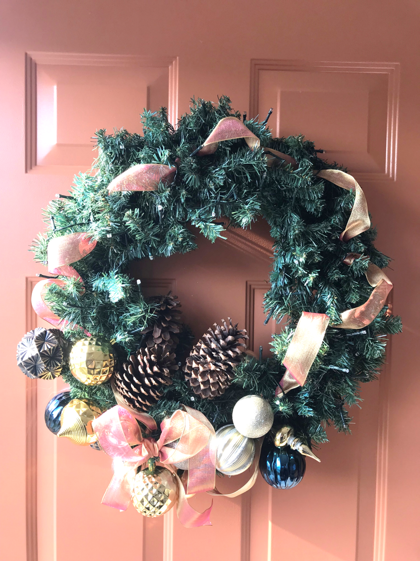
The last area I tackle is outside. I found this wreath at a thrift store right after I found these 3 8’ garlands. The set of 4 greens cost me a whopping $8.75, steal of a deal.
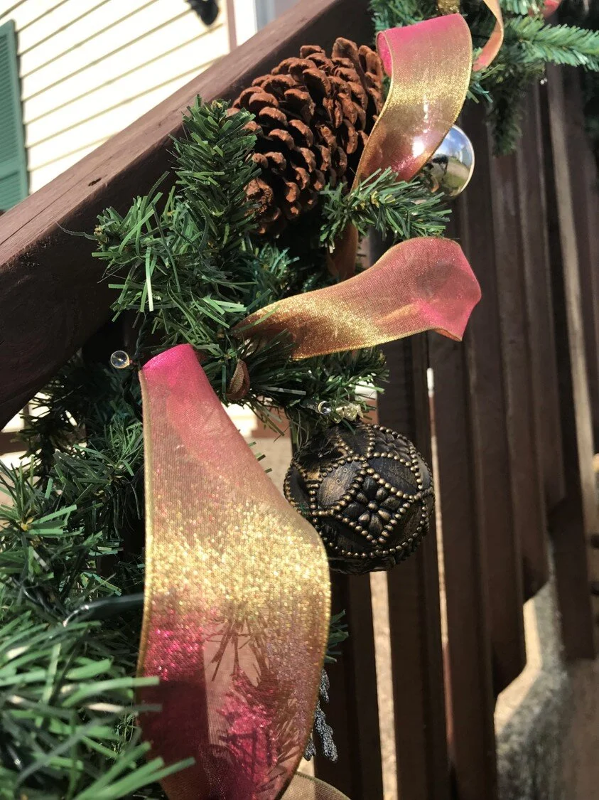
I just installed the front railings, so I wanted to give them a little attention this year. I didn’t have any more copper ribbon, so I decided to use this metallic orange to compliment my orange front door. (Another reason I didn’t want to play up the red and greens.)
I’m really happy with the way it turned out and it just goes to show that you don’t have to decorate with traditional Christmas colors if you don’t want to.
Conclusion:
1. Choose inspiration piece
2. Choose Colors from the Inspiration Piece.
3. Create the Mood.
4. Keep your Inspiration Close.
5. Implement Your Plan.
I’d love to hear from you. What do you use as inspiration for your holiday decorations? Leave me a comment below and tell me about it.
Did you know?
Did you know that I write a weekly newsletter in addition to this blog? It’s short and sweet and has inspiration, tips, tricks and hacks to make your decorating projects really shine.
I also tell you about all the things going on here at interiorsmh and a whole lot more that I don’t share anywhere else.
It’s literally where my best stuff lives and you have direct access to run anything by me each week.
Seriously, there’s a link to ask me my opinion on a design or process that you’re stuck on. That’s something I charge up to $700.00 for here! You get it FREE when you subscribe to my list, what??!!
I know how sacred your email inbox is and I WILL NEVER sell your information or spam you with any emails, I hate that shit!
I will only send you timely decorating advice and inspiration to encourage you along your decorating journey, plain and simple. If you want to join in, I’d love for you to check it out!
“That link to the gallery wall post saved my day! I was just about to forget the whole thing, so many nail holes… It went up in 30 minutes. It’s like you read my mind!””
“I look forward to your emails every week. Thank you for helping me with my paint color. It turned out great!”
As always, thank you so much for reading and I hope you had a wonderful Thanksgiving yesterday – for all my USA friends and, for everybody, I hope you’re falling into the joys of the season and getting your homes decked to the rafters!
I wish you joy, health and happiness this holiday season. Until next week, stay amazing and keep your dreams big for your small space!
Here’s What to Read Next:
13 CREATIVE SECRETS TO MAKE YOUR CLASSIC, TRADITIONAL CHRISTMAS LOOK AMAZING!
DON’T MAKE THIS EXPENSIVE COMMON MISTAKE IN YOUR SMALL SPACE.
Michael is Principal designer and blogger at Michael Helwig Interiors in beautiful Buffalo, New York. Since 2011, he’s a space planning expert, offering online interior e-design services for folks living in small homes, or for those with awkward and tricky layouts. He’s a frequent expert contributor to many National media publications and news outlets on topics related to decorating, interior design, diy projects, and more. Michael happily shares his experience to help folks avoid expensive mistakes and decorating disappointments. You can follow him on Pinterest, Instagram and Facebook @interiorsmh.

