Color Theory Crash Course
I put together this brief crash course in color theory but I feel this is a very helpful way to apply the use of a color wheel to the selection of your wall color.
To begin, think of the colors on the color wheel as temperature hemispheres. You have a “warm” hemisphere, with yellows, oranges, and reds and a “cool” hemisphere with purples, blues and greens.
Vivid, energetic rooms tend to gravitate toward the “warm” hemisphere. Refreshing, soothing and calm feeling rooms will find inspiration in the “cool” hemisphere.
Hue – is the pure color.
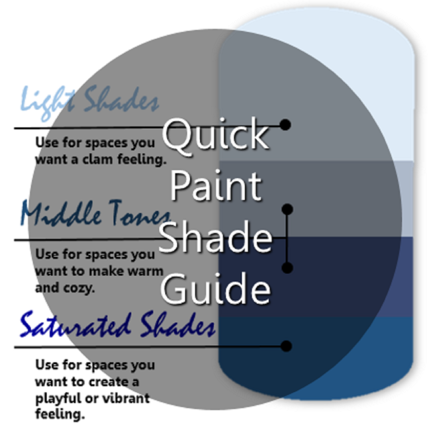
Shade – is mixing the pure color with black.
Tint – is mixing pure color with white.
Tone – is mixing the pure color with gray or by mixing tint and shade.
The way you arrange your color choices will depend on the colors that you choose from your inspiration pieces, area rugs, accent fabrics, etc. You can create harmony with your color choices by choosing different shades, hues, tints and tones. I included the definitions for each above but don’t let how the colors are produced sway you because of what is added to the colors. Instead, take note of how the colors you choose look with your inspiration pieces and use that as your guide.
Monochromatic Color Scheme
Use a monochromatic color scheme when you are interested in attracting attention to specific elements in your room design. For example, this dining room table is the star of this room. The monochromatic color scheme here allowed me to focus on the beautiful rich and dark wood tone of the table. The wall color is similar to the carpet and the table setting is also very subtle. The gray drapes support the story without being distracting. Mixing the hue, shade and tint makes this work!
Analogous Color Scheme
Analogous color schemes are right next to each other on the color wheel. The commonality of the colors always makes for a pleasing composition. Here, the white kitchen cabinets are supported by an analogous color scheme consisting of greens in the barrel shades and counter stools and the blue of the appliances and yellows in the fruits. This combination makes a very pleasing palate for this all white kitchen!
Complimentary Color Scheme
They say opposites attract…Its seems a bit counter intuitive that contrasting hues could be complimentary, but that is indeed what a complimentary color scheme is. By combining colors from opposite sides of the color wheel you can come up with some pretty swanky and eye catching designs! Opposite colors add energy and pizazz. The orange upholstery and accents in this room play opposite the blues in the art work, pillows and accessories. The intensity of color adds a vibrant feeling to the other more neutral upholstery and wood tones.
Split Complimentary Color Scheme
“That’s an interesting and lively room you’ve got there!” You’ll hear that a lot when you put together a split complimentary color scheme. The juxtaposition of three colors, one opposite two colors with one color between them, works similarly to a complimentary color scheme. The addition of one more color adds more drama and contrast which really escalates the mood and feel of your room. In this example, the reason it works is because of the intensity of the three colors, pure green, purple and orange. You can easily bring the intensity down by adjusting the hue and tint of the colors, but it will still be dramatic, and that’s the point!
Triadic Color Scheme
Triadic color schemes come from the combination of colors that are evenly spaced on the color wheel. Another way to think about the triadic scheme is to imagine an equal lateral triangle on the color wheel. No matter which way you point it, you’ll have a perfect triad. The best way to make a successful triad work is to let one color dominate the room and use the other two as accents. Here, the yellow-orange wall is the dominate color. The green carpet and sofa add the first side of the supporting color triangle followed by the pinks as the third supporting side of the triangle.
Additional FREE Guides: