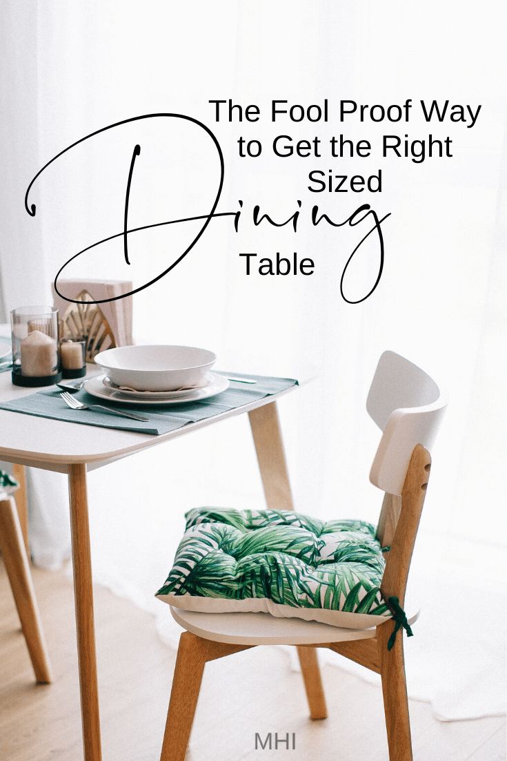
“We’ve moving to a smaller home and my formal dining set just doesn’t fit the new space, help!” I hear that almost every day. There is a building boom going on in Buffalo and the charge is being lead by the Baby Boomers and a few Gen X’s. For many couples, the kids are grown and out on their own and they are finally getting to have the home design they’ve always wanted. For the most part this new exciting chapter is filled with dreaming and planning new furniture layouts, color schemes. Some days are filled with wood, metal and tile samples, fabric swatches and a few little headaches here and there. One of those headaches being the dinning room. Now for some reason, and this has been my experience as a designer, people really know what they want their new great room/open kitchen to look like but the dinning space really throws them. If that’s the case for you and you’re struggling to finish up your new dining space, here’s the fool proof way to get the right size dining table. It’s broken down into 5 tips to avoid buyer’s remorse.
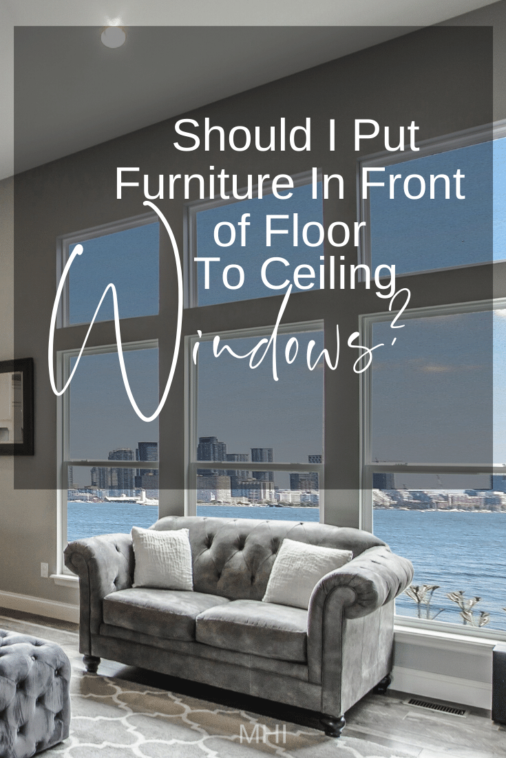
Should I Put Furniture In Front Of Floor To Ceiling Windows? Mom Said No, But…
I remember having this discussion with my mother years ago. Can furniture go in front of windows? As I recall, she did not like that idea much. Growing up my mother even placed her bed, angled, between the two adjacent windows in the bedroom to avoid the window. I think she was afraid of falling out of the 2nd story window or something, not sure. As I’ve progressed in my profession I have come up against this very question a number of times and I’ve switched up my own thinking about it. I used to think, “you can’t put furniture in front of windows! We’re you raised in a cave?!” But I’ve learned, sometimes the best place for furniture is in front of a window. And I think that this might be even more imperative when you have floor to ceiling windows, especially if they go around the space. To help you decide, here are 5 key points to consider when deciding, “Should I put furniture in front of floor to ceiling windows?
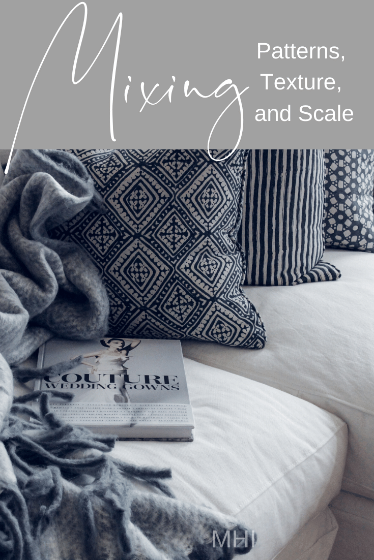
Read MoreMix It Up! Get The Skinny On Mixing Patterns, Texture and Scale For Your Living Room
Let me guess, HGTV did it to you again. You’ve just binge watched Flip or Flop and Fixer Upper and now you’ve decided to spruce up your living room. You think - a little change, like some new accent pillows. So off to the rabbit hole, A.K.A., Pinterest, you go! Seven hours and a bottle of Pinot later, you decide, “forget it!” It’s not that you didn’t see anything you liked, it’s that everything you saw, you liked.. right? After doing a little math in your head and thinking that heat and hot water is a more responsible investment, you arrive at: “Let’s just keep everything gray and call it a day.” Well my Dears, I’m gonna let you in on five decorator tricks to make your living room come to life without having to spend the kid’s inheritance to make it happen! Let’s Mix it up and get the skinny on mixing patterns, texture and scale for your living room.
Mix It Up! Get The Skinny On Mixing Patterns, Texture and Scale, Trick #1: Mix Small, Medium And Large Patterns.
Yes, decorating has small medium and large, just like Dairy Queen! But unlike an Oreo Blizzard with extra Oreos, you don’t have to rationalize the pattern on your sofa’s accent pillows as a “cheat day” pass… like last Friday after the kids’ swim class. Anyway, mixing the size of your accent patterns, like pillows, area rugs and accent seating can make a huge impact in your living room style. It doesn’t matter if you like traditional, eclectic, or contemporary, when you mix it up and add in a small, medium and large pattern, you create visual interest and that goes a long way! This trick works for those of us who like lot’s of color and for those who prefer more neutral color schemes as well.
Mix It Up! Get The Skinny On Mixing Patterns, Texture and Scale, Trick #2: The Pattern Combinations That Work Great Every Time.
Let’s stick to accent patterns for one more minute. Trick number two, understanding which patterns work together always, is really tried and true. Sometimes, after a lengthy project and having to really rack my brain to get a layout that is functional as well as pleasing to live in, a process that I LOVE, btw.. However, sometimes it can be a relief to get to pick out the soft finishes like pillows, area rugs and drapes. If that makes you want to burry your head under the covers and forget that you even have a living room to decorate, then I have a short list of my favorite patterns to mix for maximum impact. Here you go:
Mix It Up! Get The Skinny On Mixing Patterns, Texture and Scale, Trick #3: Vary The Line And Scale Of Pieces.
Trick # 3 is all about creating movement with the objects that you place around your room. Most of the time your décor won’t literally move but, you can create a sense of drama, movement and energy with the composition you choose to arrange. The most important thing from this trick to remember is that you don’t want a dull composition where everything is the same height, and your décor is all straight lines up with no variation. Instead you want to mix your décor items, vases, pottery, picture frames, sculptures, etc. , where some items are taller than the others. Think of arranging your composition like a vignette that tells an interesting story that highlights a color, texture or theme to bridge the pieces.
Mix It Up! Get The Skinny On Mixing Patterns, Texture and Scale, Trick #4: Layer Your Décor.
Trick #4 is also closely related to #3 in that along with varying the line of your décor pieces it’s also really interesting and appropriate to layer your items as well. Placing a small sculpture in front of a picture that’s in between a tall vase of flowers or decorative braches is a wonderful way to create a moment. By layering your items in a composition, you automatically create interest and drama. This simple layering can do wonders for an empty corner that feels out of balance with the rest of the room. Layering a live plant in front of some tall vertically hung art in an empty corner is a classic way to fill an otherwise less functional space.
Mix It Up! Get The Skinny On Mixing Patterns, Texture and Scale, Trick #5: Mix Up Your Textures.
Trick #5 is all about mixing up wood tones, metals, stones and glass or pottery. Gone are the days where you had to match all the pieces in your space for the room to be considered “finished”. I say, good riddance! These days, in order to make a truly “designer” room, you want to bring in touches of distressed wood in an otherwise traditional room. Introduce a silver metal along with your brass accents. If you have a few tables that have turned legs, go ahead and bring in a metal accent table with straight pin legs and a stone top. Mix until your heart’s content!
There you have it! My 5 favorite tricks for mixing patterns, texture and scale for your living room. To review:
Mix small, medium and large patterns.
A tired and true list of patterns that look great every time!
Vary the line and scale.
Layer your décor.
Mix up your textures.
Michael is Principal designer and blogger at Michael Helwig Interiors in beautiful Buffalo, New York. Since 2011, he’s a space planning expert, offering online interior e-design services for folks living in small homes, or for those with awkward and tricky layouts. He’s a frequent expert contributor to many National media publications and news outlets on topics related to decorating, interior design, diy projects, and more. Michael happily shares his experience to help folks avoid expensive mistakes and decorating disappointments. You can follow him on Pinterest, Instagram and Facebook @interiorsmh.
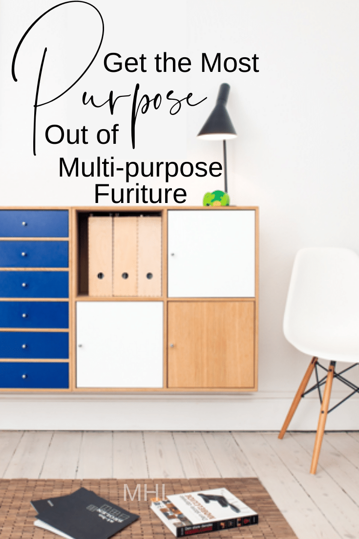
Get The Most Purpose Out Of Multi-Purpose Furniture
Space saving, dual, triple, multi-function. That’s the key to making a small space work. I’m still on the small space kick that I was on last week. I just really like the challenge of designing small spaces. So if you need to have furniture function a few different ways or you’re afraid you’ll have to sacrifice style to get a functional space, then this post is for you my friend! Let’s explore a few ways to get the most purpose out of your multi-purpose furniture.
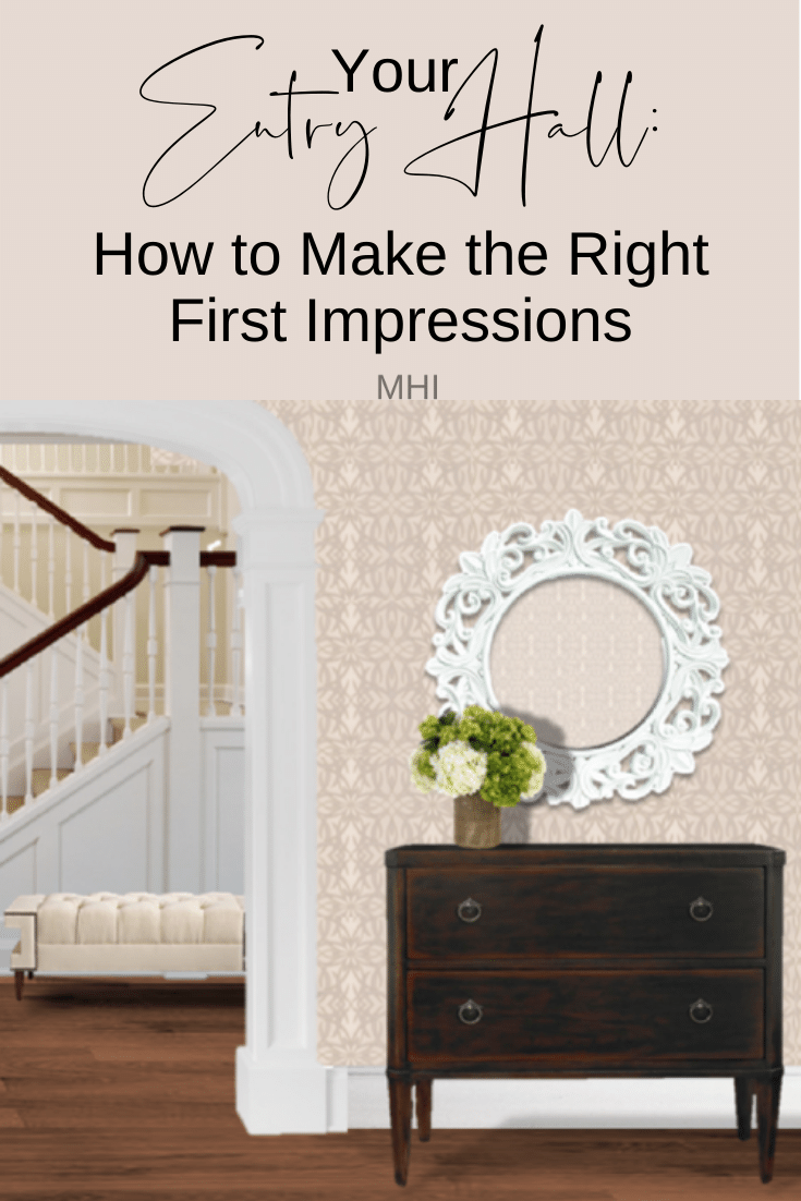
Your Entry Hall: How To Make The Right First Impressions
The entry hall. The portal to your world and the gateway to Firstimpressionville, population you! It’s not the main living space and it can sometimes fall victim to being overlooked or worse, completely forgotten. I get it. It’s not where the family is going to hang out and it is more of a utilitarian space; a storage area, in most cases. But before you write off the entry hall as simply a pass through to the more sexy areas, ie: the knock out Great room or the Chef’s kitchen.. Let’s focus on 5 really easy tips to make the right first impression in your entry hall.
What Is The Golden Ratio, And Why It’s Important For Decorating Your Home
Artists, architects and a slew of interior designers have been using the golden ratio to create “pleasing” compositions for centuries. If you flip through any art or architecture history book the evidence almost jumps off the page. There is something about how the elements are arranged that just makes sense. Why should you care? Well, let’s say that you’ve spent the weekend rearranging your furniture and after moving it around 10 different ways, you still feel that something is not “right” but you can’t quite figure it out. Chances are your room’s golden ratio is out of whack! Darlin’, we’ve all been there! So before you chuck the furniture out the front door and go full on minimalist, let’s really get into what the Golden Ratio is and why it’s important for decorating your home.
5 Secrets Decorators Use To Make Window Treatments Look Amazing!
Ever wonder how the window treatments in magazines and on TV always look so amazing? They’re flawless right? They always seem to make the room. Well I’ll let you in on a little secret… It’s not magic. It’s just a bit of proper planning and knowing a few key things that can make or break the design. Ready to learn the 5 secrets that decorators use to make window treatments look amazing? Let’s get into it!
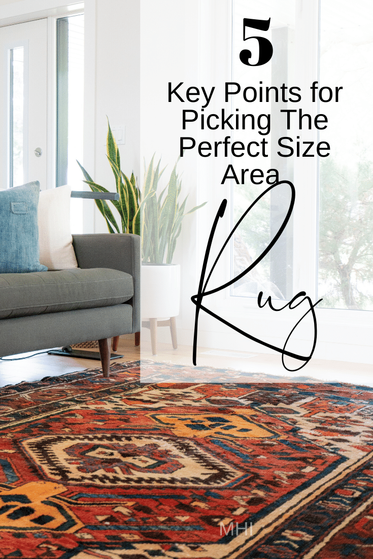
5 Key Points For Picking The Perfect Size Area Rug
As Summer approaches, I’ve been concentrating a lot on my outside décor. Every year we put out a cabana tent with some patio furniture and a lovely geometric sisal rug that is perfect for the patio floor. We have a large concrete patio right off our family room and we spend most nights out there enjoying the Summer weather. As I was planning my editorial Calendar last Fall, I chose this week to focus on 5 Key points for picking the perfect size area rug and I almost scrapped it for something more “Spring” like. Then I thought, wait a minute… A lot of people place rugs outside on patios for function and color. Now is a great time to talk about area rugs and the size of the rug can translate to both an indoor and outdoor area. So let’s talk about it, shall we?
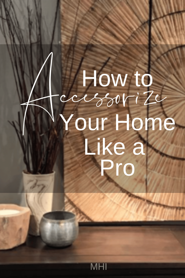
Read MoreHow To Accessorize Your Home Like A Pro
There are a many tricks that designers use when accessorizing spaces and all of us have our favorites. That’s because most of these tricks, or techniques – if you want to be fancy – really work in a number of situations. Here’s a list of my favorite tips for accessorizing your home like a pro. I subtitled this piece 10 Tips For Decorating Your Home From Scratch because these techniques can apply to accessorizing a new home – from scratch – or they can also apply to a quick seasonal or holiday makeover too.
Read More7 Steps To A Total Living Room Makeover
Are you stressed out over trying to get your living room makeover done? Does the thought of making a mistake with decorating keep you up worrying? Let me guess, you have a summer wedding coming up and the clock is ticking. That old busted sofa has to go and you can’t bear the thought of hosting a pre-wedding cocktail party in your tired and dated living room. So, first thing you do is hit up Pinterest and after a glass of wine or 4, you’re totally overwhelmed and even less sure about what you wanted your room to look like than before, sound familiar? Well, my dear, you are not alone.
Read MoreHow Designers Find Inspiraton
You see them on TV, online, and in the pages of House Beautiful and Architectural Digest. You love their style and are always amazed at how they seem to pull off the most amazing transformations. You wonder, how do these Interior Designers find inspiration? They make it look effortless, right? In the span of a half hour, or between 2 to 3 pages, a magnificent thing happens… A space goes from ho-hum to holy cow! Well, the way it happens is all in the planning and a good plan often starts with a swipe file.
Read MoreHow To Not Screw Up Your Living Room Furniture Arrangement
It’s happened. After binge watching your favorite decorating shows, you caught the HGTV bug! Now all you can think about is re-doing the room you hang out in most so it looks like Joanna Gains just left! But before you dash off to the furniture store or click away at your computer, you should first consider how to place the furniture in your living room.
Read More
