Guest Post by Eric Gonzalez
Art affects your mood, color psychology can wreak havoc on your emotions, and too much of anything on your walls can make it feel cluttered. (Never a good position to be in).
When you get your walls decorated harmoniously, you’ll feel the difference in your emotions.
For wall art, you can use photos, memorabilia, books, and items from your spare time hobbies to take control of the atmosphere in any room.
Start in the hallway by opening it up.
By opening it up, I don’t mean smashing walls down to make it open plan. Use visual illusions instead. It’s much easier.
Hallways tend to be narrow and if there’s a window, it’s usually small, making the space feel dull and uninspiring. Mirrors open spaces up by bouncing what light there is around the area.
Don’t be tempted to use too many mirrors though. For example, hanging two mirrors on opposite walls may make the space feel bigger, but it can also make it feel disorientated. Remember the mirror mazes at funfairs?
It’s better to use one ‘bigger’ mirror, and to consider the reflection in the mirror before hanging it. This way you can create a lovely focus as well as harvesting additional natural light.
To pull this off is to hang a large mirror on one wall, then opposite, a light of some sort, like a candle, a lamp on a shelf, or a wall sconce.
If you want to stick with wall art, anything shiny across from a mirror will reflect light, brightening up the area.
If you want something artsy that you can make yourself adorn your walls, explore diamond art. It’s 5D art made with shiny colorful gems. The type that makes light bounce.
Dealing with the staircase
For homes with staircases, picture wall displays can be arranged on the stairs. These are ideal for family photos.
Pick photos that you love, as those are what you’ll see at the start of your day when you’re heading downstairs.
For u-shaped staircases (where there’s a small landing and then another flight of stairs), the landing between the flights of stairs offers the perfect opportunity for a gallery wall display. These can go anywhere and they can be done cheaply, or with no money.
The focus area (or home office/study)
For those with a home office, or even just a dedicated space where you focus on work, and if not work, the business of running the family home - the budget, the bills, the holiday planning… the weekly appointment calendar.
Use the psychology of color to put yourself in the right mindset by removing any stimuli from colors.
Offices or anywhere deep focus is required, tend to have bland walls. That’s because neutral tones prevent distractions, and that’s what helps you to focus.
On the other hand, warm color hues like pastel orange, yellow and fiery reds can evoke positive emotions, like a sense of get-up-and-go energy vibes in the room. The sort of thing that’d be welcoming around the breakfast table on school mornings in family homes.
The family rooms.
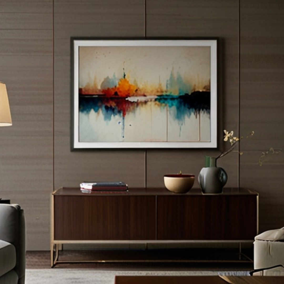
In the living room, sitting room, or family room, there’s generally up to 2 focal points. One above the mantle of the fireplace, the other above the sofa. Depending on the size of the room, you may want to use the same illusionary trick with the mirrors as the hallway or get artistic with those prime zones.
Above the sofa is enough space to put a gallery display together.
For something more cohesive, consider just the three prints, arranged as a triptych display - that’s one image split into 3 and then displayed together as a group.
Or create a feature display behind the sofa transforming it into a statement zone.
The same can be done above any side table. When hanging art above any large piece of furniture, it has been two-thirds the size of the furniture to feel like it's part of the display, but not so much that the wall becomes a dominant aspect.
Creative spaces
Creative spaces can be a game room, a reading room or a nook within a room that has a dedicated purpose allocated to it, like for puzzling, crafting, reading, drawing, or painting. These could be in a corner of the living room, a nook under the staircase, or a dedicated activities room.
In these areas, it’s not solely the wall art that sets the vibes, but the shelves on the walls and the items placed on them, too.
Floating shelves, bookcases, and display cabinets on walls can be used to showcase any number of items. From handcrafted origami decor, 3D puzzles and memorabilia brought back from your travels.
The more unique the items, the more they’ll catch your eye, setting off feelings of accomplishment, or inviting your mind to wander off into mystery.
For instance, a beautifully crafted Knight's sword hanging on the wall could serve as a striking centerpiece, evoking tales of valor and adventure that spark creativity.
The more unique the items, the more they’ll catch your eye, setting off feelings of accomplishment, or inviting your mind to wander off into mystery.
As an example, a bookcase could have rows of books arranged neatly, then suddenly, a light appears catching your eye, and then as you look closer, it becomes evident that it’s a gaping hole in the bookshelf exposing an alley leading to a miniature kingdom appearing as though it’s behind the wall the bookshelf is on. 3D puzzles like DIY book nook kits can provide functional decor pieces for shelves.
BookShelf Memories: DIY TOKYO ALLEY BOOK NOOK
As can some of the tabletop gaming accessories like miniatures be used as shelf decor when not in use.
Above headboard wall art
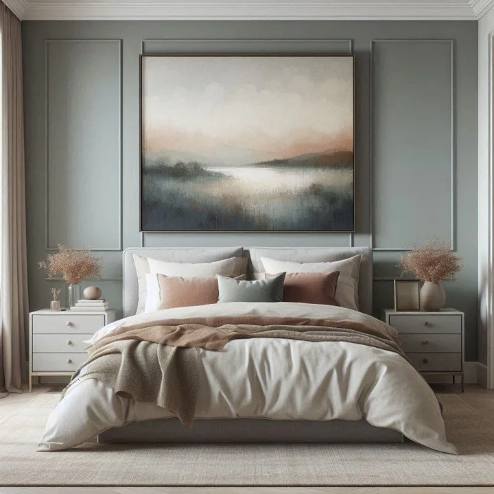
Setting the tone to wind down for the night right before climbing into bed is tranquil colors, the likes you’d expect to see in a meadow in the spring. Think of scenes like lilacs of lavender, blue from bluebells and yellows of daffodils.
The soft hues of meadows tend to create a sense of calm, which is just the thing to be used in bedrooms to wind down for the day.
The best place for bedroom art is above the headboard where it’ll be the last thing you see before putting the light out.
Calming art for above the headboard tends to be of serene scenes of nature like forests, or beaches with the ocean and perhaps an island in the distance. Somewhere your mind drifts off to dreamy lands far away.
Even if you use art that is monochrome, the image portrayed makes you imagine the colors, creating the same effect.
Hanging your art where it’ll be appreciated most!
Naturally, to get the most from your wall decor, you’ll want it hung directly in your line of sight. There are two ways to go about the hanging height.
1. 57” from the floor
57 inches is the average person's height. The consensus is to hang frames so that the center of the art is 57 inches from the floor. Up to 60 inches works so don’t get stressed if your measurements don’t turn out exactly.
2. Or 8” to 10” above large furnishings at two-thirds of the width of what’s beneath
The two-thirds rule is what to use when hanging wall art above feature pieces like above your headboard, above a mantel, the sofa, or a side table.
When it’s 10” or less above the main furniture, the art appears as part of the display. Not hung about 57” which can be too close or too far apart, making it appear unconnected, creating a visual distortion and causing an awkwardness when you look at it because it feels off.
Conclusion
Decorating your walls with the right artwork makes a big difference to how you feel in your space, and consequently, your wellbeing. Our houses are not just four walls, they’re a collection of places that each have an optimal way of hanging up your artwork.
Your family room will have a different vibe, and different art strategy than where you go to do work or study.
As we all know, our surroundings can bring us up, or bring us down.
We hope you learned something today to make your surroundings bring up your mood no matter where in your house you are.
Read Next:
How To Incorporate Metal Photo Prints Into Your Room Aesthetic
Update your space with a twist! Let’s explore the world of metal photo prints and discover how these sleek beauties can elevate your home's vibe in a snap! From adding a pop of elegance to showcasing your favorite memories in vibrant hues, these lustrous stunners are a game-changer. Ready to infuse personality into your home? Let's dive in!
Join the Fun!
If you enjoyed this post and you want to keep seeing my weekly blog, the best way to do that is to subscribe.
You can subscribe by downloading my 11 Secrets Only Designers Know to Make Your Space Rock. If you’re curious about how decorators and designers make a home look magazine ready, you’ll love taking a gander at these 11 secrets. You’ll learn how to style your room from the floor up and it will work for ANY space you have.
I write about small space design and decorating, sustainable furniture options, positive self care and a variety of do-it-yourself home décor.
I’d love to connect with you!
“Michael Helwig was top-notch, very professional and responsive to my needs. He allowed me time to explore ideas and try out a variety of combinations until we found the perfect fit. Michael provided detailed information and offered beautiful ideas to make my dream living room become a reality. The furniture he sourced has totally transformed my living room space. Everyone that has seen my new living room has one word, WOW! A special thank you to Michael for a wonderful experience.”
“Michael was very knowledgeable and guided us, with great patience and good humor, through the process of designing our dining room and helping us find the perfect sleeper sofa. He offered really helpful advice when we asked questions - which was often - but at no time did we ever feel pushed. He helped me when I felt like I couldn’t make one more decision. When my new furniture finally arrived I realized everything down to the pillows was perfect. I couldn’t be happier!”
The opinions and views expressed in any guest blog post do not necessarily reflect those of Michael Helwig Interiors or its Principal, Michael Helwig. Michael Helwig Interiors, and Michael Helwig, do not have any affiliations with any products or services mentioned in the article or linked to therein. Guest Authors may have affiliations to products mentioned or linked to in their articles or bios.
Eric Gonzalez is the founder of Bookshelf Memories, the first premium DIY Book Nook Kit that embodies locations across the world, starting with Tokyo Alley. Eric founded Bookshelf after visiting his friend who had just bought a DIY book nook kit for his fiancé because it reminded them of their travels across the world.
Eric loves to travel to other countries at least once a year and has a close group of friends and family. He founded Bookshelf Memories because he believes that his time is always best spent experiencing the world and being with people he cares about. Before founding Bookshelf Memories, he had a career selling software to large businesses.


