Does this sound like you? You walk into your living room, and it feels, well, a little blah. The walls are bare, the furniture is nice but lacks personality, and there’s an unmistakable air of I just moved in…
Now, imagine a simple change—adding some wall panel molding. You know the stuff, that little bit of architectural embellishment that adds a bit of dimension and character to your room. Suddenly, that same room morphs into a much more interesting space, exuding character and charm. It’s like putting on your favorite pieces of jewelry that all your coworkers LOVE to see you in, I’m talking compliments galore!
So, what exactly is wall panel molding?
At its core, it’s a decorative trim that frames your walls, adding some dimension. Think of it as the finishing touch to an otherwise bare wall. It comes in lots of styles, from traditional raised panels to sleek modern profiles, and it serves different purposes: enhancing aesthetics, hiding imperfections, and even adding a bit of insulation.
But here’s the catch—choosing the right style of wall panel molding for each room can make all the difference. Each space in your home has its own vibe and function, and the molding you select can either enhance that atmosphere or clash with it. And, if you add in small, tricky, or awkward shaped rooms, you need to be even more mindful of your choices.
Whether you're planning out a serene bedroom or a ‘lively’ living room, understanding how to match the right molding with your space will elevate its overall look and feel. Let’s get into how to make those choices so you can create a unique and easy change to any room.
1. Understanding Wall Panel Molding
To really appreciate wall panel molding, it helps to know a bit about its history.
Did you know that wall paneling has been around for centuries? Originally, it was used in the grand estates of the wealthy to add elegance and insulation. It eventually evolved into a versatile enhancement found in homes of all styles. Back in the day, wood paneling was a practical fix for drafty rooms. Folks would put the panels close together to create a continuous façade in their rooms. This kept rooms from being cold long before drywall and insulation. Today, it’s a fantastic way to inject personality into any space without having to dig too deep in your pockets.
Now, let’s get back to the different types of wall panel molding I mentioned earlier. Each style has its own flair and can dramatically change the look of your room:
Raised Panels: These are the classic choice, featuring panels that protrude from the wall surface. They offer a traditional and elegant look, perfect for dining rooms or formal living spaces. Raised panels can be quite detailed, allowing for intricate designs that show a lot of uniqueness and grandeur.
Flat Panels: If you’re leaning toward a more contemporary vibe, flat panel molding might be your best bet. These panels sit flush against the wall and have clean lines, making them a great fit for modern or minimalist interiors. They create a sleek and polished look without overwhelming your space.
Beadboard: This charming option features a series of vertical grooves, giving a cottage or farmhouse feel. Beadboard is particularly popular in kitchens, bathrooms, and casual living spaces, where it can add some whimsy and warmth. Plus, it’s relatively easy to install, making it a favorite for DIY’ers.
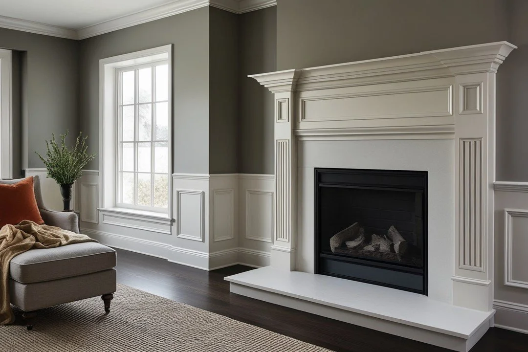
Wainscoting: A classic choice that combines functionality with style, wainscoting typically covers the lower halves of walls. It can be made from many different materials and is often used to protect walls from scuffs. Wainscoting is very versatile and works great in both traditional and modern spaces.
2. Consider these things:
A few key things can help with your decisions, so that the final look enhances your space and also feels right for its purpose.
Room Functionality
First and most importantly, think about the functionality of your room. Each space in your home serves a different purpose, and the style of molding you choose should reflect that.
For instance, in a formal dining room, you might choose an ornate raised panel molding. On the other hand, a playful family room might benefit from more casual beadboard or flat panel molding that feels more relaxed.
Think about how you use the space daily.
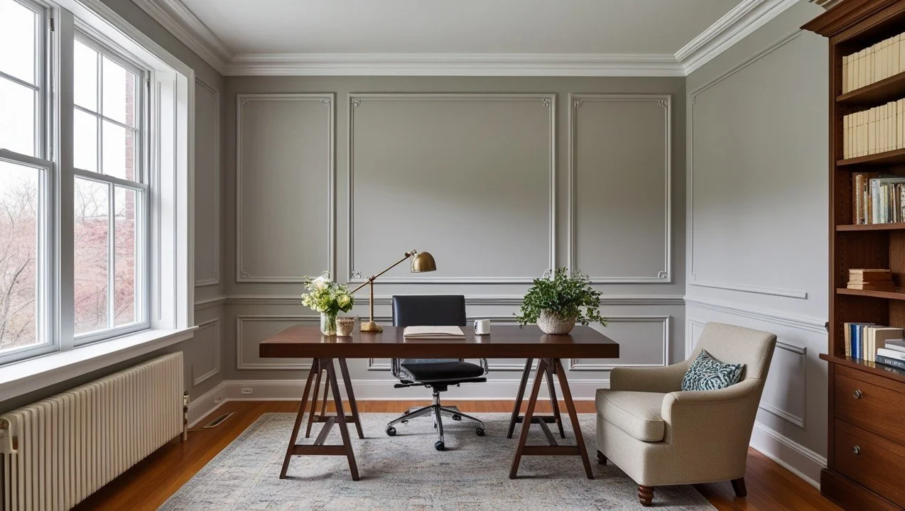
Your home office may call for a clean, modern look that could help you with focus and productivity, while a cozy reading nook could have a softer, more inviting molding that inspires you to curl up with a good book. The key is to select a molding style that aligns with the room’s look and purpose.
Height and Proportions
The size of the molding should harmonize with the dimensions of your room. Taller ceilings can handle more substantial, detailed moldings, while lower ceilings might feel cramped with overly ornate designs.
A good rule of thumb is to choose molding that increases in height by about 1 inch per one foot of wall height, above 7’. For 8’ ceilings, up to 5” molding height will be dramatic. This creates a balanced look. For example, if you have a flat, 10’ ceiling, and you want a chunky, impactful molding, you should choose moldings that are 7” or more in height to achieve more visual impact. That would be about 6% or more trim height for a wall that is 10’ tall. For an 8’ tall wall, 4% to 5% of the wall height will give you similar visual impact.
For rooms with unique architectural features—like vaulted ceilings or open layouts— try adding a combination of moldings to draw your eye upward or to create visual breaks.
If you’re dealing with a particularly small room, simpler, narrower molding can help maintain an airy feel, making the space look larger and more open.
Color and Finish
The color of your molding can set the tone for the entire room.
Lighter shades, whites and soft pastels, can brighten a space and make it feel larger.
And darker colors like deep blues or rich woods can add warmth and create a cozier vibe.
Tip: When it comes to finish, think about how the surface texture will interact with light. Glossy finishes can reflect light and make a room feel more modern, while matte or satin finishes offer a softer, more traditional feel. Also, think about the overall color palette of your room. A contrasting color for the molding can create an interesting visual effect, while a monochromatic look can result in a polished, sophisticated look.
3. Room-by-Room Guide
let’s break down what to think about for applying molding room by room. Each space has its own personality, and the right molding can elevate it beautifully.
Living Room
The living room is often the heart of the home. Here, you have the flexibility to choose between cozy and modern vibes.
For a warm, inviting feel, consider traditional raised panel molding painted in a soft white or pastel hue. This can be layered with rich textiles like plush throws and patterned pillows, creating a beautiful, “lived-in” feel.
On the flip side, if modernity is more your style, flat panel molding in a bold color can be striking.
Pair it with minimalist furniture and sleek decor for a clean, contemporary look. Don’t be afraid to mix materials—wood molding can complement metal accents in your lighting or furniture, creating an important contrast, making it feel cohesive and intentional.
Bedroom
When it comes to bedrooms, I’ll bet your goal is to create a serene and calming environment, right? If that’s true, then softer designs work best here.
Think about using beadboard or flat panel molding in gentle tones like light blue or soft gray. This not only adds texture but also sends you a relaxing visual cue.
For even more tranquility, consider installing molding that frames your headboard or creates a feature wall behind it. This can act as a focal point without overwhelming the space.
Soft, ambient lighting and natural materials, like cotton and linen, will harmonize beautifully with the molding, making your bedroom a truly restful spot.
Kitchen
In the kitchen, practicality should be key. Wall panel molding should not only look great but also stand up to the challenges of a busy cooking space.
Choose materials that are durable and easy to clean, like moisture-resistant MDF or painted wood. Beadboard is a classic choice for kitchens, adding a touch of “farmhouse” charm, while still standing up to the inevitable splatters from spaghetti sauce and cake batter.
Pick a color that complements your cabinetry—maybe a crisp white or a bold color that ties in with your backsplash. This creates a cohesive look while still being stylish.
If your kitchen is open to the dining area, think about how the molding can flow from one space to the other, to enhance your sightlines throughout.
Bathroom
Bathrooms often present unique challenges, particularly with moisture and limited space.
Look for water-resistant wall panel options, like PVC or composite materials, which will hold up well in humidity.
For small bathrooms, vertical paneling can create an illusion of height, making the space feel larger. Paint it lighter colors to reflect light and enhance the feeling of openness.
Tip: Don’t forget about the finishing touches—think about how your molding will pair with mirrors, light fixtures, and other decor.
In general, whites, creams, earth tones, and mid-tone blues and greens go very well with brushed nickel metals.
Warm neutrals, terracotta, charcoal grays, and darker earth tones go well with brushed brass.
If matte black fixtures call to you, go for high contrast colors like jewel tones: cobalt blue, emerald, green. You can also add a more subtle contrast to matte black with pastel colors, soft pink and baby blue.
Home Office
I like home offices that inspire creativity and productivity. So, don’t be afraid to be a little bold here. Use statement molding, like wide wainscoting or geometric patterns, to create a fun and interesting backdrop for your workspace.
Darker colors like deep green or navy can stimulate focus.
Don’t forget to bring in things that reflect your personal style too—artwork, plants, and your favorite accessories will help you create a space that feels very you.
Tip: Don’t shy away from mixing molding styles; a combination of flat panels and more detailed designs can create visual interest and help define different areas within your office, especially if you have a larger space or an open layout.
4. Unique Tips for Personalization
It might sound strange to talk about personalizing your space with moldings, but details like this can be a fantastic way to express your individuality.
Mixing and Matching Styles for a Unique Look
Don’t be afraid to blend different molding styles! Mixing and matching can create a dynamic and interesting space.
Maybe you’d try combining a traditional raised panel molding in one area with sleek flat panels in another, allowing you to highlight different features throughout your home. This approach can help your rooms to feel layered and unique.
Consider the overall theme of your space. If your home has a modern farmhouse vibe, you might pair beadboard with simple trim for a casual yet refined look.
In a contemporary home, mixing geometric paneling with classic molding can create a stunning contrast that looks fresh and innovative.
So, the key is to maintain a cohesive color palette to ensure that the different styles harmonize rather than clash. In other words, if you pair a couple architecturally different molding styles, paint the walls and the moldings the same color so that the different profiles complement each other. Too many wall colors, patterns, or textures can overwhelm your rooms, especially if they’re smaller.
Incorporating Molding into Existing Decor Themes
Think about how your molding choices can complement your existing decor. Like if your room has a specific theme—coastal, industrial, or bohemian—choose molding that enhances that style.
For a coastal look, think about beadboard painted in soft whites or seafoam greens.
In an industrial space, you might go for raw wood or metal accents that resonate with the materials already present in your decor.
You can also use molding to tie together different elements in the room.
If you have vintage furniture, maybe use “antique style” molding to create a cohesive feel.
If it’s more eclectic, playful molding shapes and patterns can add a fun touch without feeling disjointed.
Think of molding as an extension of your design choices, weaving through your space to enhance its personality.
Upcycling or DIY Options for a Personal Touch
If you’re looking for a truly unique look, there are lots of ways to repurpose materials into beautiful moldings for your home.
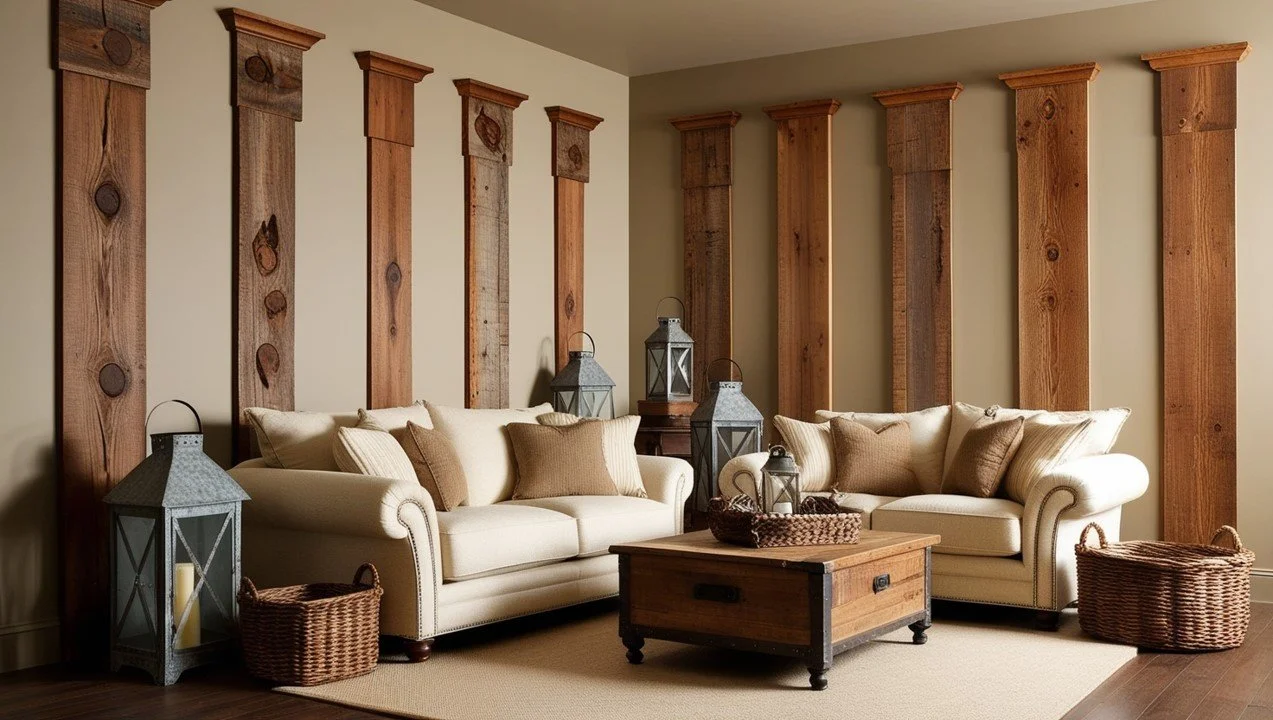
• Reclaimed wood can be transformed into rustic paneling that tells a story and adds charm to your space.
• You could also make your own moldings using plywood or MDF, painting them in bold colors or patterns for fun accents.
Don’t forget about embellishments!
Adding decorative touches, like trim or stencils, can personalize your molding even more.
For a vintage-inspired look, distressing them or adding decorative appliqués will up the character factor.
If you have a knack for painting, think about creating a unique mural or design within the panels themselves.
With personalization through mixing styles, incorporating your existing decor, and exploring DIY options, you can create a space that looks beautiful and totally reflects your uniqueness.
5. Common Mistakes to Avoid
While wall panel molding can enhance your home’s rooms, it’s important to avoid some common pitfalls so you can have a polished and cohesive look.
Overdoing It: When Less Is More
One of the most frequent mistakes homeowners make is overdoing the molding. While it’s tempting to go “all out” with intricate designs and bold colors, too much molding can overwhelm your space. Remember that sometimes, less is more.
Instead of trying to cover every wall or going for overly ornate designs in every room, focus on key areas where molding can truly make a difference.
Maybe install raised panel molding on a feature wall or as an accent around a fireplace, allowing it to stand out without competing with other design elements. This approach keeps the space feeling open and balanced while still showcasing the beauty of the molding.
Ignoring Room Function and Style Cohesion
Another mistake is not taking into consideration your room’s function and how the molding style fits within your overall design theme. Each room has its own purpose, and the molding should enhance that purpose.
For example, using highly ornate molding in a casual family room may feel out of place, while another option with simple, clean lines can create a way more relaxed look.
Also, maintaining style cohesion across different rooms is important.
If your home has a specific design style—like modern, traditional, or rustic—pick molding that aligns with that style.
Tip: Mixing styles haphazardly can create a disjointed look that feels chaotic. If this isn’t what you want, look for molding that complements your existing decor, so you can create a harmonious flow throughout your home.
DON’T Skip the Measuring Tape: Why It Matters
Accurate measurements are essential for getting a professional-looking installation. Not measuring properly can result in uneven cuts, misaligned panels, or moldings that simply don’t fit the space.
Before you start shopping for or installing molding, take the time to measure your walls and plan your layout carefully.
Consider the height of the molding in relation to the ceiling and furniture to ensure that your design works with your room’s proportions.
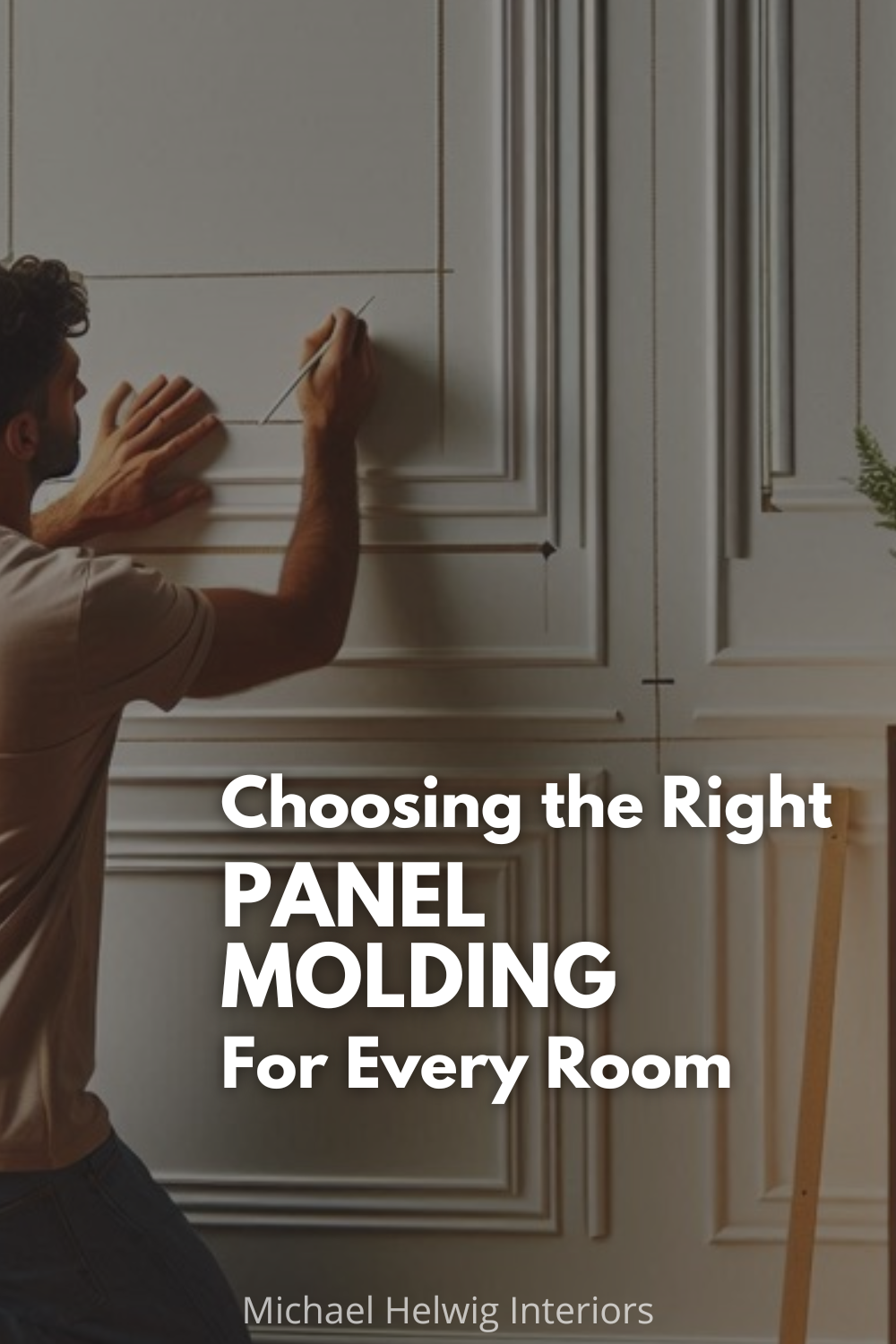
Tip: Do a test run with painter’s tape on the wall to see what the outline of the panel molding would look like before making any changes. This is a great way to see if you’ll actually like the look of it before buying your materials.
Accurate measurements will help you avoid expensive mistakes and ensure that the final result looks intentional and well thought out.
Conclusion
So, first, remember that wall panel molding is more than just a decorative element; it’s a fantastic way to enhance the character of your home. Whether you’re leaning towards a cozy, traditional look or a sleek, modern vibe, there’s a molding style that can perfectly complement your space.
Consider your room’s functionality, height, and color when selecting molding. Each room has its own personality, and your choices should reflect that while also maintaining a cohesive design throughout your home. To add an eclectic look, don’t hesitate to mix and match styles or even get creative with DIY’s to add your own uniqueness!
And don’t forget about the common mistakes to avoid, like overdoing it with too much molding or neglecting those all-important measurements. Taking a thoughtful approach to installing moldings can make a world of difference in the final look of your space.
Now, I’d love to hear from you! Have you tackled any molding projects in your home? What styles or colors have you found to work best? Feel free to share your experiences, tips, or even challenges in the comments below.
Read Next:
Decorating Around Thermostats, HVAC Vents, and Awkwardly Placed Switches
Tired of those awkwardly placed thermostats, vents, and switches ruining your decor? Discover fun and creative ways to turn these pesky features into stylish design elements. From clever camouflages to tech-savvy solutions, these tips will help you seamlessly integrate or even showcase these functional necessities. Find out how to make these unexpected elements work for you!
Join the Fun!
If you enjoyed this post and you want to keep seeing my weekly blog, the best way to do that is to subscribe.
You can subscribe by downloading my 11 Secrets Only Designers Know to Make Your Space Rock. If you’re curious about how decorators and designers make a home look magazine ready, you’ll love taking a gander at these 11 secrets. You’ll learn how to style your room from the floor up and it will work for ANY space you have.
I write about small space design and decorating, sustainable furniture options, positive self care and a variety of do-it-yourself home décor.
I’d love to connect with you!
“Michael Helwig was top-notch, very professional and responsive to my needs. He allowed me time to explore ideas and try out a variety of combinations until we found the perfect fit. Michael provided detailed information and offered beautiful ideas to make my dream living room become a reality. The furniture he sourced has totally transformed my living room space. Everyone that has seen my new living room has one word, WOW! A special thank you to Michael for a wonderful experience.”
“Michael was very knowledgeable and guided us, with great patience and good humor, through the process of designing our dining room and helping us find the perfect sleeper sofa. He offered really helpful advice when we asked questions - which was often - but at no time did we ever feel pushed. He helped me when I felt like I couldn’t make one more decision. When my new furniture finally arrived I realized everything down to the pillows was perfect. I couldn’t be happier!”
Michael is Principal designer and blogger at Michael Helwig Interiors in beautiful Buffalo, New York. Since 2011, he’s a space planning expert, offering online interior e-design services for folks living in small homes, or for those with awkward and tricky layouts. He’s a frequent expert contributor to many National media publications and news outlets on topics related to decorating, interior design, diy projects, and more. Michael happily shares his experience to help folks avoid expensive mistakes and decorating disappointments. You can follow him on Pinterest, Instagram and Facebook @interiorsmh.


