Square rooms are tricky to arrange because they often have limited floor space due to the walls being the same size or close to the same size.
Add to this the inevitable doorways into the room and other architectural features like large windows, built-on cabinetry, or fireplaces that take up even more space, and you have a conundrum.
This week I have a square room project that I think could help a lot of folks with similar rooms because the ideas that I share can be applied to practically any square room.
So, even if your room doesn’t have 3 doors on 3 different walls and a pass-through, you’ll still get plenty of applicable tips to help you overcome many common issues with square rooms.
Let’s get into how to arrange a square living room with doors on 3 walls and a pass-through.
A Little Backstory to Start…
To set the stage a bit, this room project came about because a reader of my past blogs reached out wanting me to look at her living room that she was having a tough time arranging.
She asked if I had a few suggestions on how she could improve the layout and flow of the room without having to do a major overhaul to the space. (Who has time for that, right?)
After a few emails, I asked if she would be willing to participate in a “case study” type post where I would write about how to improve the function and layout of her tricky room.
It was a proposal that would benefit her and, hopefully, a few others with similar size and shaped rooms.
To my delight she said she would be happy to participate!
The Goals for the Room
During our email correspondence, I asked for some clarification on what she wanted to accomplish, and she sent me a detailed response that included pictures, measurements, and a wish list for the space.

The goals included:
Clarify how to layout the room without obstructing pathways.
Need space to serve multiple functions: entertaining, dining, exercise, games, and toys.
Brighten the space – it’s too dark and there is not enough lighting.
Room has an echo, how to fix that?
French doors open into the room. How to arrange furniture so you can still use the doors?
Doorways on 3 of 4 walls, plus kitchen pass-through, how to achieve all of this and still have open pathways?
Once I got this list, I got to work on analyzing the space through photos and the excellent measurements and sketches she sent along.
Watch the video Instead?
Measure the Room First
I write about the best way to do this a lot on this blog, so I’ll keep it simple and share it as a two-step process.
1. Measure the Length and Width of the Room
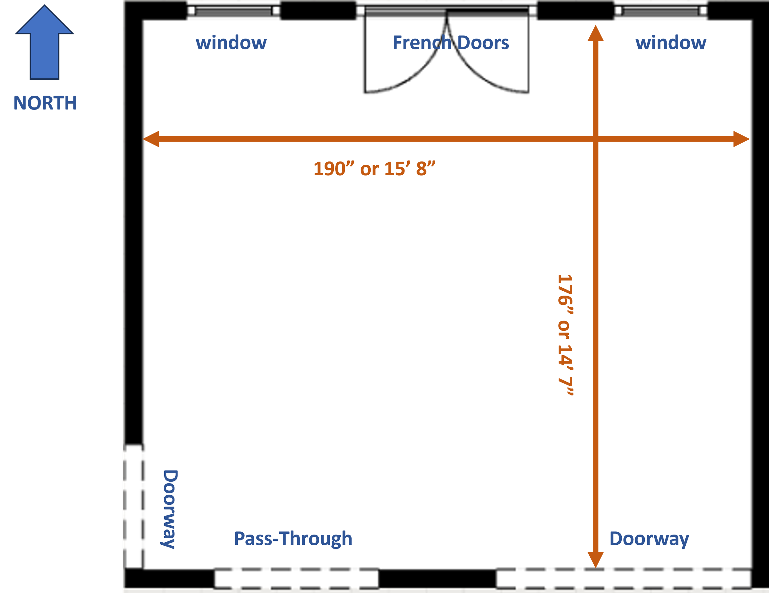
One side measured 190” and the other 176”. In the grand scheme, that’s close to a square.
2. Measure the Room Segments

These are the sections all around the room: walls in between windows, doorways, and other architectural features like built-ins, fireplace, etc.
It’s important to know all these measurements so you know exactly how much space you have for furniture, window treatments, wall art.
This will help you plan for what will fit anywhere in the room regardless of the size of the wall.
Tips to Make the Best Flow and Function in This Room
1. Keep the main pathways clear.
The two doorways near the kitchen pass-through are butted right up to the corner of the wall.
The smaller doorway, perpendicular to the pass-through, is a main pathway through the room and therefore should not have anything obstructing it.
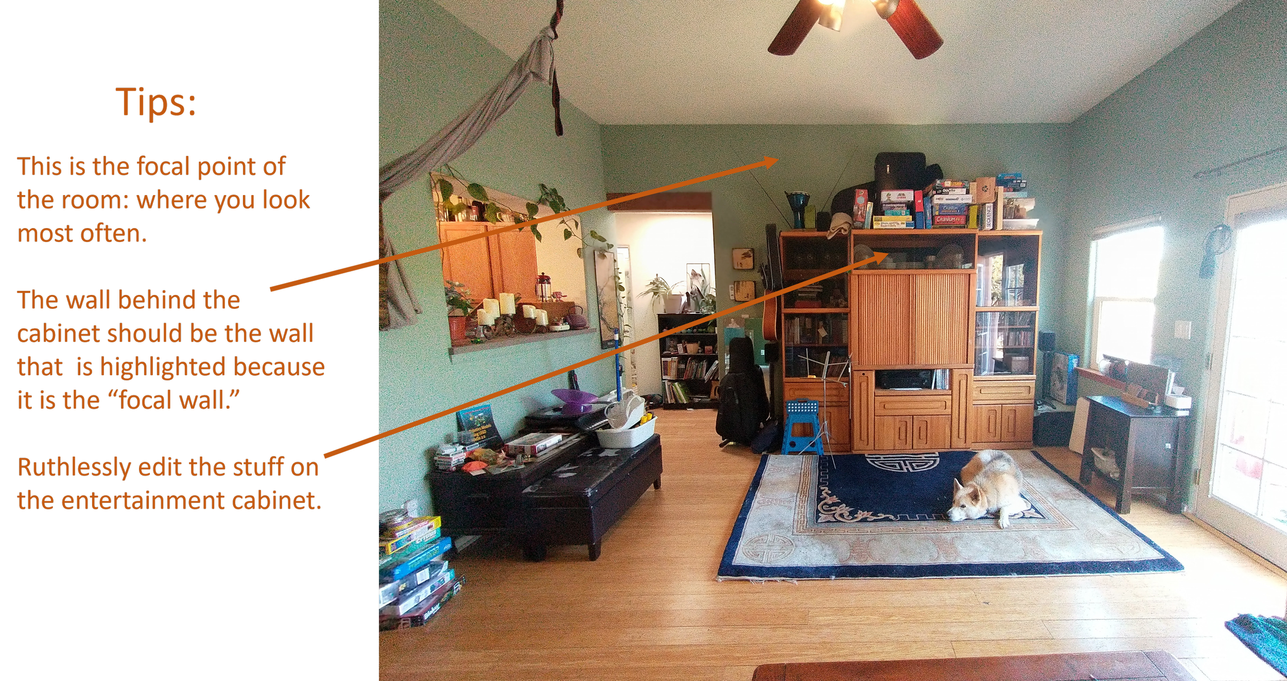
2. Re-think the Accent Wall
I’m all for defining walls purposefully in rooms. My peeve is “accent walls” that don’t support a focal point.
In this room, the accent wall is a beautiful darker green shade but it’s behind the main seating area.

Although the color doesn’t affect the arrangement of the furniture directly, it does interrupt the flow of the room.
What I mean by this is, 90% of the time the wall color that you defined is behind you. 10% of the time – when you walk in the room or through the room – you get to enjoy it.
The better way to make an accent wall is to highlight the wall that you look at most often in the room, behind the TV, the fireplace, or wherever you most want the attention to go in your room.
3. Center the Furniture on the Long Wall
As you can see, the furniture is pushed into the corner in this room.

This is because the homeowner wanted to keep as much passable space near the large doorway as possible and because there is a silk rope attached to the ceiling that her kids use for climbing on.
Let’s set aside the silk ropes for a minute and focus on optimizing the layout on the long wall.
First, the storage containers to the right of the sofa should be edited so they can be moved to another room.
Without those containers, there’s a lot more space to center the furniture on the wall and to also add seating if desired.
4. Increase the Scale of the Furniture
One of the goals the homeowner wants is a comfortable entertainment space for friends and family.
Immediately I noticed the size of the furniture – it’s small. If you want a comfortable seating area, get the biggest and most comfortable upholstery you can.

That doesn’t mean over-stuffed sofas or chairs, that means furniture that has slim and scaled down arms with the most interior space to accommodate guests.
So, for this room, this wall is long enough to have a large 3-seat sofa and bigger secondary chair.
When you keep the outside dimensions paired down, you’ll fit more seating than you think you can.
5. Ruthlessly Edit Clutter
I know we all want to have our stuff right at hand.
But, if you’re trying to create a comfortable, multi-functional room, it’s essential to eliminate unnecessary clutter from the mix.
So, items that are broken, things with missing pieces, things that only get used once in a great while – if at all, these items should be removed and the items that you absolutely need in the room should stay.
That doesn’t mean you need to throw everything out but if your goal is better function and flow, then unnecessary stuff must find a new home.
And since this is the “focal point” of the room: the place where your attention goes, the wall behind the entertainment cabinet is the perfect place for that accent wall I wrote about earlier.
6. Maintain the Vertical Lines in the Room
Visual flow is important in small, tricky, or awkward spaces, so maintaining the height of the room from one wall to the next is a good way to help with visual flow.
The ceilings in this room are 10’ tall and that means there’s a great opportunity to capitalize on the height of the décor and window treatments in the room.
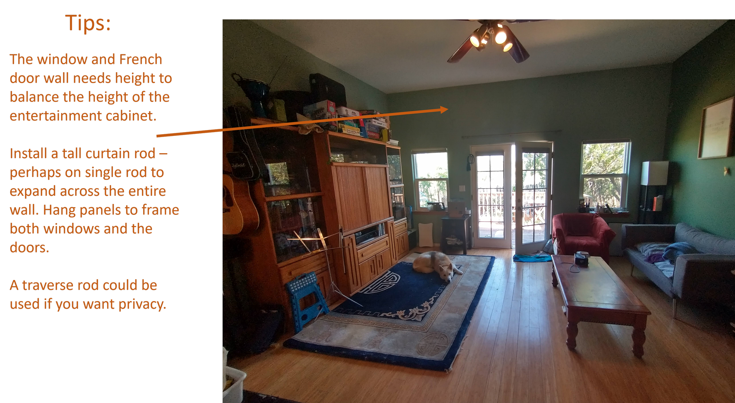
Installing some curated merchandise on the top of the entertainment cabinet will add order and height.
Then, on the window and French doors wall, add tall window treatments to continue the visual line across the wall.
One of the goals for the space is to make the room “less echoy” and that can be accomplished by increasing the fabrics in the room: curtains, area rugs, indoor door mats, and more upholstery.
Plan the Zones of Your Room
Once you have accurate and detailed measurements of your room, you should be able to plan out the functional areas, or zones.

This step isn’t so much about getting the exact furniture for the space. I go into detail about how to makeover a room in other posts. This is more about getting the main purposes for your room hashed out so you can concentrate on certain parameters.
1. After pondering the room, I felt that the best place for the main upholstery should stay on the long wall because that was going to give my homeowners the best chance at scale appropriate and maximum furniture options.
2. Opposite that long wall, the second longest wall, would be the best spot for the entertainment unit to go.
3. That left me with 2 functional spaces left to fill.
The first was the dining space. I wanted to have a table near the kitchen pass-through to make serving easy, but I knew that the scale, and shape of the table and chairs would be an important consideration. (More on that in a bit…)
4. The last space was the “bonus” space. This is essentially blank floor space that can be used for different activities: exercise, play, etc.
The Final Floor Plan
The pathways into and through the room are clear.
Even though there’s furniture near the French doors and the large 82” doorway, there’s plenty of room near all the doorways in the space.
Tip: Don’t be afraid to place furniture near open doorways. As long as you have around 3’ of space to walk into the room without encountering furniture you should be okay.
Plus, you must also be mindful of the shape of furniture you choose as well (More on that in a bit…)
The Zones in Action
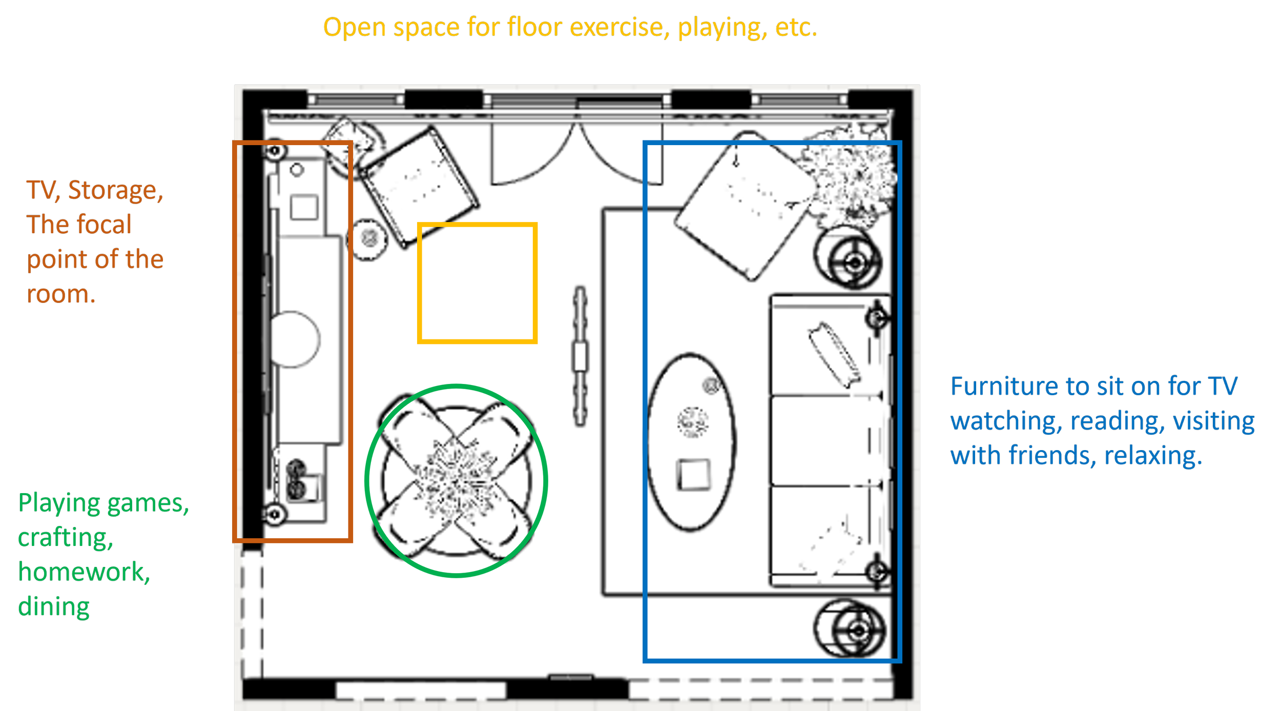
The entertainment zone features a console and two tower shelves on either side of it.
This configuration gives the unit a “break-front” appearance. That means, the center is deeper than the sides.
This allows for a substantial TV cabinet in the middle and tapered back towers on the sides so as not to fully block the windows.
The main lounge zone features a generous size 3-seat sofa, oval cocktail table, slim recliner, and two round end tables.
This is a classic living room upholstery configuration that works well for family time and for entertaining guests.
The furniture is scaled appropriately: thin arms, maximum interior seating.
The shape of the accent tables: round end tables allow for easy visual flow near the 82” doorway, and the oval shaped cocktail table is the best shape for the room because it is easy to navigate around – no sharp corners.
The dining zone features a round table that fits appropriately in the space.
Not too small and not too big, 45.5” (can be expanded with 2 table leaves.)
The base is a hair-pin leg that mimics a pedestal style. I like to use pedestal style dining tables in smaller or tricky spaces because no legs on the table means you can push armless chairs all the way under the apron of the table. That makes the table and chairs easier to navigate around.
The bonus zone is purposely left open so that the family can use it for many purposes.
I included a second accent chair near the entertainment zone for another seating option.
This space can be for reading because it’s next to the window.
The chair can also be moved closer to the main lounge seating, if need be, for extra seating on occasion.
The table and chairs are small enough to move when necessary and that will allow some occasional re-configuration of the lounge space when needed.
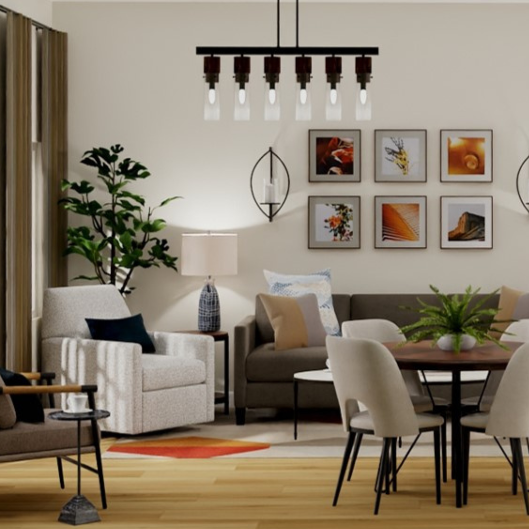
What the Room Can Look Like with These Changes
As you walk in form the 82” Doorway
The lounge space is on the right, directly inside the doorway and the dining space is floating in front of the entertainment wall.
You immediately see the wall length curtains that draw your eye up, focusing on the height of the ceiling.
As you turn to the left, you see the entertainment wall with the new herringbone, hunter green wallpaper to highlight the focal wall.
Now the place that you would look at most often in the room is the true focal wall.
I placed wall sconces to provide extra ambient lighting that can be dimmed for movie nights or dinners.
As you turn back around, the lounge space wall is centered and balanced with scale appropriate furniture.
The wall is highlighted in a simple geometric grid – a photo wall that ties the colors of the room – blues, greens, and oranges – together.
The addition of taller table lamps will provide more lighting.
The overhead linear chandelier acts as a visual cue to define each side of the room.
The final wall, where the doorways and the pass-through are, is purposefully left the most open.
This wall already has a lot going on and adding more décor will highlight the lack of wall space.
I installed an oval mirror to tie in the oval cocktail table and to provide some additional reflection of natural light.
There you have it, how to arrange a square room with doors on 3 walls and a pass-through.
To sum up:
It’s important to have a plan or goals for what you want to do with your room makeover, especially if your room is small, has a tricky layout, or has awkward architecture.
Always measure your room so you know exactly how much space you have.
After that, plan the zones of your room so you know how to get the best flow and function possible.
Read Next:

10 Proven Tips To Turn Cramped Rooms Into Stunning And Stylish Spaces
Let’s go on a design journey that will transform your cramped little rooms small into spaces that radiate openness and sophistication. Get ready to break away from the constraints of your square footage and unleash the full potential of your cute, small rooms! Today I’m sharing ten solid tips that will revolutionize your small rooms. I’m talking tips that you won’t see anywhere else because they’re specific to small and awkward rooms!
Join the Fun!
If you enjoyed this post and you want to keep seeing my weekly blog, the best way to do that is to subscribe.
You can subscribe by downloading my 11 Secrets Only Designers Know to Make Your Space Rock. If you’re curious about how decorators and designers make a home look magazine ready, you’ll love taking a gander at these 11 secrets. You’ll learn how to style your room from the floor up and it will work for ANY space you have.
I write about small space design and decorating, sustainable furniture options, positive self care and a variety of do-it-yourself home décor.
I’d love to connect with you!
“Michael Helwig was top-notch, very professional and responsive to my needs. He allowed me time to explore ideas and try out a variety of combinations until we found the perfect fit. Michael provided detailed information and offered beautiful ideas to make my dream living room become a reality. The furniture he sourced has totally transformed my living room space. Everyone that has seen my new living room has one word, WOW! A special thank you to Michael for a wonderful experience.”
“Michael was very knowledgeable and guided us, with great patience and good humor, through the process of designing our dining room and helping us find the perfect sleeper sofa. He offered really helpful advice when we asked questions - which was often - but at no time did we ever feel pushed. He helped me when I felt like I couldn’t make one more decision. When my new furniture finally arrived I realized everything down to the pillows was perfect. I couldn’t be happier!”
Michael is Principal designer and blogger at Michael Helwig Interiors in beautiful Buffalo, New York. Since 2011, he’s a space planning expert, offering online interior e-design services for folks living in small homes, or for those with awkward and tricky layouts. He’s a frequent expert contributor to many National media publications and news outlets on topics related to decorating, interior design, diy projects, and more. Michael happily shares his experience to help folks avoid expensive mistakes and decorating disappointments. You can follow him on Pinterest, Instagram and Facebook @interiorsmh.