This week I’m trying a new approach to talk about small, tricky, and awkward spaces.
I’m going to concentrate on just one challenge in a room to talk about a couple of ways you can overcome something that might have you stumped.
I’m calling this 5 awkward room design dilemmas solved and my hope is that you might find a few of these tips useful if you’re faced with similar challenges.
And, who knows, if this goes well, you might see a series of these types of posts.
The idea came from researching topics for my blog.
I often read through design forums to see what folks are writing about and many times I’ll see posts asking for help with certain challenges like what to do with awkward, empty spaces, or if they should place furniture in front of windows, or how to hide or disguise things that they don’t like about their rooms.
When you add these types of challenges to rooms that are already small, or that have tricky layouts, it can be super frustrating, you know?
I say don’t let these awkward spots get you down. I promise you’ll get some great solutions here.
Let’s tackle some common design dilemmas.
Design Dilemma 1. What if the only place for the bed is in front of large windows?
But first, there’s another challenge with this room…
The wall space on both sides of the window isn’t even. One side is slightly bigger than the other side.
That means that you’ll always see this discrepancy if you leave the windows unadorned.
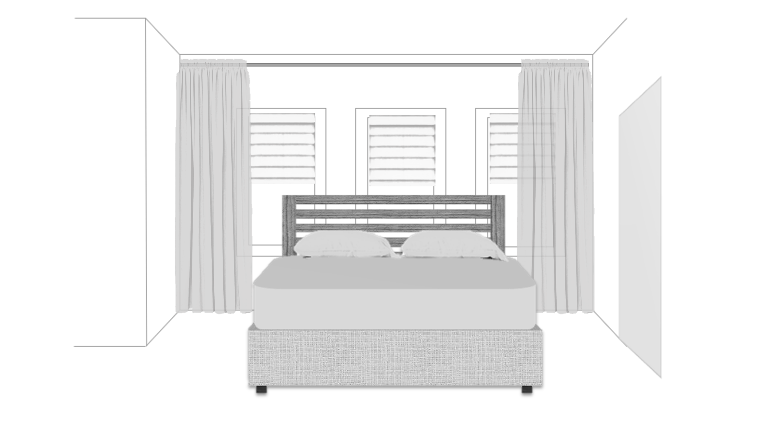
The solution to this awkward issue is to hang decorative curtain panels on both sides.
I happen to like the look of blinds or Roman shades with curtain panels, so that’s what I did here.
The panels hide that uneven wall and give you a soft framed backdrop to place the bed in front of the windows.
Now, one of the biggest mistakes I see people make is covering the windows with a big, solid headboard.
If the only natural light in the room comes from these windows, then you’re not doing yourself any favors by covering them with a piece of furniture.
Think about it, you wouldn’t put a huge armoire in front of windows or a row of tall, solid bookcases, right? Then don’t put a huge headboard in front of them either.
Instead, go for a headboard that is both low and has some openness to it.
Tip: if your room is quite small, leave the footboard off the bed. You can attach a headboard to nearly any floating bed frame.
Design Dilemma 2. What do you do with an uneven angled wall in a smaller dining room?
Much like the first room, this one has two design dilemmas.
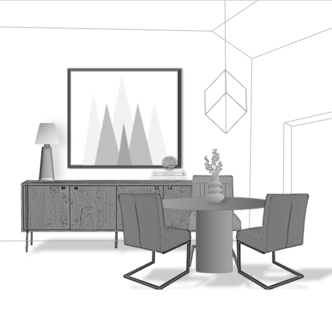
First, the geometric chandelier is not centered in the room. It is centered on the entry door wall and is awkwardly hung closer to the entry wall as well. That makes picking a table more challenging.
You can’t get a large table because it won’t be able to fit under the light… As a rule, chandeliers help define the space where a table should go.
Tip: You could swag a new light fixture from the current position or install a new box in the ceiling which could be centered in the room.
But let’s just keep it simple and stick to a quick solution for this challenge…
The easiest answer is to find a table that will fit under the chandelier.
I’m going to guess that this is a 12’ x 12’ dining room. The table size that would fit best would be 42” to 48” round. Anything larger than that would make navigating around the table tough.
Notice the base of the table. It’s a pedestal style. This allows you to position the chairs around the table so that they’re out of the way of main pathways.
Armless dining chairs are a usual go-to for me in designing small and awkward rooms because you can push them all the way under a round pedestal dining table. (No chair arms to catch a table apron…)
Now the wall with the clipped corner is the second dilemma.
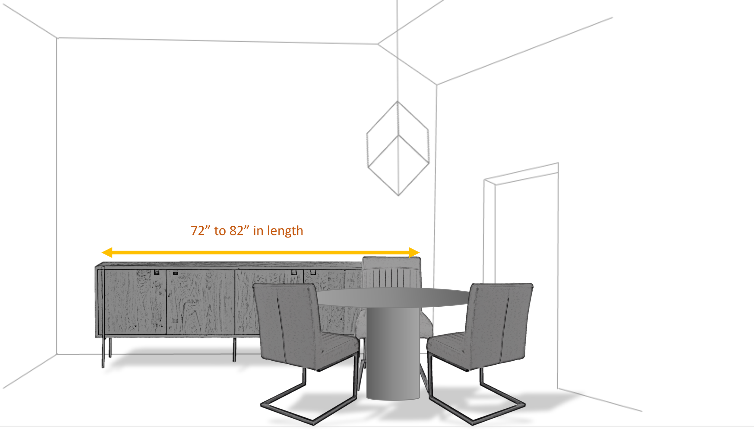
Since the wall space next to the doorway is only about 24” deep, you must be mindful of the size and scale of furniture you place on the wall.
For instance, you can’t put a super deep, buffet or credenza on the wall. So, nothing 26” deep by 10’ long, that would overpower the wall.
A credenza that’s 72” to 82” in length by 16 to 18” in depth would be the best footprint for this space. (That’s about ¾ the length of the wall.)
Tip: In addition to the size and scale of the buffet credenza, you also want to make sure you get something that has openness to it as well.
This cabinet is raised off the floor, which makes it feel lighter in the room.
Furniture that has open space is important in smaller or awkward shaped rooms because it helps to visually open the space and make it feel less crowded.
Now, to decorate the uneven wall, I say keep things simple.
Avoid something like a gallery wall, with lots of different shaped frames and objects. That will only draw more attention to the unevenness of the wall.
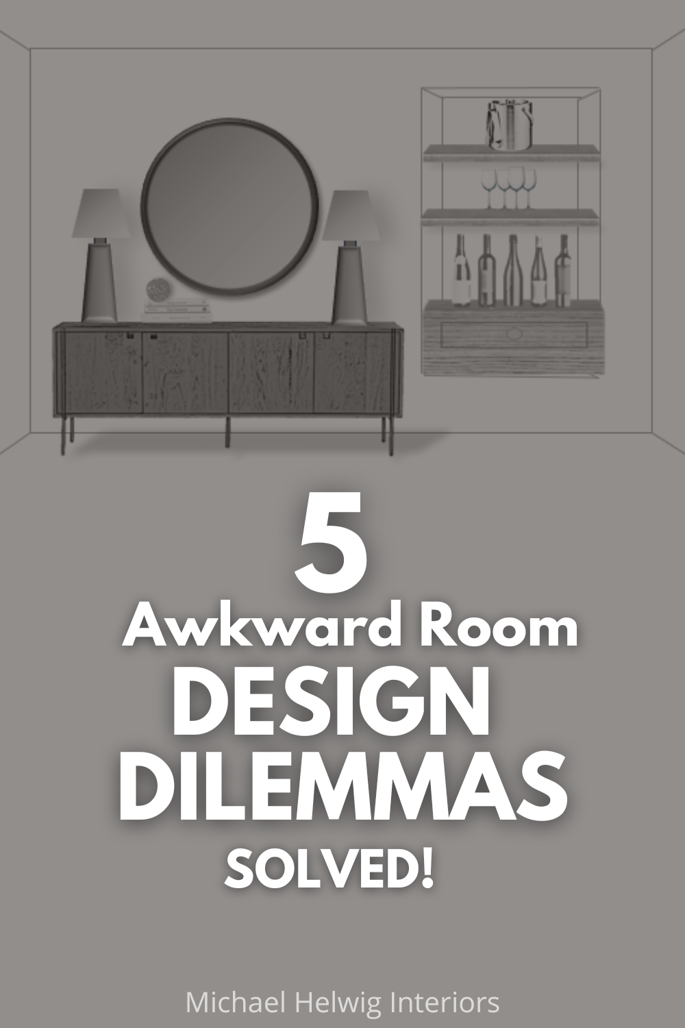
Instead go for a simple round mirror to tie in the round dining table. Flank the mirror with a couple of evenly spaced buffet lamps and you’ll have a lovely, balanced wall.
Or choose a large statement piece of art that can anchor the wall and bring the focus down from the tall ceiling and clipped corner wall.
Perhaps you’d prefer a simple arrangement of 3 related pictures as a focal point above the buffet? This is another great way to keep the focus lower on the wall.
Last, bring in just one of the buffet lamps and choose other décor for the other side of the buffet. This will help you vary the line and scale of the décor, which makes for a pleasing composition.
Watch the Video Instead?
Design Dilemma 3. What do you do with a vent that’s in an awkward place on the wall?
Ahh, the dreaded unsightly wall vent…
This room could be an office or den, at least that’s what I’m imagining to be…
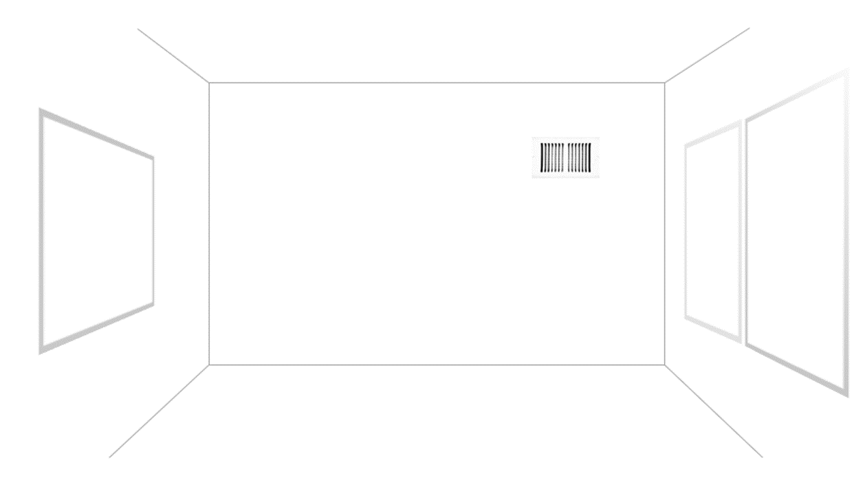
First, Let’s address the fact that the wall is blue, and the vent is white.
The easiest fix for this is to paint the vent cover the same color as the wall to make it blend in.
I decided to paint the wall instead so that the vent and the wall were the same.
I still think there’s even more we can do here though…
This room has windows on opposing walls.
One side has two windows, and the other side has one.
The side with two windows has a similar wall issue to the last room.
There’s only about 12” of wall space from the corner to the window. That will make placing a piece of furniture tricky on the vented wall because you don’t want something tall and deep that will block the windows.
The solution I came up with was to place floating shelves on the wall. These can be customized to an appropriate depth, say 8” to 10” so they don’t obscure the windows.
I placed some décor on the shelf to hide the vent, but it didn’t completely cover it.
Tip: Don’t place a picture or lean something solid and big in front of the vent because that would defeat the purpose of heating and cooling your room.
With this décor, there’s plenty of stuff to camouflage the unsightly vent, but not so much that it would interfere with its function.
Design Dilemma 4. What do you do with an awkward niche in a wall?
Niches are either loved or hated…
If you’ve inherited a wall niche in your home from a previous owner, you’re probably in the hated wall niche camp.
That’s because the previous owner probably had a piece of art or sculpture that warranted the necessity of a wall niche.
Unless you too have some impressive art, you’re probably stumped as to what to do with this awkward hole in the wall, right?
Well, maybe you do have some art that will fit perfectly in the niche. I say put it up!
Make it a focal point, put a picture light above it and give it the honored spot in the room.
If priceless art isn’t your bag, then here are a couple of other ideas:
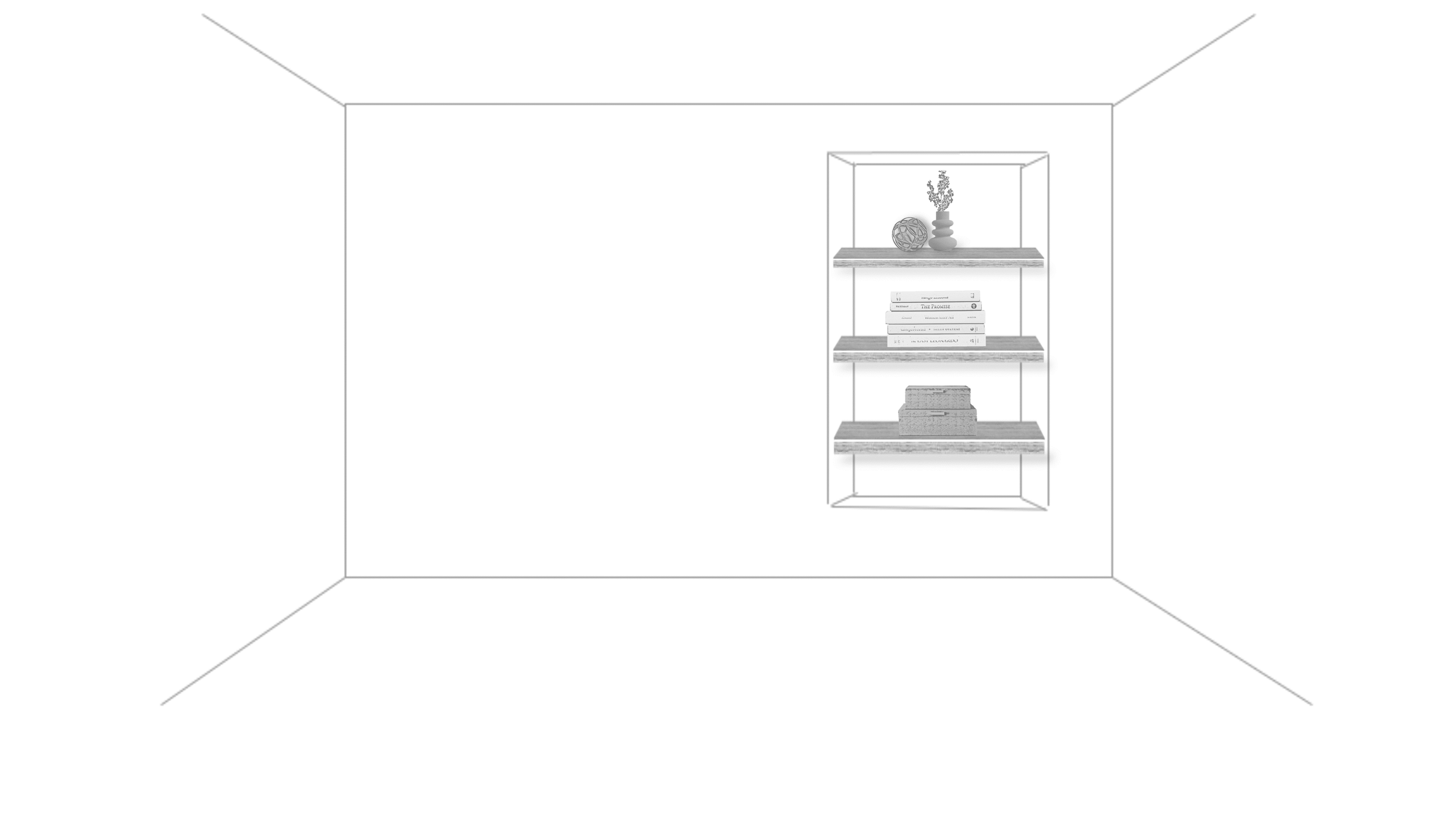
First, you can install shelves in the niche.
This will make the space look more intentional and useful, like a built-in shelf.
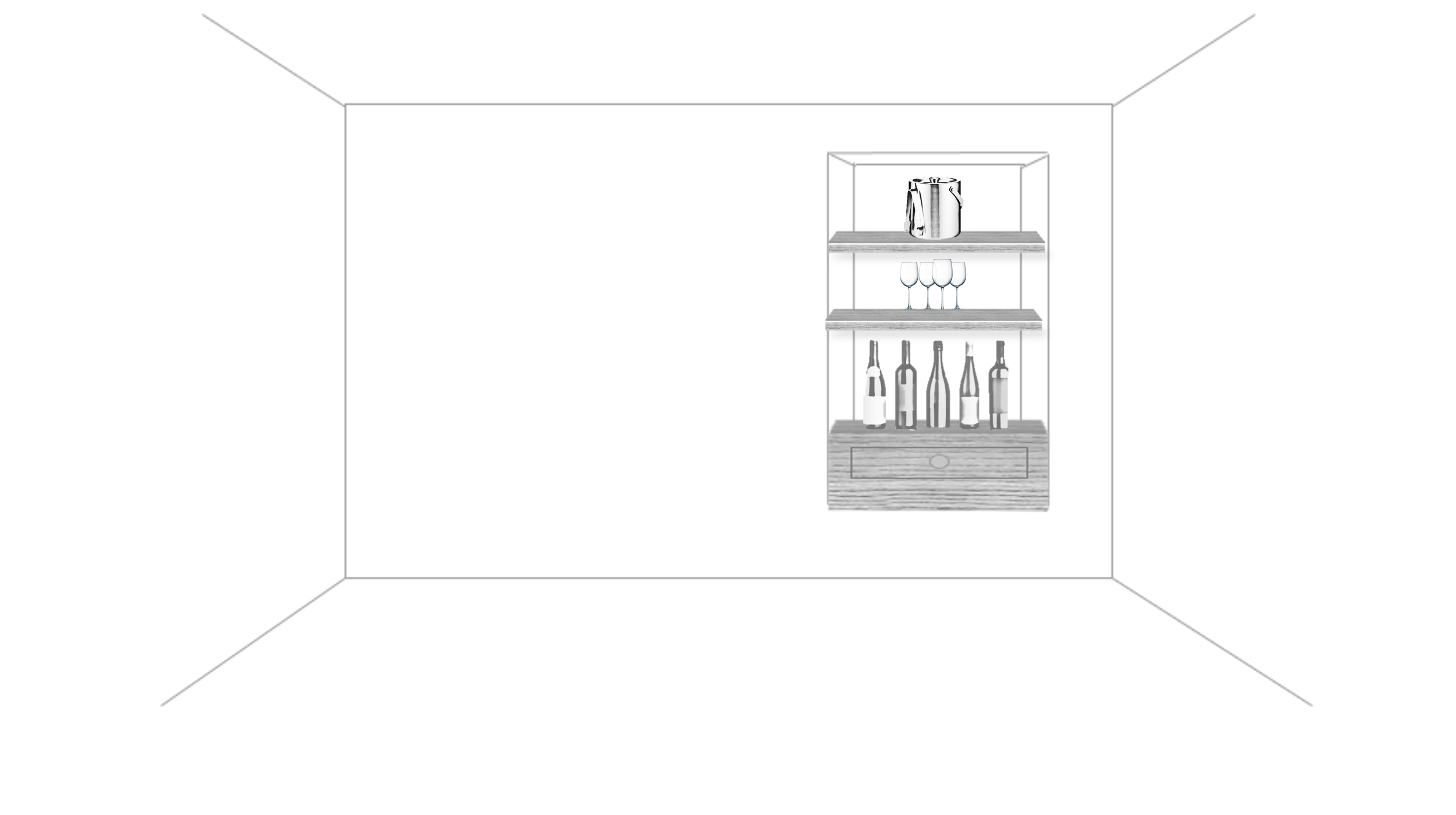
Or give the space a complete makeover with a customized built-in bar.
This one has a drawer on the bottom to store bar utensils and a couple of shelves above to display spirits and glassware.
You could then bring in a server piece to place next to the niche as a place to mix drinks and set out cocktail foods.
This awkward confusing niche now has a completely new purpose to help you entertain guests.
Design Dilemma 5. What do you do with a fireplace that’s off center?
This is one of the most posted types of design dilemmas I come across.
The off-center fireplace is a confusing conundrum.
The other stinker about this wall is the doorway right to the left of the fireplace. It really makes the space feel unbalanced.
So, the easiest fix for this awkward wall is to place an etagere shelf next to the fireplace.
I like etagere shelves because they’re open, allowing you to see the wall behind the shelf. (As I mentioned before, seeing around and through pieces in smaller or tricky spaces makes things feel more open and less crowded.)
The décor on the shelf, along with the art on top of the fireplace and the height of the open doorway, are all nearly the same height. That extends a visual line across the wall and makes the space feel balanced and purposeful.
The second idea I had for this wall involves a little more construction.
I think that if you extended the fireplace façade, mantle, and hearth to the wall, it would help to make the space feel purposeful and intentional.
This eliminates the awkwardness of the unbalanced wall space and gives you an impressive and lovely focal point in the room.
The extra length gives you space to decorate the mantle and the newly expanded hearth gives you plenty of space for fireplace tools and other décor.
All-in-all, this is a textbook study of varying your line, scale, and materials in design.
Well, there you have it, 5 awkward room design dilemmas solved.
To sum up:
When dealing with small or awkward walls, it’s important to know exactly how much space there is. Make sure to measure all the wall segments close to the wall because that will affect the size, scale, and depth of furniture you plan to use near the space.
Be mindful of blocking windows with big or bulky furniture because you may unintentionally block natural light. Big solid furniture in front of windows will also make the space feel crowded and obscured.
Keep your mind open to using tricky or awkward walls in your home for different purposes. When you think outside of the “intended” use for certain spot, you’re more likely to come up with a solution that really fits well for your needs – just like the built-in wall niche converted to a bar cabinet.
Read Next:
How To Arrange A Square Living Room With Doors On 3 Walls And A Pass-Through
Drawing inspiration from a real-life room transformation, I provide practical tips to maximize space, improve flow, and create versatile layouts. From precise room measurements to the strategic placement of furniture and thoughtful editing of clutter, I guide you through a step-by-step process to make the most of your square living area. Whether it's optimizing pathways, rethinking accent walls, or designing functional zones, this post equips you with the tools to conquer the unique challenges of square room arrangement.
Join the Fun!
If you enjoyed this post and you want to keep seeing my weekly blog, the best way to do that is to subscribe.
You can subscribe by downloading my 11 Secrets Only Designers Know to Make Your Space Rock. If you’re curious about how decorators and designers make a home look magazine ready, you’ll love taking a gander at these 11 secrets. You’ll learn how to style your room from the floor up and it will work for ANY space you have.
I write about small space design and decorating, sustainable furniture options, positive self care and a variety of do-it-yourself home décor.
I’d love to connect with you!
“Michael Helwig was top-notch, very professional and responsive to my needs. He allowed me time to explore ideas and try out a variety of combinations until we found the perfect fit. Michael provided detailed information and offered beautiful ideas to make my dream living room become a reality. The furniture he sourced has totally transformed my living room space. Everyone that has seen my new living room has one word, WOW! A special thank you to Michael for a wonderful experience.”
“Michael was very knowledgeable and guided us, with great patience and good humor, through the process of designing our dining room and helping us find the perfect sleeper sofa. He offered really helpful advice when we asked questions - which was often - but at no time did we ever feel pushed. He helped me when I felt like I couldn’t make one more decision. When my new furniture finally arrived I realized everything down to the pillows was perfect. I couldn’t be happier!”
Michael is Principal designer and blogger at Michael Helwig Interiors in beautiful Buffalo, New York. Since 2011, he’s a space planning expert, offering online interior e-design services for folks living in small homes, or for those with awkward and tricky layouts. He’s a frequent expert contributor to many National media publications and news outlets on topics related to decorating, interior design, diy projects, and more. Michael happily shares his experience to help folks avoid expensive mistakes and decorating disappointments. You can follow him on Pinterest, Instagram and Facebook @interiorsmh.

