It’s a bold statement when you declare something to be “the perfect way” to do something. However, in this case, I haven’t found a better way to narrow down different types of decorating inspiration.
In my years of experience with many, many clients, I often hear things like, “I like farmhouse and my husband likes Industrial.” Or it’s, “I love Mid Century Modern, but I also love contemporary too.” Sometimes it’s, “I don’t know what I like.” Or “I don’t know what my style is at all… I’m all over the place.” Perhaps you know exactly what design style(s) you like, but you don’t know how to pull it together for yourself.
Does any of this Sound familiar?
That uncertainty comes from overwhelm.
You’re probably overwhelmed by the fear of making a mistake.
You might fear that the different styles you like can never really work cohesively together. Or you might fear screwing up when trying to combine you and your spouse’s preferred styles.
Whatever is happening, your fear has morphed into inaction, right?
If you’d rather ‘live with’ something that you don’t love rather than risking the mistake of choosing something wrong, then stick around because this one will be a gold mine for you!
First, read this and really absorb it:
You have style, and you already know what looks great together.
The disconnect is that you don’t trust your instincts to make good design decisions.
• The great news is that you can easily learn how to immediately trust your instincts by taking yourself out of the equation.
What does that mean?
It means that I’m going to show you how to “diagnose” your own inspiration pictures so you can SEE the cohesion that might not be immediately obvious. Like a professional interior designer, you can train your eye to spot patterns, colors, and styles that perfectly work harmoniously.
Think if it this way, it’s like you’re a forensic investigator. The picture(s) you’re investigating might not make sense, but when you pull all the details out of it, a story starts to emerge.
This is the exact way I “diagnose” my client’s style.
That’s right, I’m peeling back the curtain on one of my most closely held design secrets here.
One of the first things that happens when I get hired to work with a new e design client is I ask them to send me a link to their Pinterest Board(s). Sometimes they upload pictures to me or email them directly to me…
It doesn’t matter how they get the pictures to me; it only matters that I get them, and I can start my diagnosis…
First, I create a “working file”
This just means I pull all the relevant information for the client into a single place. This includes copying inspiration pictures into PowerPoint, which is my preferred program to use. I like PP because I can use many of the native tools to help with my diagnosis. (More on that in a bit…)
This is what PowerPoint looks like:
I don’t re-size the slides, I just open the program and copy and paste all the images that I need.
Sometimes my clients send me images that have very apparent similarities and sometimes they’re wildly different.
Let’s start with some similar inspiration pictures.
The first thing I’ll do is to make a note about the color ratio in the pictures.
For this is I use the 60%, 30%, 10% rule.
Here’s a link to a handy reference on 60,30,10
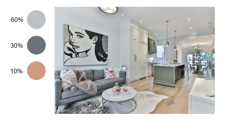
For now, I’ll just say that this is the most useful ratio I’ve found to quickly “diagnose” a room’s color breakdown. It helps me to immediately see the main colors in the pictures. 60% is the most present color, 30% the second most present color and 10% the least present color that still appears at least two or three times.
What’s the point?
• Consciously, you may be attracted to a room because of the style of furniture or the tidiness of the room or the use of a particular shape or pattern you gravitate towards.
• Subconsciously, and especially when I can look at many pictures in a Pinterest board, I will usually notice that you’ll pin rooms with very similar color compositions, regardless of style.
Here’s how I use the 60,30,10 rule to determine color compositions.
Sidekix Media
60% of this room is that light gray – or white wall color. 30% is the darker gray upholstery on the sofa. That color also shows up in the area rug and in the background of the pop art painting on the wall. 30% is hinted at in the accent pillows, on the coffee table and in a few little spots in the kitchen in the background.
Sidekix Media
60% of this room is that light gray – or white wall color. 30% is the gray upholstery on the sofa. That color also shows up in the area rug again, in the lighter gray part of the rug. 30% comes through in the accent pillows, metal sculpture on the coffee table and in hints in the artwork above the sofa.
Sidekix Media
60% of this last room is that light gray – or white wall color. 30% is the gray upholstery on the sofa. That color also shows up in gray/brown of the flooring. (Since there isn’t much “color” in this room, I’ll usually look at the flooring to make up that 30%.) 10% shows up twice in the outline of the built-in shelves beside the fireplace. I can also see hints of that chocolate brown in the artwork too.
PowerPoint Color Picker Tutorial
If you’re interested, this is how I use the native color picker in PowerPoint to highlight and pull different colors form the inspiration pictures.
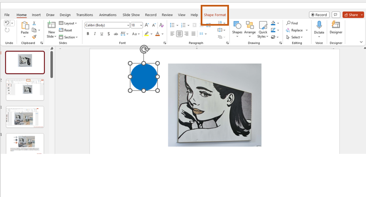
First, I like to insert a circle next to my inspiration image. To do this, go to “insert” in the top menu. The select “shapes” from the submenu. You can choose any shape you’d like. I prefer circles. The shape will show up as blue, but you’ll be able to change the color with the picker.
Next, highlight the shape and go to the “shape format” option in the top menu.
In the submenu, choose “shape fill” then click on the “Eyedropper” option. This will bring up a little arrow that you can hover over the picture with and select the colors from the picture.
When you see the arrow, go to the color in the inspiration picture and click the color to apply it to the shape. (The shape will have an outline around it. If you want to remove that, go back the “Shape Format” step and you will see an option for “remove shape outline.” Just click that and it will go away.
Let’s Combine These Styles Together Cohesively
Now that I see how the color is compiled for each picture, I’ll next go back and look at the pictures again to pull the dominant themes out.
What I mean by “themes” is the obvious things that make up the room: the artwork, the shape of the furniture pieces, the materials the furniture is made of, wood, metal, glass, etc.
This “forensic” second look helps me to zoom right in on similarities that will eventually help me pick the right furniture for your room. These details construct the story of what you like, even if you don’t notice them right away.
As the story unfolds, similarities begin to shine through.
Regardless of style, I know that you like:
Light walls, either a very light gray or a bright white.
This tells me that bold wallpaper patterns or deep colorful walls won’t jive with your style.
Thin arms on your upholstery.
This means that I’ll be looking for sofas and chairs with track (thin) arms. I’ll avoid rolled arms or wide square arms because that’s not going to fit your aesthetic.
You like abstract and ‘pop art’ style art.
So, no classis style portraiture or scenic landscapes. You prefer a more edgy style of art, non-representational and contemporary.
You prefer contemporary light fixtures and lamps with barrel style shades.
I wouldn’t choose a traditional, crystal chandelier for instance. I would go for simple linear fixtures with straight lines, not fussy.
Now what for what you don’t need:
You’re not interested in wood furniture, preferring chrome, glass, and metal instead.
This tells me not to spend a lot of time looking for the perfect wood accent pieces for the design. Makes sense?
You aren’t interested in stark contemporary or ultra clean lines. You like a little bit of detail in things like molding and stone to add texture and to ‘warm’ up your space with some more ‘traditional’ details.
Last, I look at the accent details:
I can see that you’re interested in an eclectic mix of details.
You like natural materials like the hair on hide rug. You also like geometric patterns and abstract, almost monochromatic looking rugs.
This tells me not to spend any time looking for floral accents, or traditional patterns. You’re probably not big on stripes, or very colorful and pattern rich area rugs.
See how this can really narrow down the selection process?
• It’s not about style.
• It’s not about specific pieces -at this stage.
• It’s about getting the details that connect inspiration pictures together so that you can make a framework or master list of things that will help you create the cohesive look for your space.
Now let’s look at seemingly very different styles
Alex Qian, Element5 Digital
This is what usually happens when couples have wildly different tastes and talks have broken down.
That’s usually the point I get brought in to figure it out.
These two rooms look very different. The first is much more “traditional.” The second is more “modern.”
One is pattern rich and dark the other is pattern(less) and neutral.
Is there any hope for combining these two different styles so that both people in this relationship feel seen and heard?
Can you see the similarities?
Let’s start with the 60,30,10 rule again
Here, 60% of the room is dark paint- that deep charcoal color on the wall. 30% comes through with the chair and bench ottoman. And the 10% is the seafoam blue color in the tufted ottoman.
Here, 60% of the room is that neutral taupe wall color. 30% is present in the upholstery fabric and the last 10% shines through I the wood tones – the open shelves and the coffee table frame and legs.
Let’s take a closer look at the themes in each room
I see tufting and nail trim in the upholstery. I see geometric patterns in the rug. There’s open shelving, neutral accents fabrics, and a lovely crown molding and paneled wall detail. The lighting is simple and the arms on the sofa and chair are also thin.
I see a simple, track arm on the sofa. Neutral fabric. I see tufting on the back of the sofa. There’s an open self here. Then I see a glass top coffee table with a simple leg – unfussy. The pillows are neutral and there’s a geometric rug, tone-on-tone color.
Now let’s see what they have in common:
Tufting & Thin Upholstered Arms
Despite the different color upholstery, each room has tufting and thin arms on the sofa. That tells me that I can bring in both of those elements and both people will be on board.
Geometric Rug Patterns
Both the area rugs have geometric patterns. That tells me that each person will be okay with a geometric type of pattern in the area rug. Even though the colors are different, if I stick with a tone-one-tone or two to three similar colors, I’m still within the aesthetic range they’re looking for.
Open Shelves and Medium Wood Tones
I see open style shelving in both inspiration pictures, and medium wood tones on the furniture. That tells me that I can source etagere style shelves and that I can pull in simple, medium wood accent furniture and both parties will be good with that.
Neutral Soft Accents
Last, I see that both rooms have very neutral pillow fabrics and soft accents. That tells me that neither person wants to see lots of color in the pillows or blankets. What I can play around with is texture and contrast.
So, there you have it.
Even though these two rooms seem very different, there are key elements that appear in both, and those elements are the bridges between different styles.
Now it’s you turn.
Try this process out for yourself and let me know how it works out for you.
If you’re struggling to marry two different design styles that you love or if you’re trying to marry your style with your spouse’s style, I’m telling you, this works!
Read Next:
Balance doesn't have to be a precarious monster in small rooms. It's not anything to be intimidated by and, I would go so far as to say that it could be just what you need in your small or awkward room. If something is feeling "off" around one of your rooms, I'd venture to predict that that "something" could be balance.
Join the Fun!
If you enjoyed this post and you want to keep seeing my weekly blog, the best way to do that is to subscribe.
You can subscribe by downloading my 11 Secrets Only Designers Know to Make Your Space Rock. If you’re curious about how decorators and designers make a home look magazine ready, you’ll love taking a gander at these 11 secrets. You’ll learn how to style your room from the floor up and it will work for ANY space you have.
I write about small space design and decorating, sustainable furniture options, positive self care and a variety of do-it-yourself home décor.
I’d love to connect with you!
“Michael Helwig was top-notch, very professional and responsive to my needs. He allowed me time to explore ideas and try out a variety of combinations until we found the perfect fit. Michael provided detailed information and offered beautiful ideas to make my dream living room become a reality. The furniture he sourced has totally transformed my living room space. Everyone that has seen my new living room has one word, WOW! A special thank you to Michael for a wonderful experience.”
“Michael was very knowledgeable and guided us, with great patience and good humor, through the process of designing our dining room and helping us find the perfect sleeper sofa. He offered really helpful advice when we asked questions - which was often - but at no time did we ever feel pushed. He helped me when I felt like I couldn’t make one more decision. When my new furniture finally arrived I realized everything down to the pillows was perfect. I couldn’t be happier!”
Klaus Nielsen
Michael is Principal designer and blogger at Michael Helwig Interiors in beautiful Buffalo, New York. Since 2011, he’s a space planning expert, offering online interior e-design services for folks living in small homes, or for those with awkward and tricky layouts. He’s a frequent expert contributor to many National media publications and news outlets on topics related to decorating, interior design, diy projects, and more. Michael happily shares his experience to help folks avoid expensive mistakes and decorating disappointments. You can follow him on Pinterest, Instagram and Facebook @interiorsmh.


