This room is very tricky.
Let’s unpack what’s going on here:
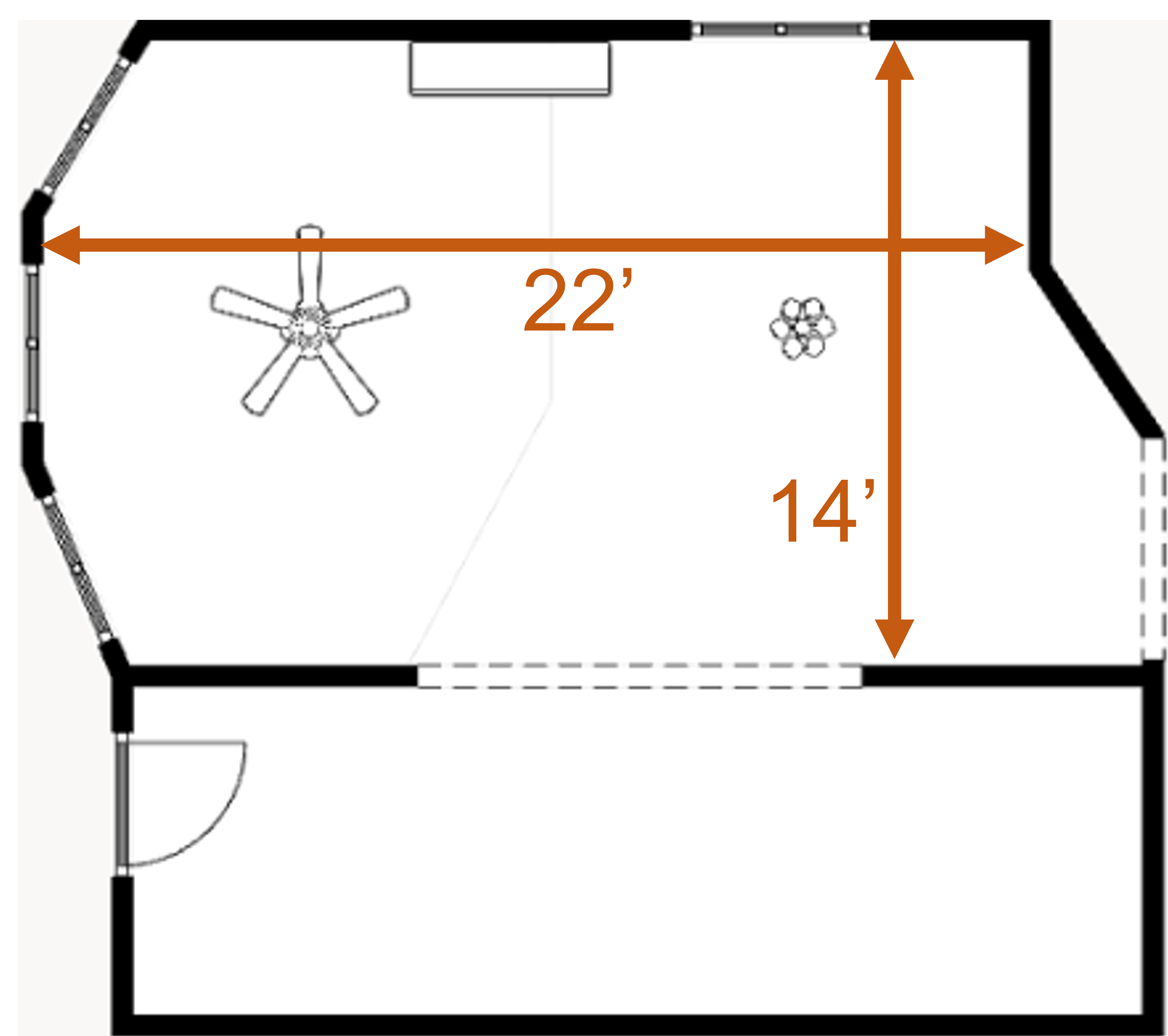
It’s a shared 22’ x 14’ living/dining room, open concept space.
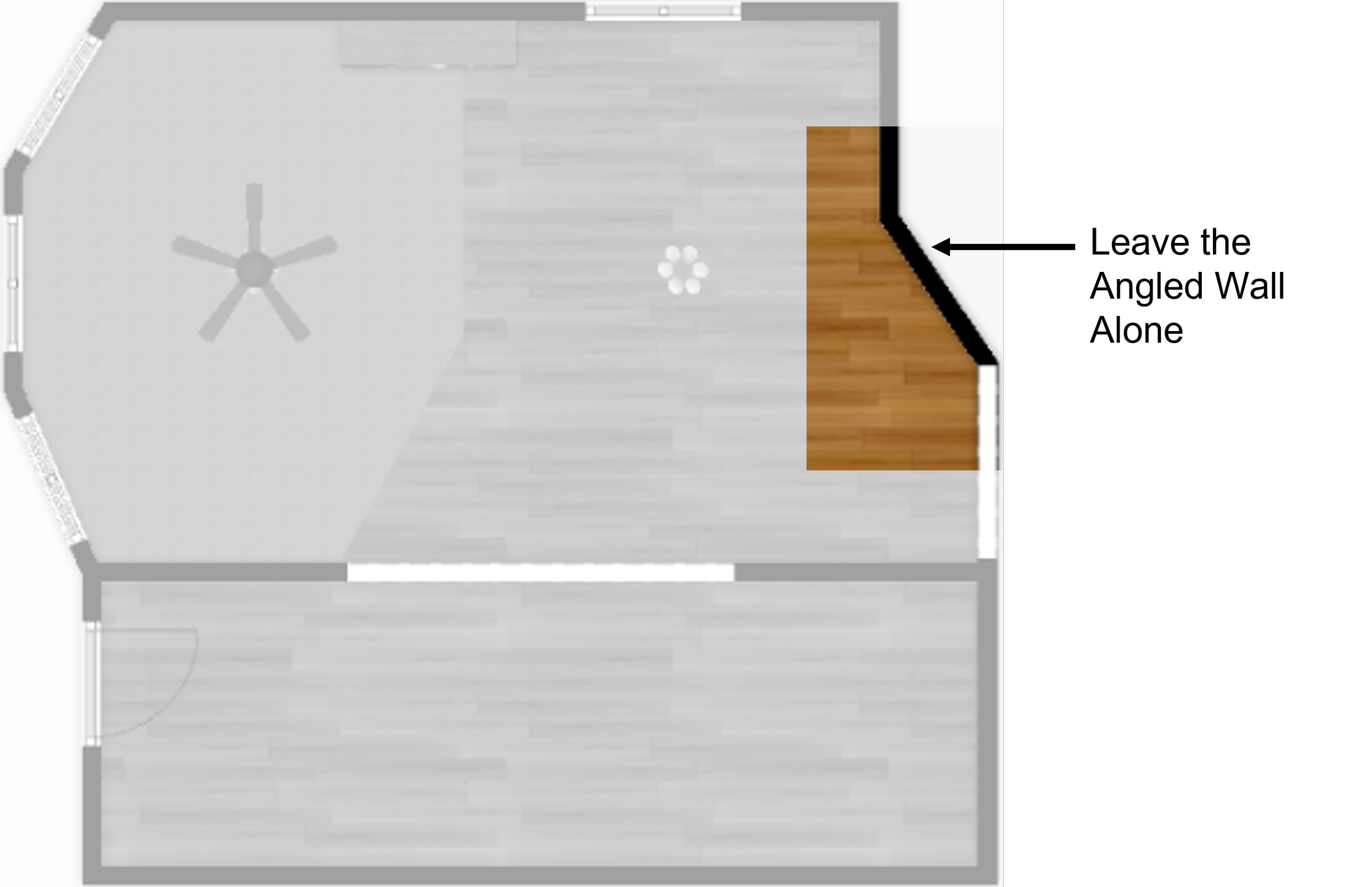
This room has angled walls.
There’s one angled wall in the dining room, and another, angled bay wall of windows in the living room.
Both these are beautiful design features, but they make placing furniture tough.
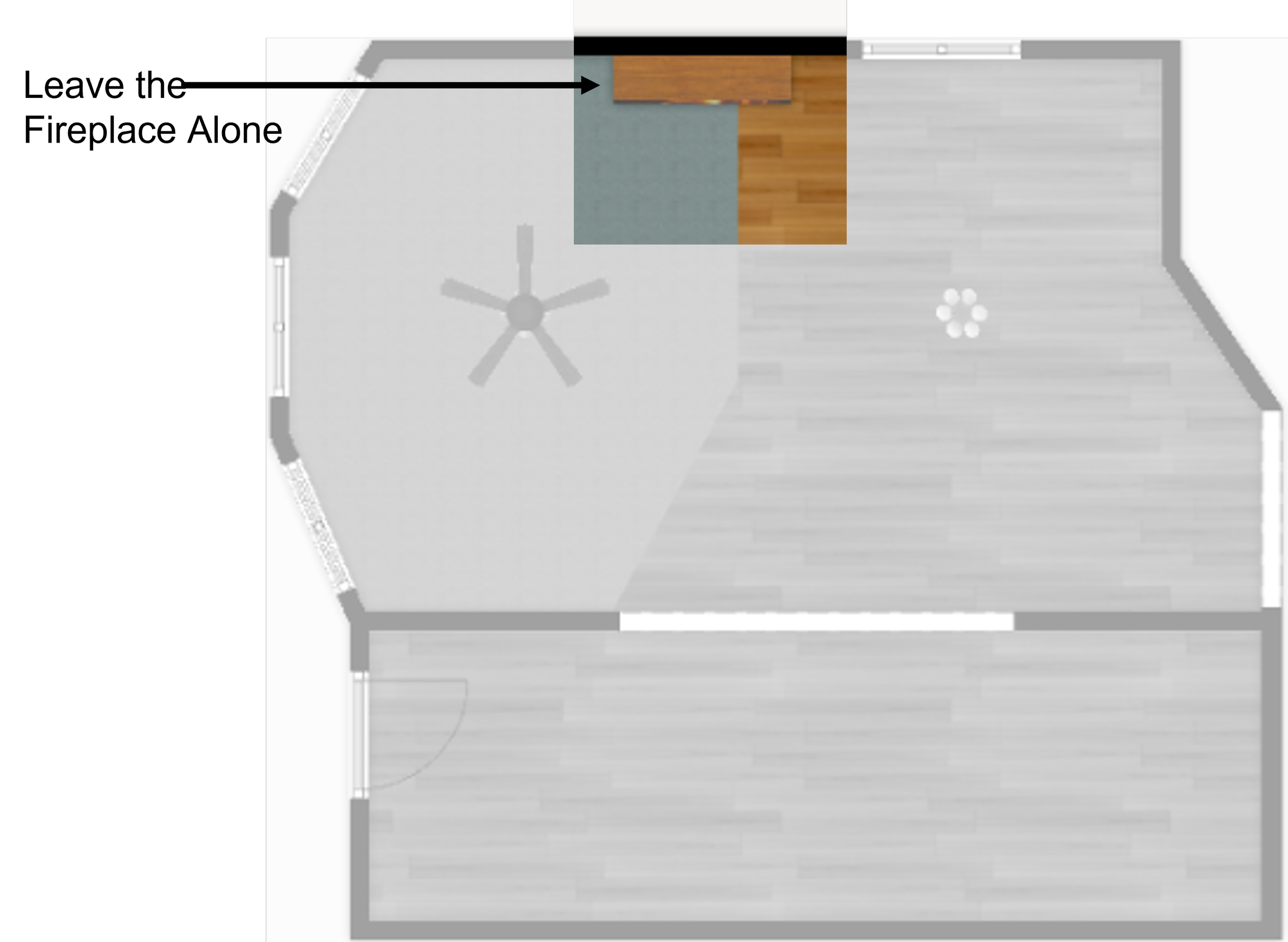
The next challenge is the fireplace.
It’s a great feature, and the placement being in the middle of the wall is okay…
The issue I have is that it’s currently off balance because there’s a window in the dining room side and nothing on the living room side.
Some might think this is a plus because there would be more room for furniture in the living room, but what should go there?
A sofa would not have a view of the fireplace…
A reading chair might work, but it would be awkwardly shoved in the corner, so eh.
Console, cabinet, or shelf will just be a space filler…
Tip: In small rooms it’s important to consider how you’ll use the space every day.
If that means that places to sit take priority over display or storage, then a shelf, credenza or cabinet isn’t the best use of that space.
This is a main gathering space, so more seating is a better option.
Then there’s the inset carpeting, cut right into the floor. Why builders, why?
This is a very 1990’s thing.
I remember visiting new builds around this time and I would see this feature a lot.
The idea behind this was to give the homeowners an idea for how to arrange the furniture.
I’m sure they thought this was helpful.
It’s like an unspoken direction: “Put your furniture here on this weird patch of carpet”. Egad!
To be fair, I advise using an area rug to define seating arrangements all-the-time.
In this case though, the angle of the inlay carpet won’t provide an anchor for a comfortable furniture layout…
It just adds to the confusion of the space.
Lastly, I feel like the open 10’ doorway between the entry foyer and the living/dining room is too large.
A sightline with a large staircase and a cathedral ceiling - Some amazing feature that can be enjoyed from many vantage points warrants a grand view.
Not to be rude, but this room is not something out of the Gilded Age, right?
The space is certainly pretty but more subtle than a turn of the Century, New York Mansion, you know?
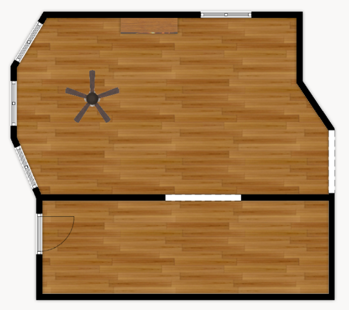
Here’s the whole picture for reference.
So, What to Do with This Space?
First, I would take up that inlaid carpet and replace it with the same hardwood that is present elsewhere in the room.
It can be done, and I would suspect that it wouldn’t be too difficult to find flooring to match since the house is only 30ish years old, not 100 or more.
Work like this would take some skill, so I would probably hire that out if you’re not a confident diy’er.
Next, I would shorten the doorway opening from 10’ to down to 6’.
That is still a very generous opening.
More importantly, it would make the wall on the living room side longer, which will help with furniture placement and flow.
These two ‘fixes’ shouldn’t break the bank, but I will say they’ll be in the $2500 to $5000 range depending on location, materials, and labor.
In the scheme of things, that level of investment will make a big difference to the ‘livability’ of this room.
What Doesn’t Need to Change?
I wouldn’t move the fireplace.
It’s fine where it is and there isn’t a “better” place for it.
And, honestly, I think this room benefits from a focal point like a fireplace.
It adds ambience to both sides of this shared room.
I also wouldn’t square up the dining room wall, just leave it be…
The angled wall will help free up some elbow room, making it easier to navigate around the dining set.
The angle will allow for dining chairs to be pulled away from the table easier.
More on that in a bit…
Changes for Better Flow
I don’t usually offer advice for making physical changes to spaces.
My focus is about simple cosmetic changes that help to make existing spaces function better.
However, I feel very strongly that changing the size of the main doorway and replacing the inlaid carpet will give this tricky space much better flow and function.
As you can see, those two relatively easy changes provide more space on the living room side and removing the carpet removed the confusing patch.
The dining room side
I quickly saw that a round table would be too wide and a rectangle would be too long (plus those square corners would be too hard to move around.)
So, the solution I came up with is an oblong dining table.
It’s really the best of both worlds: the length of a rectangle with the curves of a round table.
In small or tricky dining rooms, I always recommend using armless chairs because they can be pushed all the way in, which takes up a lot less floor space.
This eliminates the awkward shuffling around to get past armchairs that would stick out.
As you can see, the angled wall does make it easier to pull the chairs fully out and there’s room to walk behind them to serve or to get up from the table.
So, no furniture should go on that wall to black that narrow pathway.
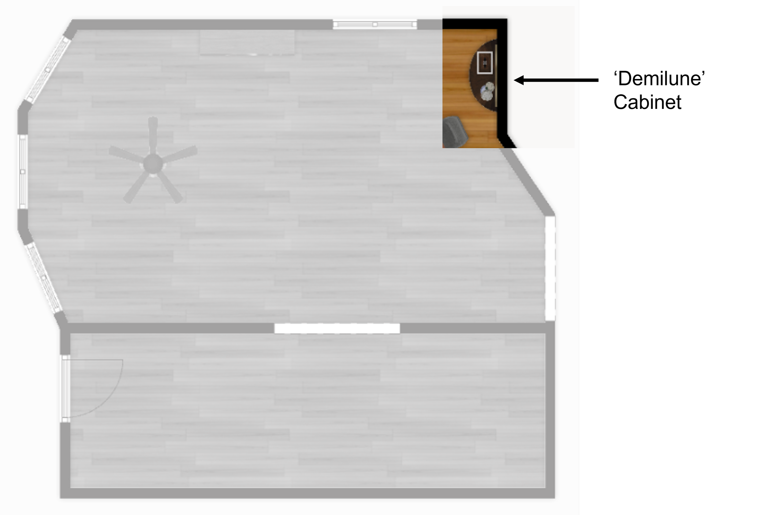
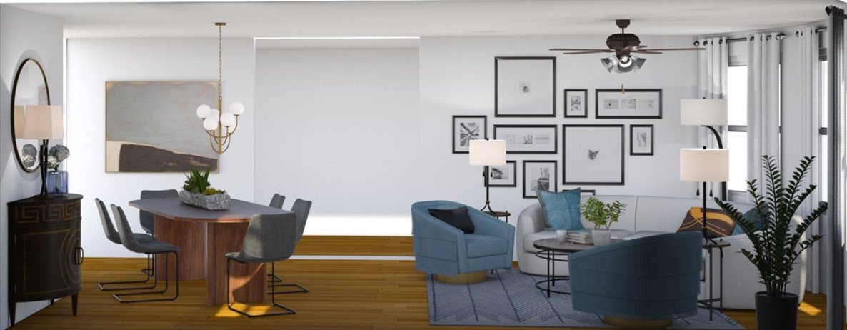
Instead, I decided to place a demilune cabinet on the perpendicular wall next to the window.
This is a useful and appropriate piece.
It balances the room, provides storage and a surface.
It also gives an anchor to wall décor – in this case, a mirror.
Most importantly, the rounded front provides the perfect amount of space to pull the adjacent dining chair fully out.
If the piece was squared off, there would not be adequate room for getting in and out of that chair.
Opening doors or drawers on the cabinet would be tricky too since they would surely bump the chair.
Moral of the story, to avoid a P.I.T.A. in a small or award dining room, consider a demilune cabinet instead of a buffet or console.
The living room side
At this point it became clear that the theme of this post should be curved furniture.
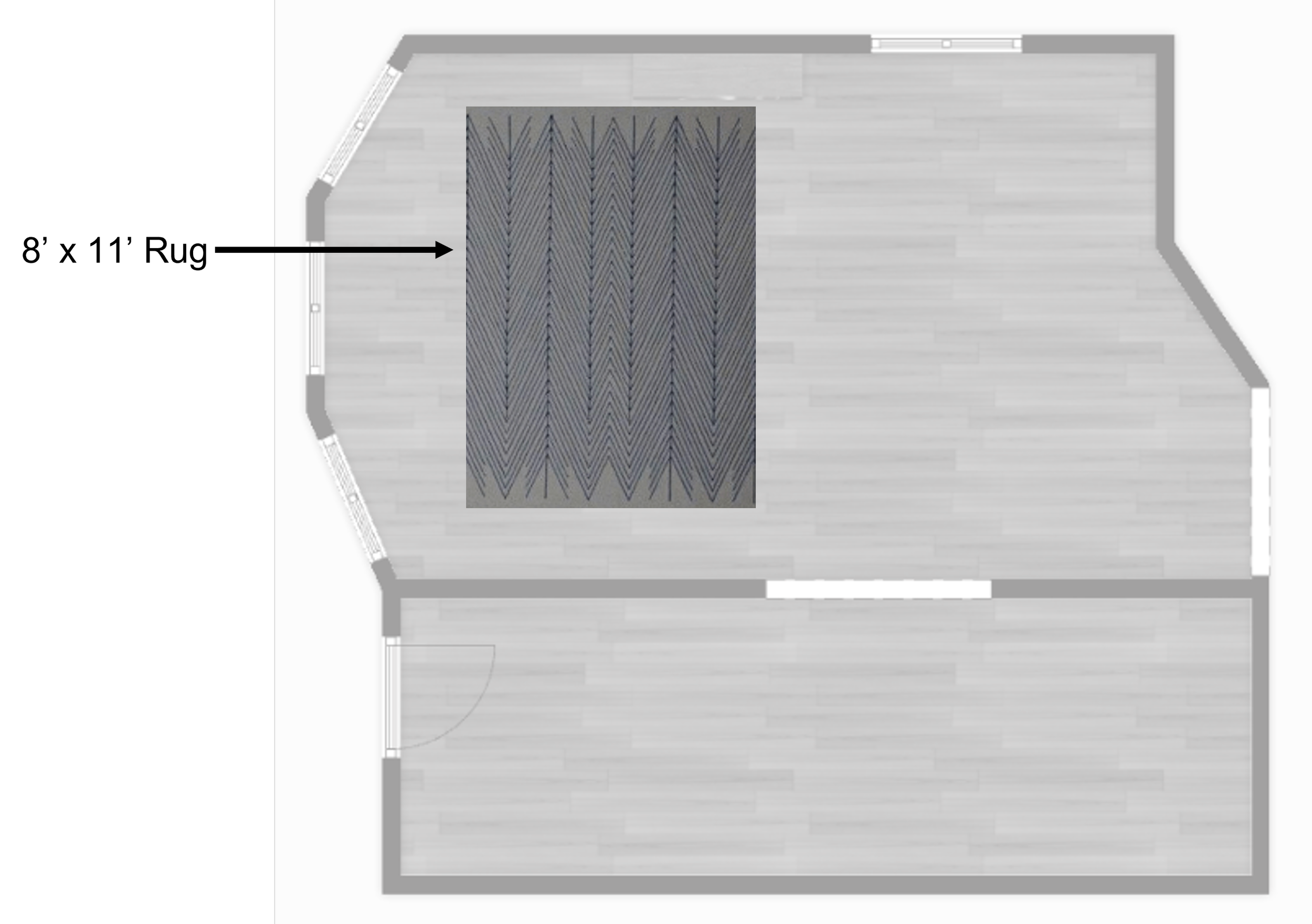
I first positioned an 8’ x 11’ area rug right in front of the window.
This is where you want a squared off shape…
The rectangle defines the space and makes it easy to position furniture on it.
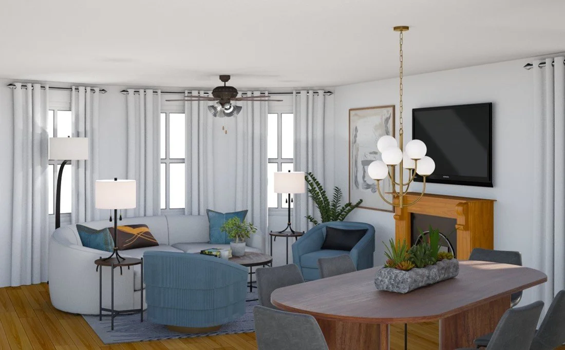
I chose a curved sofa and angled it into the curve of the bay wall.
I decided to lean fully into the angles of the room and instead of an inlaid carpet defining the space, I positioned the entire seating arrangement on an angle.
Two swivel barrel chairs positioned on the same angle, flanking the sofa, provide a classic conversation grouping.
Plus, round back chairs work very well in tight spaces because you can navigate around them.
And, if they swivel, like these, there’s no hard corners to catch walls or tables as they turn.
This arrangement is interesting and unexpected. and it makes great use of the unconventional walls.
Ignoring the curves of the architecture and putting a bunch of right-angled furniture in the space would leave you with a lot of empty spots that would be tricky to fill.
There’s only so many cabinets or tables you can fit into a room without it feeling cluttered, you know?
The Finer Details
I love to use curtains that are similar or the same color as walls in smaller spaces.
You can get just as much ‘drama’ from a full, billowy white curtain on a white wall as you can with a full, billowy black curtain on a black wall.
Tone on tone just works in small spaces.
I hung the curtains high and used the exact same panels in both the living room side and the dining room side. (It’s one room after all.)
I added a large, vertical piece of art on the living room side of the fireplace to visually balance the height and fully dressed window in the dining room.
Tip: Think of your “unbalanced” walls as an equation. Add something that’s the same size and shape to the empty side to make them equal.
It doesn’t always have to be identical. Symmetrical works just as well.
Behind the sofa, I opted for a sprawled-out gallery wall to take up the width of the newly longer wall.
I like the mix of large and medium size black picture frames and long and short.
It’s interesting and a nice composition in the room.
On the other side of the new 6’ doorway, in the dining room, there’s a large art canvas to fill the wall leading into the kitchen.
I love large art in smaller rooms because it’s a great way to add drama, height, contrast and/or color.
Last, I brought in round accent furniture, a round coffee table and two round end tables.
Much like barrel back chairs, round accent furniture fits nicely in corners or in tight spots.
Round is easy to navigate around, and the curves of the coffee table fit the curve of the sofa like a puzzle piece.
The table lamps are tall and “open”.
Taller items that bring the eye up will help to make the room feel taller too.
The last piece of lighting in the floor lamp behind the curve of the sofa beside the bay wall.
It’s a gentle goose neck lamp, ideal for task lighting and its height adds to the varied line in the room.
The fact that there’s a lot of black accents in also intentional.
Touches of black provide the punctuation in any room.
Small rooms especially need touches of black so your eye can find rest.
There you have it, curved furniture and angled walls, a perfect fit.
Join the Fun!
If you enjoyed this post and you want to keep seeing my weekly blog, the best way to do that is to subscribe.
You can subscribe by downloading my 11 Secrets Only Designers Know to Make Your Space Rock. If you’re curious about how decorators and designers make a home look magazine ready, you’ll love taking a gander at these 11 secrets. You’ll learn how to style your room from the floor up and it will work for ANY space you have.
I write about small space design and decorating, sustainable furniture options, positive self care and a variety of do-it-yourself home décor.
I’d love to connect with you!
“Michael Helwig was top-notch, very professional and responsive to my needs. He allowed me time to explore ideas and try out a variety of combinations until we found the perfect fit. Michael provided detailed information and offered beautiful ideas to make my dream living room become a reality. The furniture he sourced has totally transformed my living room space. Everyone that has seen my new living room has one word, WOW! A special thank you to Michael for a wonderful experience.”
“Michael was very knowledgeable and guided us, with great patience and good humor, through the process of designing our dining room and helping us find the perfect sleeper sofa. He offered really helpful advice when we asked questions - which was often - but at no time did we ever feel pushed. He helped me when I felt like I couldn’t make one more decision. When my new furniture finally arrived I realized everything down to the pillows was perfect. I couldn’t be happier!”
Michael is Principal designer and blogger at Michael Helwig Interiors in beautiful Buffalo, New York. Since 2011, he’s a space planning expert, offering online interior e-design services for folks living in small homes, or for those with awkward and tricky layouts. He’s a frequent expert contributor to many National media publications and news outlets on topics related to decorating, interior design, diy projects, and more. Michael happily shares his experience to help folks avoid expensive mistakes and decorating disappointments. You can follow him on Pinterest, Instagram and Facebook @interiorsmh.


