This might be an unexpected thing to hear especially for a small or awkward room where you would think smaller is better.
The truth is small furniture can make a smaller room feel unbalanced.
It comes down to scale.
Smaller scale furniture can get lost in a small room, just like it can in a large room.
Consider the Scale of Your Furniture.
Francesca Tosolini
Scale, in reference to interior design, is a proportion between two sets of dimensions.
But you can also think of scale like how you would measure the weight of something as well. In that way, scale would the pursuit of balance where weight is distributed equally.
In this case the proportion of furniture to a room.
Let’s say you have a large family room. It has tall ceilings and plenty of open room to furnish to your heart’s delight.
You wouldn’t put a small two seat sofa in the center and call it done, right? The scale of the furniture would be swallowed up by the large room.
Instead, you’d measure the room and figure out how to use the available space to best function as a comfortable family room.
You’d then put the correct scale of furniture in the room, arranged to take advantage of the room’s size and purpose, right?
The same goes for smaller family rooms.
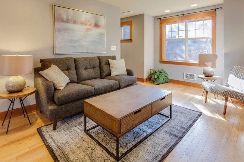
You might think that the small 2 seat sofa is the only option, when you might be able to fit a scale appropriate sectional in the room. It would take up a larger footprint, but it would create balance and comfort because it would fill the space better.
You Must Think Multi-function in Small Rooms.
Choose furniture that can serve a couple of functions, even if it’s a larger piece.
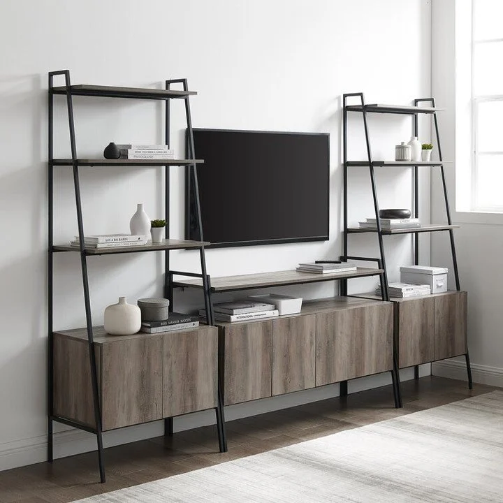
If your TV Console is dinky and your TV is huge, or even just larger than the TV Console in general, it disappears on a larger wall.
Two things are wrong.
First: the console is only serving one function. The place to put the TV.
Second: scale is off. Makes the space feel unbalanced.
The Solution: a larger and or taller console entertainment wall unit. It becomes a focal point, has storage, some open, some closed. It becomes functional, has multipurpose. It’s interesting symmetrical and balanced.
Vary the Height of Furniture.
Tall, open shelves or etagere. Ladder shelves, bring the eye up.
Huy Phan
If everything is on the same level, the space feels monotonous. There’s no inflection in the room and that’s boring.
So, always vary the height of furniture in a small room.
This is the rule of using the wall space: When you can’t go wide, go tall.
Even though you may have “shorter ceilings,” in the range of 7’ 5” or 8’, the height of a tall, open etagere will bring in some much-needed interest and height to a small room.
Choose Slim Profile Furniture.
For a living room, choose sofas or sectionals that have thin arms, and open bottoms.
Kenny Eliason
Heavy, rolled arms and skirts can make a large piece fell very heavy in small rooms.
Go for those slim profiles and you won’t sacrifice comfort, but the more modest scale of “larger” furniture will fill the room and feel size appropriate.
The same goes for other rooms:
In small bedrooms, it’s important to keep the furniture “lite.” That means, choose a bed that has a lot of openness to it. This would be head and footboards with bars that you can see the wall behind.
For furniture, kid’s furniture is often smaller scale and just as sophisticated looking like adult furniture.
This means, dressers are usually not as deep as adult dressers, the same goes for chests of drawers and nightstands. What you “loose” in depth, you gain in passable floor space. That’s a very good tradeoff.
So, skip heavy fully upholstered beds or canopy styles in smaller rooms and opt for open head and footboard, or low or no footboard beds.
Choose Rounded Accent Furniture.
Adding in some accent furniture with curves will help to balance the scale in the room.
Choose round end tables, demilune, or half-round console tables, oval cocktail tables, instead of squares or rectangles.
The edges of those tables will always create issues with positioning furniture in corners, floating in a narrow room, or positioned next to swivel chairs because there’s a higher chance of catching the corners.
Rounded is easier to navigate by, especially in narrow rooms.
You can still have a “larger” oval coffee table in a narrow room, be able to walk comfortably by in, and it will still look scale appropriate in the room as well.
What to Leave Out?
Ottomans: Specifically for accent chairs.
I’m all for ottomans in place of coffee or cocktail tables in smaller rooms, especially if they’re storage options. (That’s a multi-functional purpose.) But I say leave them out of the room if they’re supposed to go with an accent chair.
Emre Can Acer
They’re bulky and awkward to move around. You’ll probably spend more time scooting them out of the way to walk through the room instead of sitting with your feet up.
Get a recliner instead. The footrest is out of the way until you need it.
There are many stylish recliners, that don’t look like recliners to be found.
Here’s some of my favorite options now:
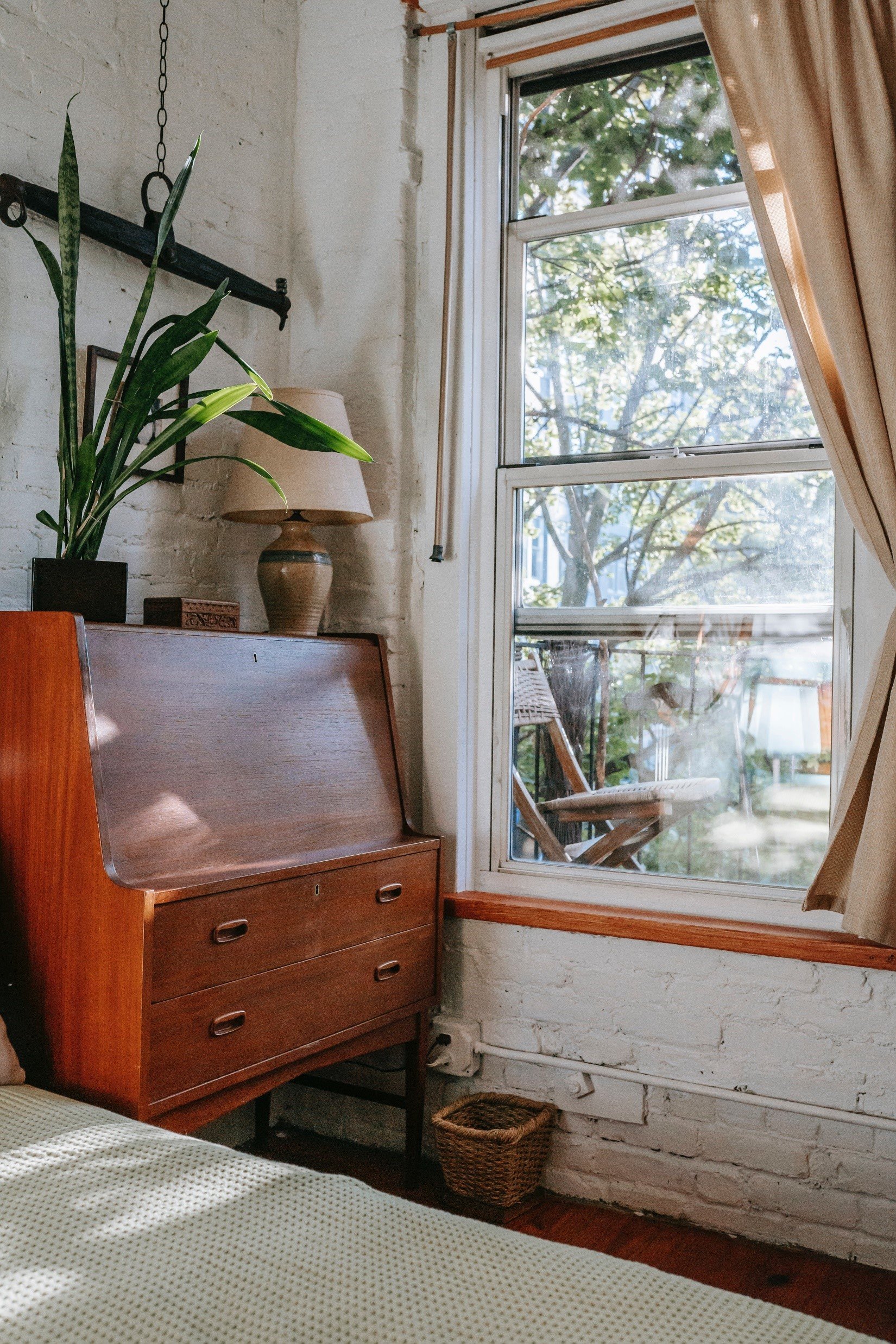
Heavy closed storage: This is deep, bulky closed cabinets or hutches.
They take up way too much room and close of the view to the wall behind them.
Pixabay
If you can see through to the wall behind “large” furniture, you’ll notice an immediate expansion of the room. That goes a long way to making large pieces in a small room work.
Michael Helwig Interiors
For storage, get some appropriately sized closed baskets or decorative boxes to go the shelves. Stick to the middle of the shelves down to the bottom for these and don’t get them so large they take up the entire shelf. Keep them scaled down so they don’t overpower.
Unnecessary “Extra” Furniture: This might get a little “touchy”, so stick with me…
These are pieces that may have sentimental value, like your grandmother’s hutch or an antique stereo.
Charlotte May
These pieces had a place in the homes of yesterday, but when you’re struggling with making a small room feel functional and comfortable, it’s best to leave these pieces in the past.
A stereo console that has really one function, and that takes up a lot of space, may feel like a cool item to have, and if that’s the case, by all means...
If not, you should do a gut-check to contemplate why you have it. If the only reason you have it is out of a feeling of obligation, you should consider letting it go.
The tough pill here is that you can’t create a bigger room and if something is more in the way, than useful, it must go.
Supplement The Scale of Furniture with Accessories.
Rug size:
I always say go bigger with area rugs.
This is squarely because of scale. A small rug in a big room looks like a postage stamp.
A small rug in a small room enhances the “smallness” of the room. It does nothing to define a seating area – which is the main purpose of an area rug.
Michael Helwig Interiors
So, take my word for it, an 8’x 11’ rug will fit beautifully in most small rooms.
Wall Art:
I know that it might be tempting to hang small art in small rooms, but don’t do it!
One small piece of art on an average size wall, will look dinky and out of place. It won’t highlight the piece, and if it’s one that you really love, it should be on a wall or displayed somewhere where the wall surrounding it is smaller and “frames” the piece better.
What do you put in its place? I say go big with art too.
Large art on small walls makes a statement. It adds impact and drama and gives you a wonderful opportunity to reinforce the color story for the room or enhance a texture that appears elsewhere in the room.
Hatice Baran
Big art in a small room is dynamic. Small art in a small room disappears and brings focus to the room size.
No window hugging curtains:
Curtains should never rest on the frames of the windows unless there is a super low ceiling or soffit above that prevents hanging your curtain hardware higher.
Hanging the curtains just below the ceiling or ceiling trim creates that much needed visual height in a small room.
Pixabay
It’s the same idea as bringing in a tall etagere, you’re highlighting height and it makes the room feel taller.
Here’s a post I wrote recently about what to do with the open space above the window. I’d don’t mind it at all, but if it bothers you, I think this will help.
Read Next:
You’re on the last leg of your makeover. You’ve agonized over ironing your new curtains; you’ve steamed them, so they hang perfectly. As you step down from the ladder to soak in all your hard work, you notice it… The empty space between the window and the ceiling. You don’t love it. Here’s 5 ways to fix it.
There you have it: what to do when your furniture is too small for the room:
Consider the Scale of Your Furniture.
Scale is a proportion between two sets of dimensions. But you can also think of scale like how you would measure the weight of something as well. In that way, scale would the pursuit of balance where weight is distributed equally.
You Must Think Multi-function in Small Rooms.
Choose furniture that can serve a couple of functions, even if it’s a larger piece.
Vary the Height of Furniture
If everything is on the same level, the space feels monotonous. There’s no inflection in the room and that’s boring.
Choose Slim Profile Furniture
Skinny arms on a sofa will take up less outside space than a large, rolled arm.
In bedrooms, open style bed frames work best because you can see through to the wall. Don’t discount the use of “kid’s” furniture. You’d be surprised at the style variations and scale appropriateness of them in small rooms.
Choose Rounded Accent Furniture
Rounded is easier to navigate by, especially in narrow rooms.
Join the Fun!
If you enjoyed this post and you want to keep seeing my weekly blog, the best way to do that is to subscribe.
You can subscribe by downloading my 11 Secrets Only Designers Know to Make Your Space Rock. If you’re curious about how decorators and designers make a home look magazine ready, you’ll love taking a gander at these 11 secrets. You’ll learn how to style your room from the floor up and it will work for ANY space you have.
I write about small space design and decorating, sustainable furniture options, positive self care and a variety of do-it-yourself home décor.
I’d love to connect with you!
“Michael Helwig was top-notch, very professional and responsive to my needs. He allowed me time to explore ideas and try out a variety of combinations until we found the perfect fit. Michael provided detailed information and offered beautiful ideas to make my dream living room become a reality. The furniture he sourced has totally transformed my living room space. Everyone that has seen my new living room has one word, WOW! A special thank you to Michael for a wonderful experience.”
“Michael was very knowledgeable and guided us, with great patience and good humor, through the process of designing our dining room and helping us find the perfect sleeper sofa. He offered really helpful advice when we asked questions - which was often - but at no time did we ever feel pushed. He helped me when I felt like I couldn’t make one more decision. When my new furniture finally arrived I realized everything down to the pillows was perfect. I couldn’t be happier!”
Inside Weather
Michael is Principal designer and blogger at Michael Helwig Interiors in beautiful Buffalo, New York. Since 2011, he’s a space planning expert, offering online interior e-design services for folks living in small homes, or for those with awkward and tricky layouts. He’s a frequent expert contributor to many National media publications and news outlets on topics related to decorating, interior design, diy projects, and more. Michael happily shares his experience to help folks avoid expensive mistakes and decorating disappointments. You can follow him on Pinterest, Instagram and Facebook @interiorsmh.


