Small rooms can be tough to decorate and arrange. You must find the furniture that will “fit” and that’s above and beyond the style of furniture and décor that you like.
On top of that, there may be wall colors or architectural features that you’ve inherited that are contributing to making the room feel even smaller.
If you’re feeling a little claustrophobic lately, these 5 tricks to make a small room look bigger can help.
Best of all, they’re quick and affordable changes that will have you feeling like you’ve moved to a palatial estate!
Well… Maybe not palatial, but bigger for sure.
Let’s get into it.
1. Use Scale Appropriate Furniture
Let’s get the one that could have you digging in your pockets out of the way first, deal?
Sometimes furniture that worked in a previous house, won’t work in the new place.
If you’ve moved to a new house with a smaller family room, your old giant ‘U’ shaped sectional might not work. Instead of trying to cram it in, it’s better to thank it for the years of service and bid it adieu, Marie Kondo style.
Hayley Bagwell
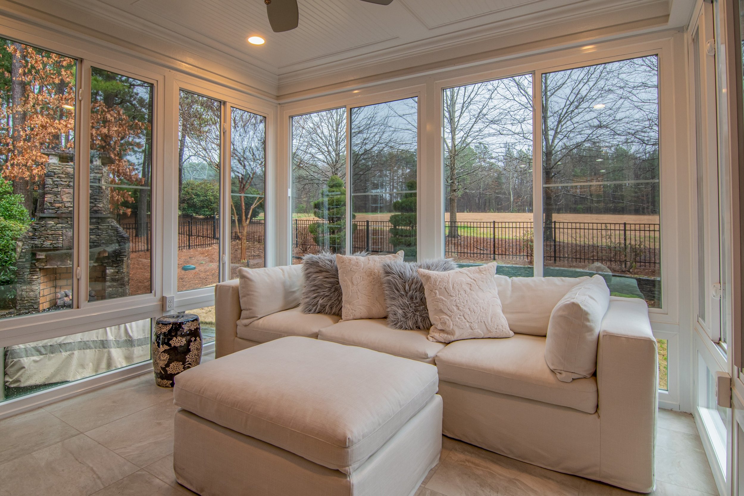
Using scale appropriate furniture doesn’t automatically mean you’ll go from a large sectional to a dinky 2 seat sofa. I happen to think larger furniture in smaller rooms can function very well.
The secret is to pick furniture that utilize the design principles of scale and proportion.
That means skip the over-stuffed bulky options, that take up a ton of floor space, and go for things that have more modest profiles.
It’s a common misconception that furniture with thinner arms, tight backs, or modest profiles are uncomfortable.
The reality is a deep sofa with thin outside arms and a tight back can be more comfortable and durable than one that is overstuffed.
Heloisa Vecchio
On average, tighter constructed upholstered pieces will also hold up to heavy use better than something with loads of pillowy upholstery. Those pillows tend to “deflate” and look awful in only a short time.
Don’t take my word for it.
Ask any designer around and they’ll tell you the same thing.
So, get furniture that fits appropriately, and your small room will go from being the place you avoid to the place you embrace!
2. Minimize the Contrast Between the Wall and the Ceiling
I’ve been accused of not liking color.
If you look at most of my designs, I have a lot of neutral, white, and gray rooms.
That doesn’t mean I don’t like color or can’t design colorful rooms.
It just so happens that I usually design small or tricky rooms that need ways to diminish things like low ceilings, or unconventional room shapes.
A high color contrast applied to these rooms highlights exactly what my clients want to change about them.
When you have a saturated wall color and a bright white ceiling in a small room, it makes the room constrict.
If the goal is to make the room feel larger, then you should minimize the color contrast between the wall and the ceiling.
Spacejoy
Now, I’m not saying you must paint the wall the ceiling the same color… (although I’ve done that before and it works very well to achieve a larger looking room.)
I’m saying lower the color contrast or use lighter colors in small rooms.
Now, there’s a slew of other factors like how much natural light your rooms gets, or the amount of artificial light your rooms has, and even the geographic location of where you live that will affect how color appears in your home. So, you’ll want options.
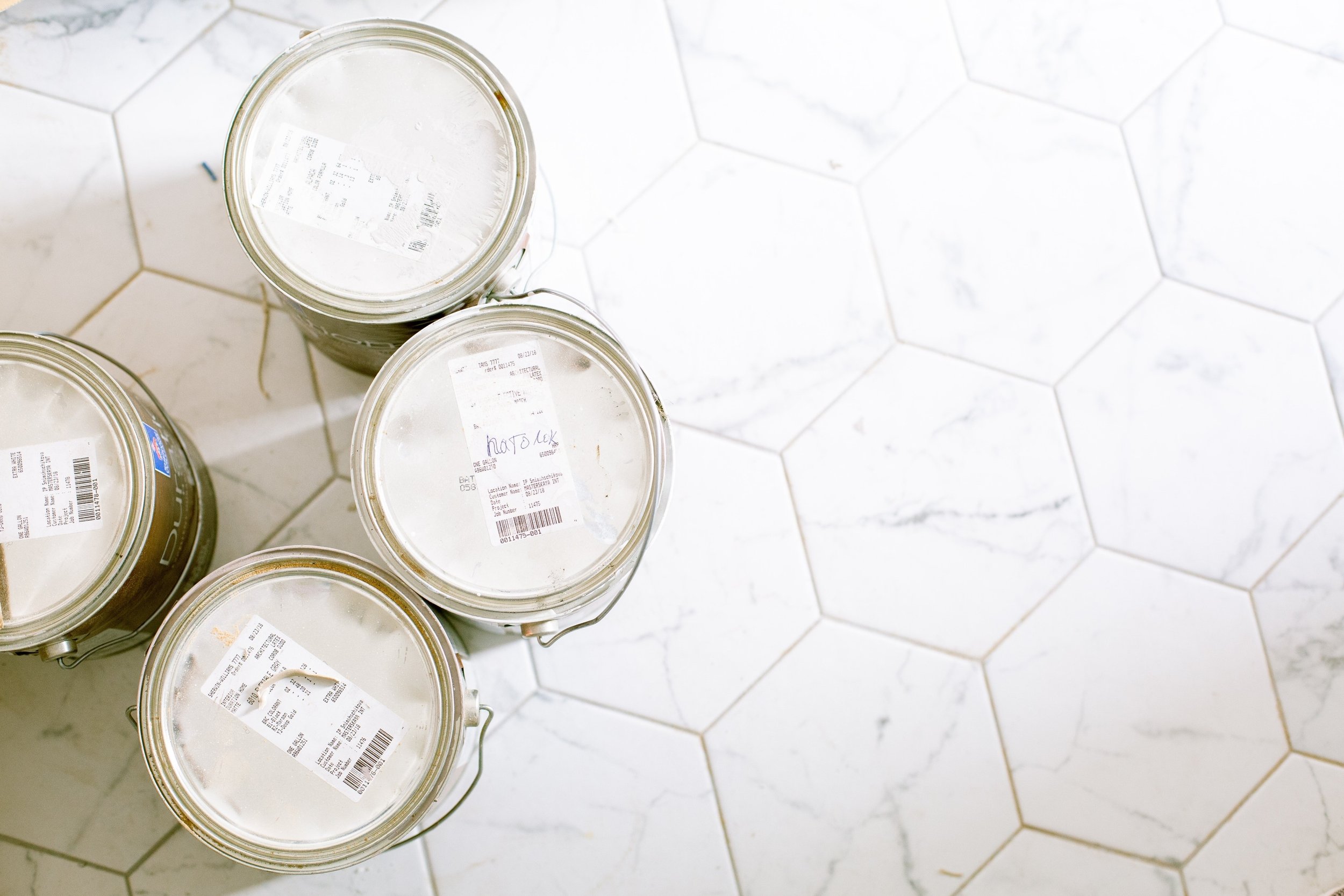
I always recommend buying small test containers of paint to swatch out wall color options before you commit to painting the whole room.
Not all white paint colors are the same just as not all green colors are the same, and so on.
Get a few options and paint a large swatch of each opposite the window(s) in your room and look at the swatches for a few days in different light -natural and artificial- before making your final selection.
La Miko
You’ll see how the color changes depending on whatever light is present in the room throughout the day.
3. Paint the Trim the Color of the Wall
Let’s stick to paint colors for another minute.
If you want your ceiling to appear higher, and if you have crown molding trim, paint that trim the same color as the wall.
Curtis Adams
This is a trick designers use to blur the line between the wall and the ceiling.
Crown trims are usually thinner and plain in smaller rooms.
However, there could be some dental trim or intricate profile to it that begs to draw your attention to it.
Painting the ceiling trim, the color of the wall adds the width of the trim back to the height of the wall. This makes the ceiling feel taller.
Conversely, painting the ceiling trim in a small room the same white as the ceiling will subtract the width of the trim from the wall, making the room feel shorter.
Will this make a HUGE difference? It won’t make a short room feel significantly taller, but it will be noticeable for sure.
4. Hang Curtains High and Make Them Blend in with the Wall Color
I’m sure you know the design pro tip: hang your curtain rods high to make the window appear taller.
That’s a widely used and sound advice.
I agree with it 100%.
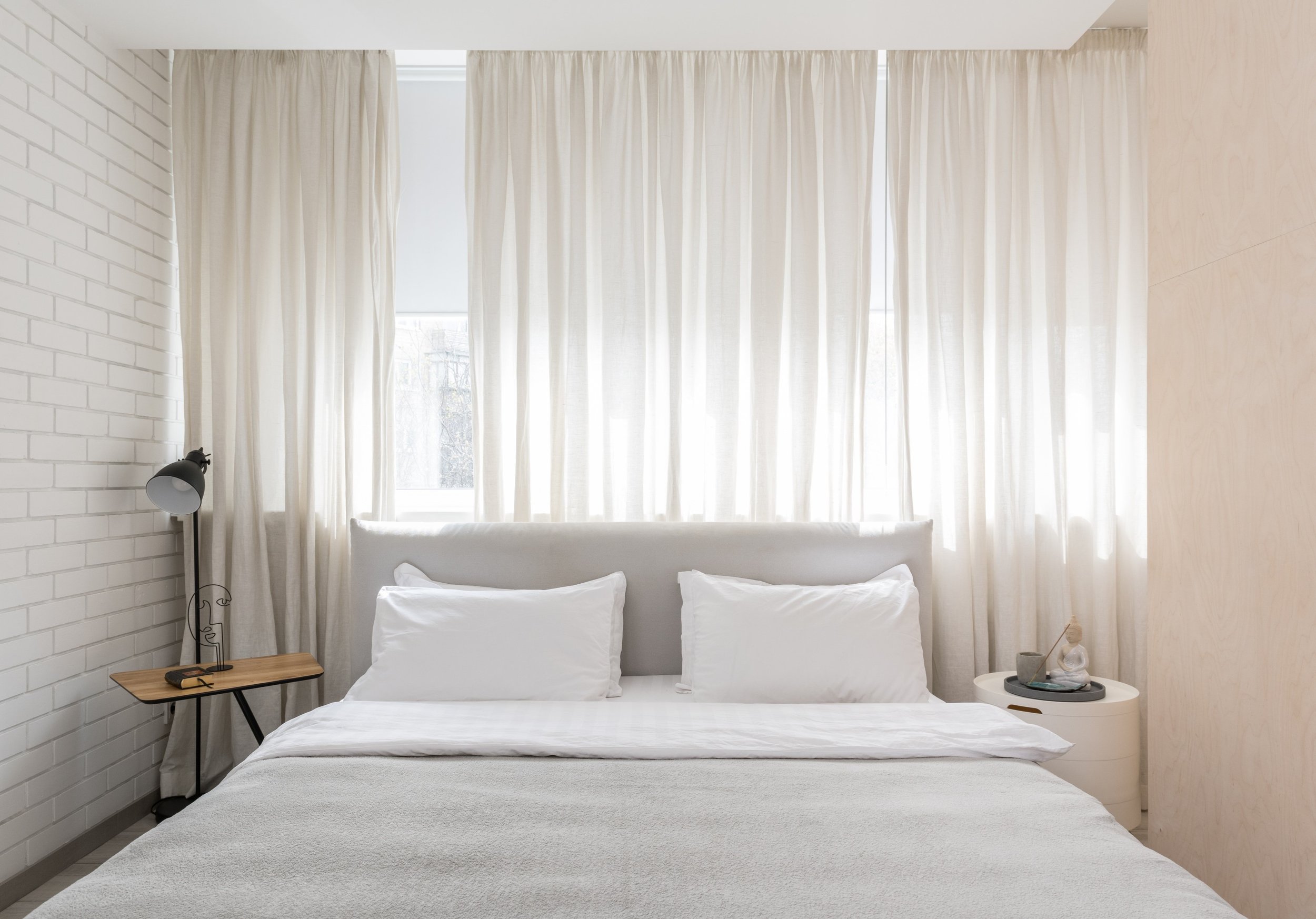
But, to make a room feel bigger, I say hang that rod high and choose a curtain color that is like the wall color.
Max Vakhtbovych
The goal again here is to diminish the contrast between the wall and the ceiling.
Curtains that are highly contrasting to the wall will bring focus to the height and width of the room.
As you notice the color contrast, your eye will scan up and down, side to side, and your brain will register the shorter ceiling despite hanging the curtain rod high. In fact, the color contrast will be immediately apparent when you look at the window wall.
Also, a fuller curtain panel in a contrasting color will make the wall seem smaller because there’s more width of color contrasting the wall color.
It defeats the purpose of making the room feel bigger completely.
When you choose a curtain color that’s similar or the same as the wall, you can have full and tall panels that will enhance the subliminal message of wall height you’re sending.
Plus, a monochromatic color composition looks amazing in any style of room.
Give it a try.
5. Bring the Eye Up
Htu Ali
Finally, if you want your room to look bigger, use taller furniture and décor to emphasize attention.
• Hang two or 3 frames vertically.
• Use a tall and open etagere to display curated items.
• Hang a tall mirror on the wall.
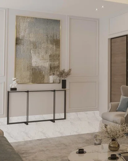
• Hang a tall piece of art on the wall.
The purpose is the verticality of these pieces will encourage you to look up. As you scan up and down, your brain will register the perceived abundance of space.
This will work the same way above lower, horizontal things like a sofa, credenza or console.
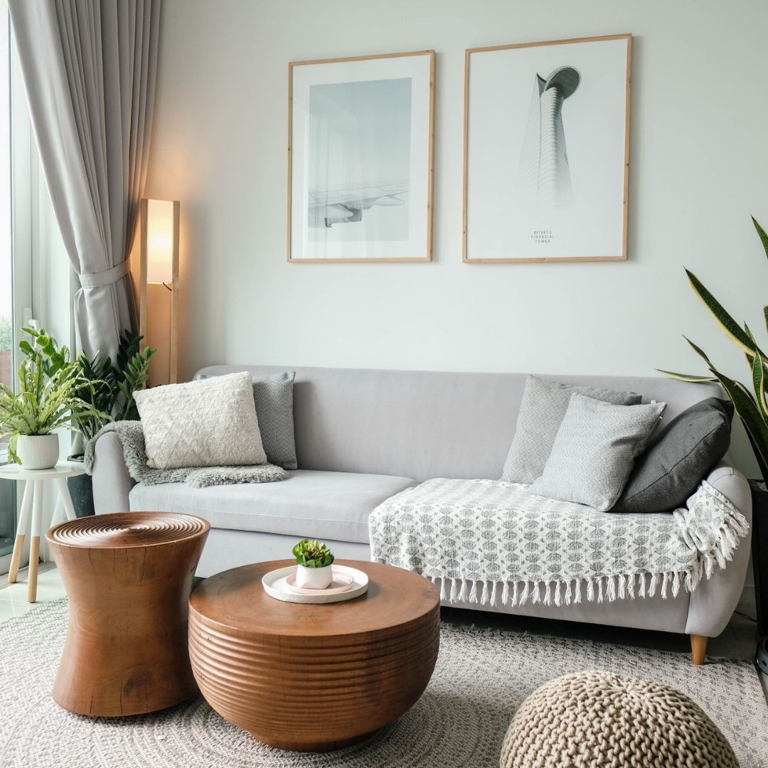
Hang 3 taller pieces of art above the sofa. Your eye will follow the height up.
Hang 3 tall decorative mirrors above the credenza or console table. Again, your eye will follow the height up.
Give these 5 tricks a try and let me know how it goes. I love to read your comments and to learn how you make out.
Remember, don’t get frustrated by your smaller room. Embrace the size and make it work for you!
To sum up:
1. Use Scale Appropriate Furniture
2. Minimize the Contrast Between the Wall and the Ceiling
3. Paint the Trim the Color of the Wall
4. Hang Curtains High and Make Them Blend in with the Wall Color
5. Bring the Eye Up
Up Next
These 6 rules will help you arrange and define a seating area, make the best use of certain types of furniture, and utilize the height of your walls like a pro. You’ll also learn how to avoid a common small room mistake so your room will feel larger immediately.
Join the Fun!
If you enjoyed this post and you want to keep seeing my weekly blog, the best way to do that is to subscribe.
You can subscribe by downloading my 11 Secrets Only Designers Know to Make Your Space Rock. If you’re curious about how decorators and designers make a home look magazine ready, you’ll love taking a gander at these 11 secrets. You’ll learn how to style your room from the floor up and it will work for ANY space you have.
I write about small space design and decorating, sustainable furniture options, positive self care and a variety of do-it-yourself home décor.
I’d love to connect with you!
“Michael Helwig was top-notch, very professional and responsive to my needs. He allowed me time to explore ideas and try out a variety of combinations until we found the perfect fit. Michael provided detailed information and offered beautiful ideas to make my dream living room become a reality. The furniture he sourced has totally transformed my living room space. Everyone that has seen my new living room has one word, WOW! A special thank you to Michael for a wonderful experience.”
“Michael was very knowledgeable and guided us, with great patience and good humor, through the process of designing our dining room and helping us find the perfect sleeper sofa. He offered really helpful advice when we asked questions - which was often - but at no time did we ever feel pushed. He helped me when I felt like I couldn’t make one more decision. When my new furniture finally arrived I realized everything down to the pillows was perfect. I couldn’t be happier!”
Minh Pham
Michael is Principal designer and blogger at Michael Helwig Interiors in beautiful Buffalo, New York. Since 2011, he’s a space planning expert, offering online interior e-design services for folks living in small homes, or for those with awkward and tricky layouts. He’s a frequent expert contributor to many National media publications and news outlets on topics related to decorating, interior design, diy projects, and more. Michael happily shares his experience to help folks avoid expensive mistakes and decorating disappointments. You can follow him on Pinterest, Instagram and Facebook @interiorsmh.

