In the last year, many of us have been working from home. That might be good or bad depending on a number of factors. But one thing I know is working from home typically involves blurred boundaries between when it’s time to work and when you live your life.
Not having a workspace set up for how you work AND how you live can make this kind of arrangement really tough.
Spending the majority of your time in a room that doesn’t support what you need for your job is a frustrating endeavor. It’s so important to understand what you need to make a work from home set up work for you.
If you don’t know exactly how to create a functional and aesthetic small home office space, then this post is for you.
I’m going to show you my 5 best tips for planning the layout for your small home office so you can create a space you’ll actually want to be in.
Let’s get into, 5 ways to create a functional and aesthetic small home office.
Now in all fairness, I have tailored this post around my own home office and it needed a makeover BAD! I had way too much stuff stuffed in every corner and it was a miss matched, catch all room that I didn’t want to spend any time in.
It took me a few tries to get the office set up so that it works the best for me. Now, everything I have in my office is tailored to me, but the process I used to make the room function and look the way it does is totally universal.
What I stumbled upon in the process of making this office space over is there’s five very specific things that I did that really made this project come together successfully.
1. I Made a List of Must Haves, My Wish List.
This list helped me set some parameters for how I wanted the space to function, feel, and look.
It was something that really kept me on track with the project, so I didn’t go all willy nilly in a dozen different directions buying things I didn’t need or making decisions that were outside of the scope of what I wanted for the room.
So, to keep yourself on track, take some time to think about what you need and what you want.
I found it helpful to structure this list around:
Need: Furniture, storage, display.
Want: color scheme, style,
Purpose: technology, shared space or dedicated.
For need, that would be things like do you need a desk, large or small? Does it need to have drawers or shelves for organization? What other pieces do you need/want? Filing cabinet(s)? Cabinet(s)? Shelves?
Sam’s Club
For want that is paint color, wallpaper, upholstery, do you want to focus on a certain style: farmhouse, Mid Century Modern, Industrial, Scandinavian?
Target, Wayfair
And for purpose, do you need the certain technology to do your work: computer(s), camera(s), on camera lighting, dedicated WIFI? (All important to think about because everything has to have a place to live.) Is the office shared with another person? Is it shared with another purpose like being a guest room, den, basement family room, etc.
Josh Sorenson
For me, I needed a desk that had drawers for my pens, paper, and all the paraphernalia that desks hold: tape, stapler, yada, yada.
I also wanted some display space for decor and such.
I knew I was going to be meeting with clients on web calls and recording videos, so a pretty background was a top priority on my wish list.
So, you should include not only things you need for functional purposes, but you should also pay attention to the aesthetics too.
Another thing to think about is space for visual inspiration. For me having bulletin boards for swatches, to do lists, procedures, processes, anything I could get out of my head and up on the wall is super important.
I also have a white board calendar that I change monthly, so much better than a throw away paper calendar, right? I like having my white board calendar for scheduling blog posts, content updates, sales schedules and launch data.
Having a calendar on the wall is easy for me to glance a month’s worth of stuff at a time.
Pottery Barn
Client meetings, and other important appointments go in my phone calendar, which is synced to different apps as a back up in case I need to schedule anything when I’m outside my home.
TMI I’m sure, but this is all a part of the wish list planning that helped me to create this function for myself.
Because I use my office as a workspace and living space, I wanted to have a spot for reading. I also wanted to be able to put my feet up while reading so I was on the hunt for a slim recliner that would tuck away in one corner.
Wayfair
It took me a minute to find it, but when I did it checked all the boxes for the space I had and the look I was going for. (More on all that in a bit…)
The last thing that I absolutely needed-and one thing I wanted as well, was over head lights.
Home Depot
Up until I made over my office, I had a bulky table lamp on my desk. I decided that had to go because it took up a ton of space and with my computer, notebooks, cameras, audio and design samples, there wasn’t any room left at the desk for me. The easy fix was to remove the lamp and install plug in wall sconces.
They give me more and better light for working and the take up zero space on my smaller desk, bonus!
2. Sketch and Measure Your Room.
I know I say this a lot but it’s probably the essential part of any room makeover. The measurements of the room hold all the answers to what’s possible and the sketch gives you a visual for all the spots in the room that could trip you up as you navigate through your makeover.
Immediately, you’ll be able to see the shape of your room and exactly how much space you have on any given wall. That alone will make a significant difference if you’re buying furniture online or in a store. It’s a total safety net that keeps you from making expensive mistakes.
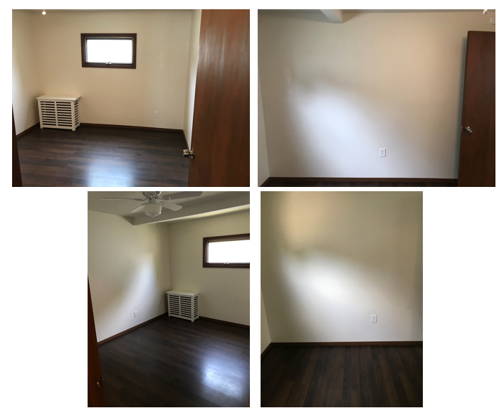
After that you should take pictures of each wall so you can really have a visual reference for how big or small the space is.
Your room sketch is great, but it’s not accurate. It’s a loose sketch of the room.
So, I recommend keeping pictures of the actual wall to remind you how the room looks when you’re away from it and making decisions.
For example, you could look at your sketch and feel like there’s more space than there actually is.
You might not look at the measurements and just look at the sketch and think, heck yeah I can fit a wraparound desk in there when actually, there’s no way.
If you have pictures to cross reference with your sketch and measurements, now you have a much more wholistic representation of the room.
Pro Tip: Above all, when in doubt, trust your tape measure, not just the sketch of the room.
3. Take Pictures of each wall.
Again, stand in the middle of the room and snap pictures of each of the 4 walls. I like to be a little extra and take a few shots from the corner to opposite corner as well.
It doesn’t matter if you have a fully furnished or empty room, the pictures are a great cross reference to check the size of each wall, where the door swings into the room, how much space you have under a window, how far a ceiling light fixture hangs down, what kind of space you have in a nook or niche, how far closets bump out.
Your sketch will have the shape and dimensions, but depending on how you drew the sketch, the space could seem bigger or smaller. The picture is the how you can clear up questions about areas and space you’re unsure of.
A picture’s worth a thousand words. Well, at least 4 pictures of your room and a sketch with measurements could save you thousands in costly mistakes and return hassles.
4. Next up you’ll want to create a floor plan.
The floor plan is different than the sketch.
A to scale floor plan a handy tool for testing out the physical fit of the furniture you want to put in the room. It combines the sketch and the measurements to give you the most accurate layout.
Now, I use an electronic floor plan tool because I do tons of design work. This tool allows me accurately to input my room dimensions and it generates a model of the room. Each wall and everything in the space has a specific and true dimension.
You don’t have to use software to make a floor plan. Graph paper will work. All you have to decide is what each 1/4” block on the graph paper translates to. The easiest is 1/4” equals 1 foot. Then you apply that measurement to the entire floor plan and all the furniture in it.
HGTV
In this case, a pencil with an eraser will be an essential tool.
Where the sketch gives you the shape of the room, the floor plan gives you actual space to work with.
5. Pull Any Inspiration into a Mood Board
The purpose of a mood board is to create a visual road map for where you want the design direction for your room to go.
This is certainly about stretching your creative muscles but it’s also a visual check to make sure what you’re planning to bring into your space make sense with everything else.
Michael Helwig
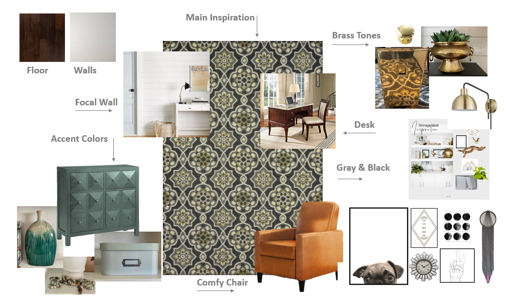
I always start with the things that aren’t changing in the room.
Maybe you’re not changing out the flooring or paint color.
I’ll make a swatch of those things first and put it into my mood board.
Next I’ll figure out my inspiration piece . This is one thing that informs the other decisions usually in terms of color. One of my favorite things to pull inspiration from is area rugs. They can provide a ton of color options for a space.
Target
How I tackled this room was I first pulled the main colors I wanted to use from my rug. I pulled out the charcoal grays. That provided guidance to go lighter and darker in the shades of gray I liked.
The rug influenced all the touches of black I pulled in from the picture frames on my gallery wall to some of the decor I featured on my shelves.
After that I pulled out the gold tones in the rug and I translated that into the drawer pulls on my desk and storage cabinet. Then I also repeated that same metallic tone in much of the decor throughout the space.
Michael Helwig
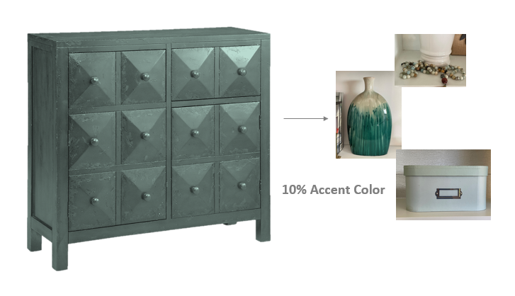
The teal green cabinet was my 10% new color addition.
Michael Helwig
I didn’t have other things in the room with that saturated color, so I introduced a vase and some faux plants on my shelves to provide a similar tone.
When you make commitments to your color choices, make sure to repeat those colors throughout the space so your outcome will feel connected and consistent.
That’s exactly what the mood board is designed to do.
And that’s how you create a functional and aesthetic small home office.
Remember to:
Write out a wish list of must have things in the space
Taking the time to sketch and measure your room
Having at least one picture of every wall to refer to when making decisions
Plotting out your space to scale so you know what you’re choosing will fit as you intend it to
And, creating a mood board to use as a design road map to make sure your design is cohesive and consistent.
If you follow these 5 steps, you’ll most certainly arrive at a small office design that’s super functional and aesthetically pleasing for many years to come.
The comfy chair
My shelf styling
The focal wall
Marqui on her chair
To see the full transformation, click the video at the beginning of the post.
Join the Fun!
If you enjoyed this post and you want to keep seeing my weekly blog, the best way to do that is to subscribe.
You can subscribe by downloading my 11 Secrets Only Designers Know to Make Your Space Rock. If you’re curious about how decorators and designers make a home look magazine ready, you’ll love taking a gander at these 11 secrets. You’ll learn how to style your room from the floor up and it will work for ANY space you have.
I write about small space design and decorating, sustainable furniture options, positive self care and a variety of do-it-yourself home décor.
I’d love to connect with you!
“Michael Helwig was top-notch, very professional and responsive to my needs. He allowed me time to explore ideas and try out a variety of combinations until we found the perfect fit. Michael provided detailed information and offered beautiful ideas to make my dream living room become a reality. The furniture he sourced has totally transformed my living room space. Everyone that has seen my new living room has one word, WOW! A special thank you to Michael for a wonderful experience.”
“Michael was very knowledgeable and guided us, with great patience and good humor, through the process of designing our dining room and helping us find the perfect sleeper sofa. He offered really helpful advice when we asked questions - which was often - but at no time did we ever feel pushed. He helped me when I felt like I couldn’t make one more decision. When my new furniture finally arrived I realized everything down to the pillows was perfect. I couldn’t be happier!”
Michael is Principal designer and blogger at Michael Helwig Interiors in beautiful Buffalo, New York. Since 2011, he’s a space planning expert, offering online interior e-design services for folks living in small homes, or for those with awkward and tricky layouts. He’s a frequent expert contributor to many National media publications and news outlets on topics related to decorating, interior design, diy projects, and more. Michael happily shares his experience to help folks avoid expensive mistakes and decorating disappointments. You can follow him on Pinterest, Instagram and Facebook @interiorsmh.


