I got to thinking the other day about that Kohler commercial from years ago where this couple is being ushered around a sprawling Architect’s office and he’s going on about how amazing his work is, yada, yada. After his tour of self greatness he asks, “what can I do for you?” The woman pulls out a faucet from her purse and says, “design a house around this.” I used to laugh at that. How can a whole house be designed around a faucet? Fast forward years later and I’ve had countless meetings where clients have had inspiration pieces they want to incorporate into a space: treasured art, heirlooms, travel momentos, you name it. The point is, inspiration to makeover any room in your house can come from anywhere. It literally happened to me this week: I got excited about redoing my home office. My idea came about literally from moving a small planter from my living room into my office. Right after I put the plant on my shelf, I had this rush of inspiration to clear out and Marie Kondo the crap out of my office! As I was working formulating plans, it occurred to me that this is the perfect opportunity to talk about how I often start makeover projects. It’s a lot like the Kohler commercial, a sort of reverse engineering inspiration and it works great, especially when you’re not sure where to start.. Let’s get into Where to find inspiration for a room makeover when you’re stuck.
Where to find inspiration for a room makeover when you’re stuck, Tip 1:
Figure what your inspiration piece is:
Just like in the Kohler commercial, find something that inspires you. For me, it’s this green planter with a succulent plant in it. I knew that I wanted to incorporate it into my office because it has a BoHo vibe, a bit of color and a classic shape. At this point I don’t have a firm direction for how I want everything to look, I just have a general feeling or vibe.
Now my planter is simple and that is another thing I want for the office: simplicity. In addition, it must feel calm, creative and uncluttered for me to want to work in there. Concentrate on how you want the space to feel because that is the most important part when you find that you’re stuck. Write down those adjectives that describe how you want to feel when you’re in the space. It’s essential to have these parameters top of mind because they are the foundation to the entire design, Believe me, if you get this part down, you’ll always want to spend time in that room.
Where to find inspiration for a room makeover when you’re stuck, Tip 2:
Take your adjectives and write a descriptive phrase for How you want your room To Feel.
I take my adjectives from before and I come up with a descriptive phrase for how I want the room to feel. This is the second step for where to find inspiration for a room makeover when you’re stuck. In my case, my adjectives are: calm, creative and uncluttered. A descriptive phrase would be: calm, creative, uncluttered home office. That is very broad and can work fine but, if you want to define the feeling further, you can expand to include other parameters as well. For example, I know I want my office to have white walls because that is part of the aesthetic I am going for. So, my specific descriptive phrase would be: calm, creative, uncluttered home office with white walls.
Where to find inspiration for a room makeover when you’re stuck, Tip 3:
Find images that reflect how you want your space to feel:
The next step for where to find inspiration for a room makeover when you’re stuck, is to find some images that reflect how you want the room to feel. I like to use Pinterest or Google to search for my images. I will find three images that really resonate with me. The images don’t have to look the same, in fact most of the time they may be very different but, as you’ll see in a bit, you’ll find a lot of similarities between them. I limit my results to 3 images to avoid going down the rabbit hole.
Where to find inspiration for a room makeover when you’re stuck, Tip 4: Formulate your plan based on similarities.
As you study the pictures, you’ll start to notice some similarities between them. Look closely and you’ll find certain wood tones repeated in each image, or a style of upholstery or artwork that you’re attracted to that shows up in each image. Look at how the furniture is arranged and notice how the space is used. Is it very full, or is the space open and uncluttered? Take notice of the textures, patterns and colors going on in each picture, you’ll start to see them repeated. These are important to discover because they are the foundation for your style direction. The point is there’s going to be similarities that you’ll be able to pick out with each. Be open to what you find because your subconscious already knows how you want your space to be and the pictures will highlight those details.
Where to find inspiration for a room makeover when you’re stuck, Tip 5:
Compile the similarities into a formula.
If you’ve been following me for a while, you’ll probably know that I have a specific way of approaching a design composition. As I mentioned earlier, I’ll start with area rugs, window treatments to or wallpaper to find color inspiration. After that, I choose upholstery and wood furniture, then art, then lighting, accessories and wall color last. I’ve found this formula to be the best way to structure my designs.
For this scenario, I would stick with the exact same formula. Since I will not be using wall paper in the design, I’ll use the window treatments as my starting point. I know I want to stick with the same simplicity plan for everything, including the details. I’ll look at my inspiration photos and see what the window treatments look like and I’ll do a search for products that have that same feel. In my case, since my rug is solid color and texture without pattern, the window treatments will be my starting point for my color and patterns.
Here is how I would bring my new home office design together using the formula I described above:
I don’t want a ton of color in the space. So The shades in my inspiration photo are a good option, crisp and white. Since I do not need privacy or light filtration on that side of the house, I’m going with a neutral, simple geometric pattern Roman shade. In my mind, it is a bright white, not so much a beige like here. I’m just using this picture as a reference for pattern and possible scale. Sometimes you’ll find pictures that are close to what you have in mind but not right on the mark. That’s okay. Remember, this is just getting the feeling or mood of your space established.
I already have much of the furniture in my office and I’m going to give certain pieces a remake with some paint and polish. I have this comfy chair that I use all the time for reading and journaling so I’m going to keep it. The small table next to it is currently a light wood tone, which doesn’t match the other wood tones in my space, so it will be getting a white wash to match with the shelving and other cabinetry in the space. The purpose is to create unity. The room is small and having a bunch of different colored furniture makes the space feel disconnected. The vibe I’m going for is not sleek, and modern, so painted furniture with a slight mid-Century feel and a touch of Bohemian is what I’m after.
The artwork I plan on using will be neutral. I’m going for classic black and white. I find that because I work with so much color all of the time, I want to have a space that is not so colorful. I still want personality and whimsy, hence the curious pug. I’m going to do a wall gallery with different size picture frames. The wall is not super long and I don’t want to add a ton of distraction, so 5 moderate sized prints will work great. I will use black frames to unify the art and that will also add impact and focus to the space as well.
The lighting is next up on the list. Currently I have a desk lamp and a bunch of cork boards on the wall. I am a very visual designer, so I often have a lot of pictures or documents that I need to see to keep my projects going. The lamp is tall and slim but it still takes up space and interferes with the right side of my board. I’m always stretching to see what’s behind it. To eliminate this I’m going for 3 sconces that are wall mounted. I chose a brass tone to match my desk hardware. I like the metal tone and picking that same tone in other elements in the room will work great for unifying the space. Mounting the sconces to the wall will also free up that important real estate on the right side so I can pin my inspiration to my heart’s content!
Time to accessorize! I instantly feel for this picture bathed all in white. My shelving is currently a hodge podge of mid-Century walnut and Ikea shelves. My plan is to make them look like a built-in and then unify them with a bright white to bring the look together. So, the reason this inspiration picture works so well is that the shelving is bright white and all of the wonderful stuff on it shines because of the super neutral background. Here again, the touches of gold and brass make an appearance and all the other elements, geodes, live plants, and natural décor like drift wood, is right up my alley! The brass handles on the cabinets also tie in with the hardware on my desk.
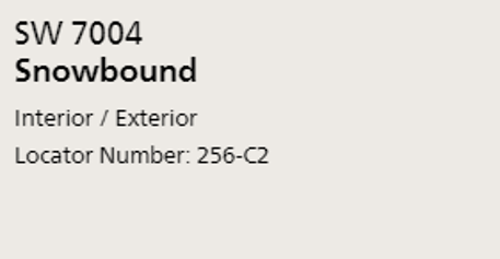
The last thing I always pick is my paint color for the walls. This is because I have everything else selected and the paint color is very easy to find when you have everything else selected. You can easily see what colors and tones go with all the other elements you focused on earlier. For my office, I selected snowbound by Sherwin Williams. It’s a fantastic white/taupe with a very slight warm gray undertone. I’ve worked with it before and I always love the way it reads in many different lights. My office has only one window and doesn’t get a tone of natural light, so I wanted a white that I knew wouldn’t come off as too cool or would look ‘neon’ when I put the lights on. Since I work at all hours, I also wanted a color that was calm and would absorb light instead of reflect it when I’m up late or early hammering away at a project. Snowbound does that beautifully!
That’s where to find inspiration for a room makeover when you’re stuck. If you deconstruct where you want to end up with your look, it’s so much easier to bring it all together! I’d love to hear what you thought of this post in the comments below, I love to read what people say. If you tackle a new makeover project yourself, I’d love to hear all about it. Head on over to Instagram by clicking my link below and follow me so we can inspire each other! I post daily pictures of things I’m working on, inspiration, places that I visit on my travels.
Until next time, rock that makeover and send me pics so I can see!
Michael is Principal designer and blogger at Michael Helwig Interiors in beautiful Buffalo, New York. Since 2011, he’s a space planning expert, offering online interior e-design services for folks living in small homes, or for those with awkward and tricky layouts. He’s a frequent expert contributor to many National media publications and news outlets on topics related to decorating, interior design, diy projects, and more. Michael happily shares his experience to help folks avoid expensive mistakes and decorating disappointments. You can follow him on Pinterest, Instagram and Facebook @interiorsmh.


