Call them finishing touches or final details, the accessories we add to our space tell the story of us. They show our friends and family what is important to us and what our personal style is all about. It doesn’t matter if your house is small, large, contemporary or traditional, these combined 20 tips will work. This is a follow up post to a piece I wrote in May of 2017. Just as in the first post, these new 10 tips for accessorizing your home like a pro will work for any occasion or season. I will be sure to link that original post below so you can check it out. Let’s get right into it.
Add Mirrors to Your Space
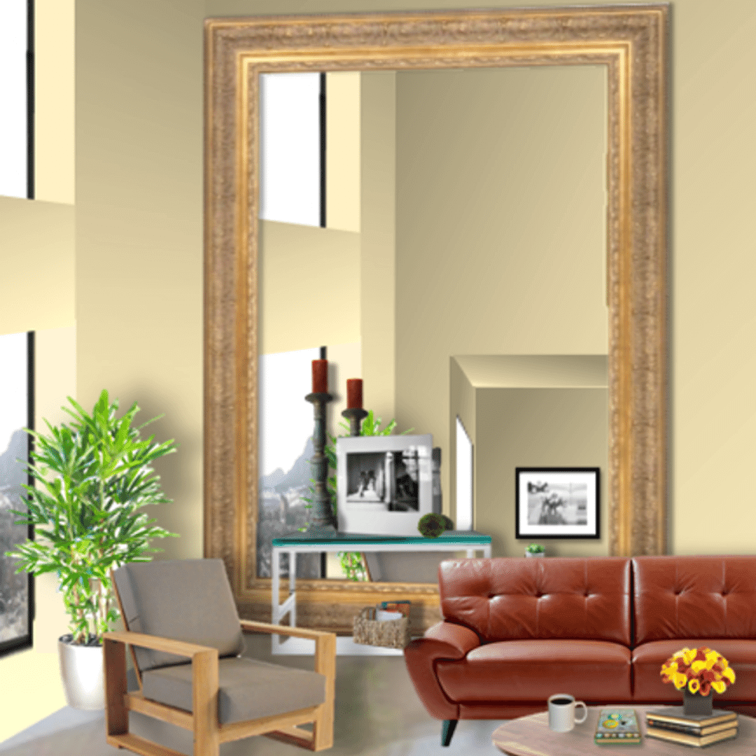
Mirrors can help maximize the light in your space. Place the mirror perpendicular to your windows to capitalize on as much natural light as you can. Large, leaning mirrors that are placed directly on the floor, can make a small room look and feel larger, visually doubling the space. It tricks you into thinking there is another room. Suddenly a small space feels opens and that can make the difference between feeling confined and expansive. Mirrors also give you the opportunity to reinforce the overall design style of the space. You can add in a large floor mirror with an ornate gilded frame to highlight a traditional or bohemian vibe. Frame-less or minimal frames will help to define a modern or minimal space.
2. Don’t Forget About Lights
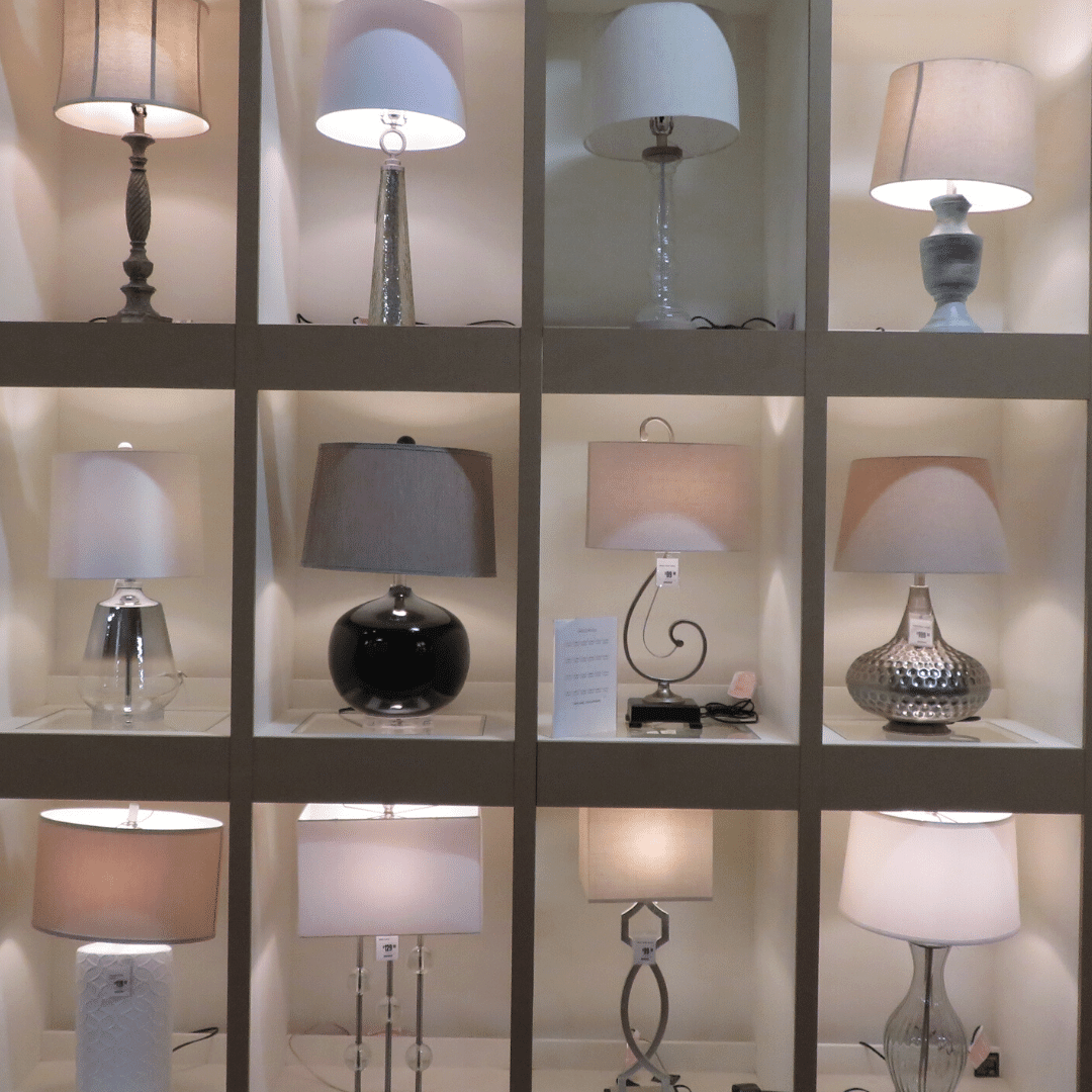
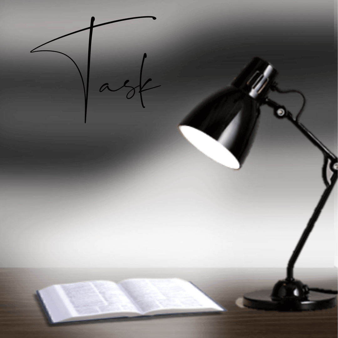
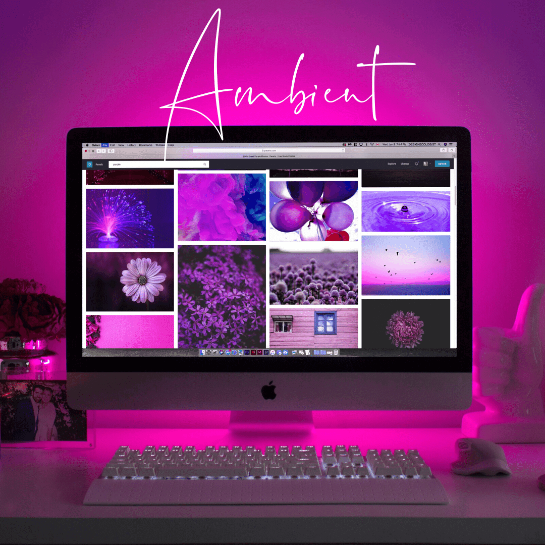
Lamps can add shape, height and texture to your space. A beautiful lamp can reinforce your color story as well. In design, we typically use 3 kinds of light: general, task and accent.
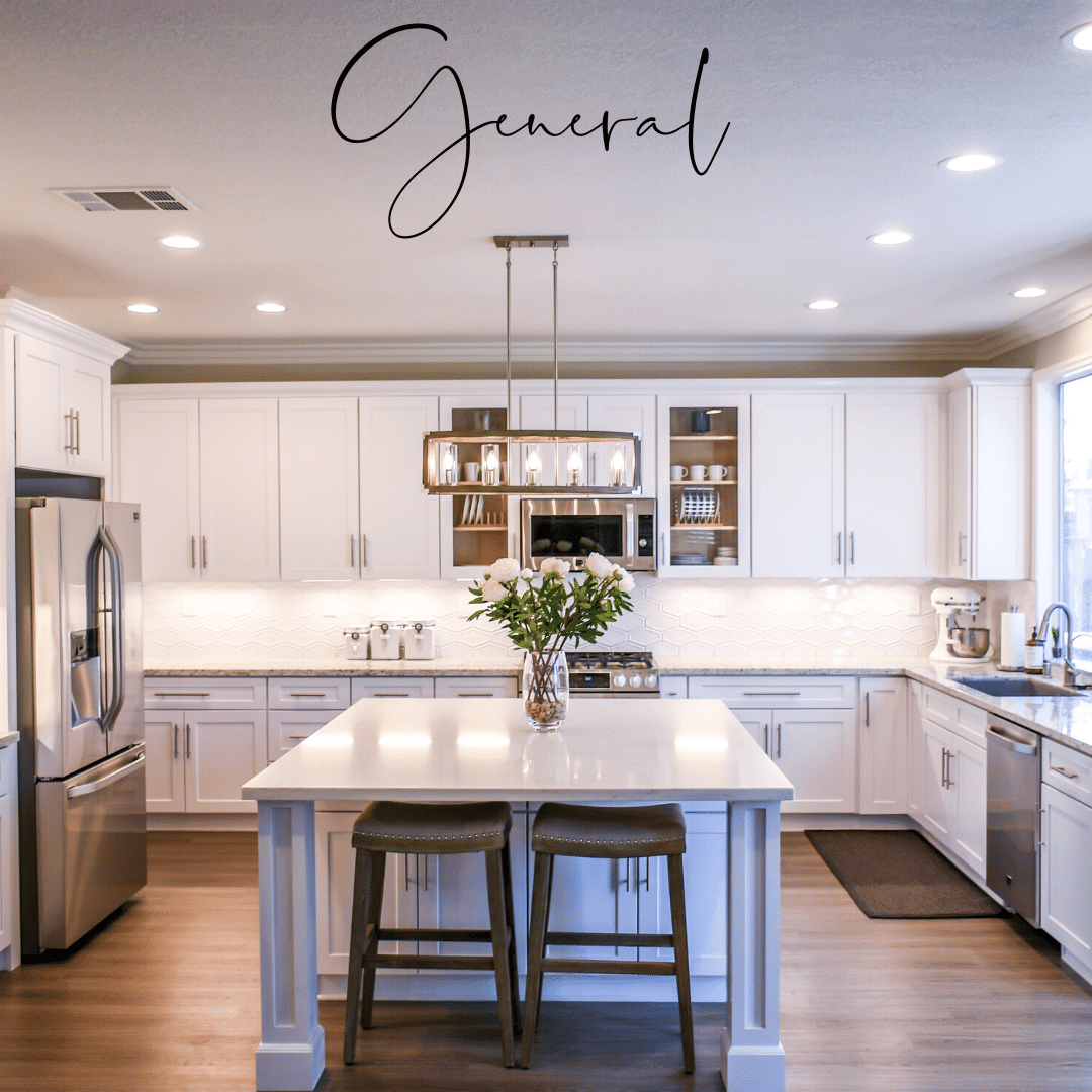
1. general “ambient”- this is your overall lighting, ceiling lights, chandeliers, recessed lights, they make up the general lighting in the room.
2. Task- help you to accomplish tasks like reading. These are floor or table lamps. This light is more utilitarian, helping you to read, work or complete other tasks that require direct light.
3. Accent- defines or highlights certain things. Think can or up-lights behind a plant or screen, directional spots on art or architectural elements you want to highlight. They add interest and drama to your space.
Light will emphasize anything that it shines on. It will create shadow and contrast so remember to use it to highlight those things. If you don’t want to draw attention to something, it’s best to rethink bathing it with light.
3. Add Patterns
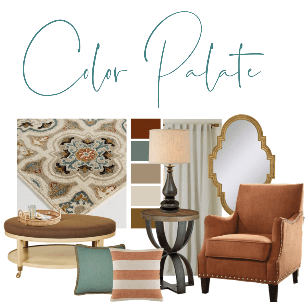
A small, a medium and a large pattern adds visual interest to your space. - I love to use this technique when choosing soft accents for a room: area rugs, pillows and window treatments. Simply, it’s choosing accents that have a small, medium and large pattern to add layers to a decorating scheme. In this rendering, the sofa, wall color and fixtures are all neutral and can accommodate any accent color combination. It can easily be updated seasonally to introduce a whole other color scheme. The small pattern of the green pillow is more texture with a tone-on-tone appearance, the medium pattern of the rug incorporates the colors in the large pillow, which acts as a bridge to the small pillow’s bold color. Paired together, the accents work to create a palate that can easily be replicated throughout the space.
4. Curate Your Collections
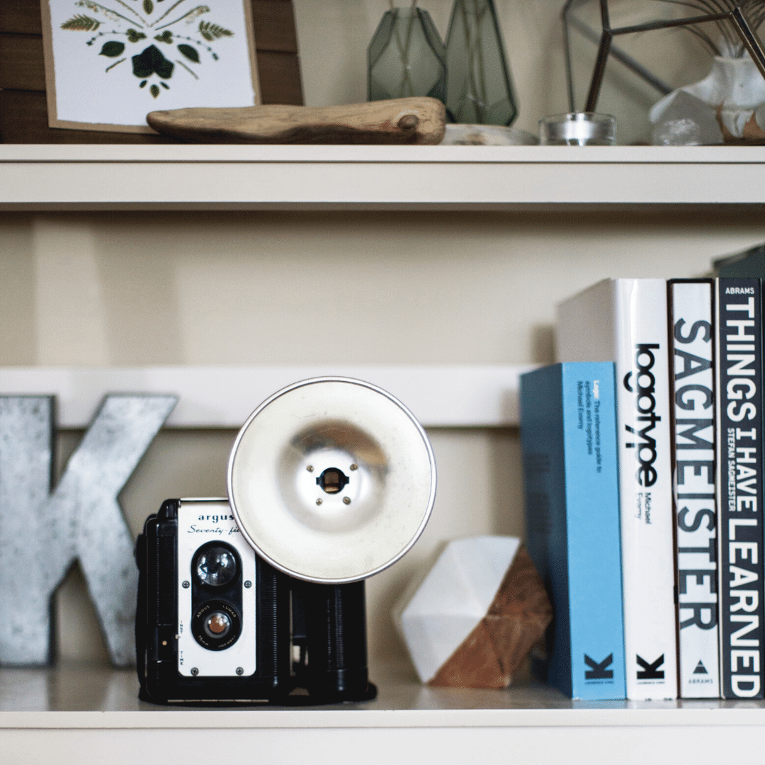
Spread your collections throughout the room, don’t clump them in one space: Say you collect vintage cameras. Spread them throughout your space on bookshelves or tables. When you display your collection singularly or in small groups, you will be able to enjoy the subtleties and differences between them. If you have a very large collection, think about displaying a few at a time. Put some away and bring them out when you change your décor around seasonally or for holidays. This way your it’s almost like a museum changing its exhibits. You may even find you enjoy your collection more because the items aren’t always the same. Conversely, when collections are clustered together:
1. It looks messy and you can’t enjoy what you have. Significance and details get lost when everything just runs together. Think about how a museum displays collections. Artifacts are not crammed together, they’re separated out and placed in cases or on pedestals where you can walk around and enjoy every angle.
2. The chance of items getting damaged or broken increases. A wall mounted shelf with heavy items can fall, someone could bump into a table and knock items off.
3. It’s harder to dust and clean items that are clumped together. Think about the time it will take to dust around all the items. That is not a fun task.
5. Use Negative Space
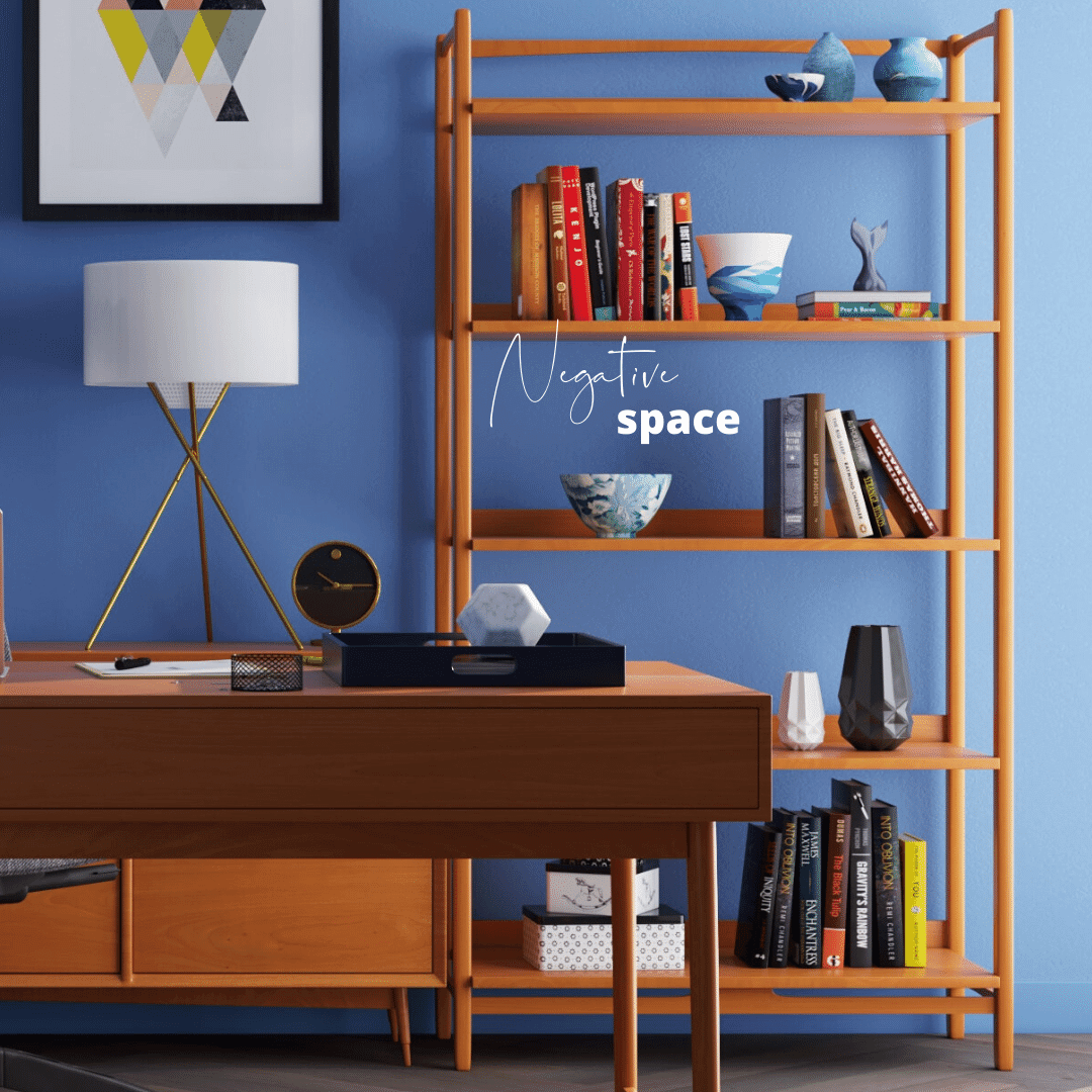
This is directly related to curating collections. You don’t have to fill every inch of space with stuff. Leave some open space. Leaving open space around items gives items context and makes them more noticeable and special. Suddenly, a group of items with space around them is highlighted. They have a narrative and a purpose. Negative space helps to create definition and balance.
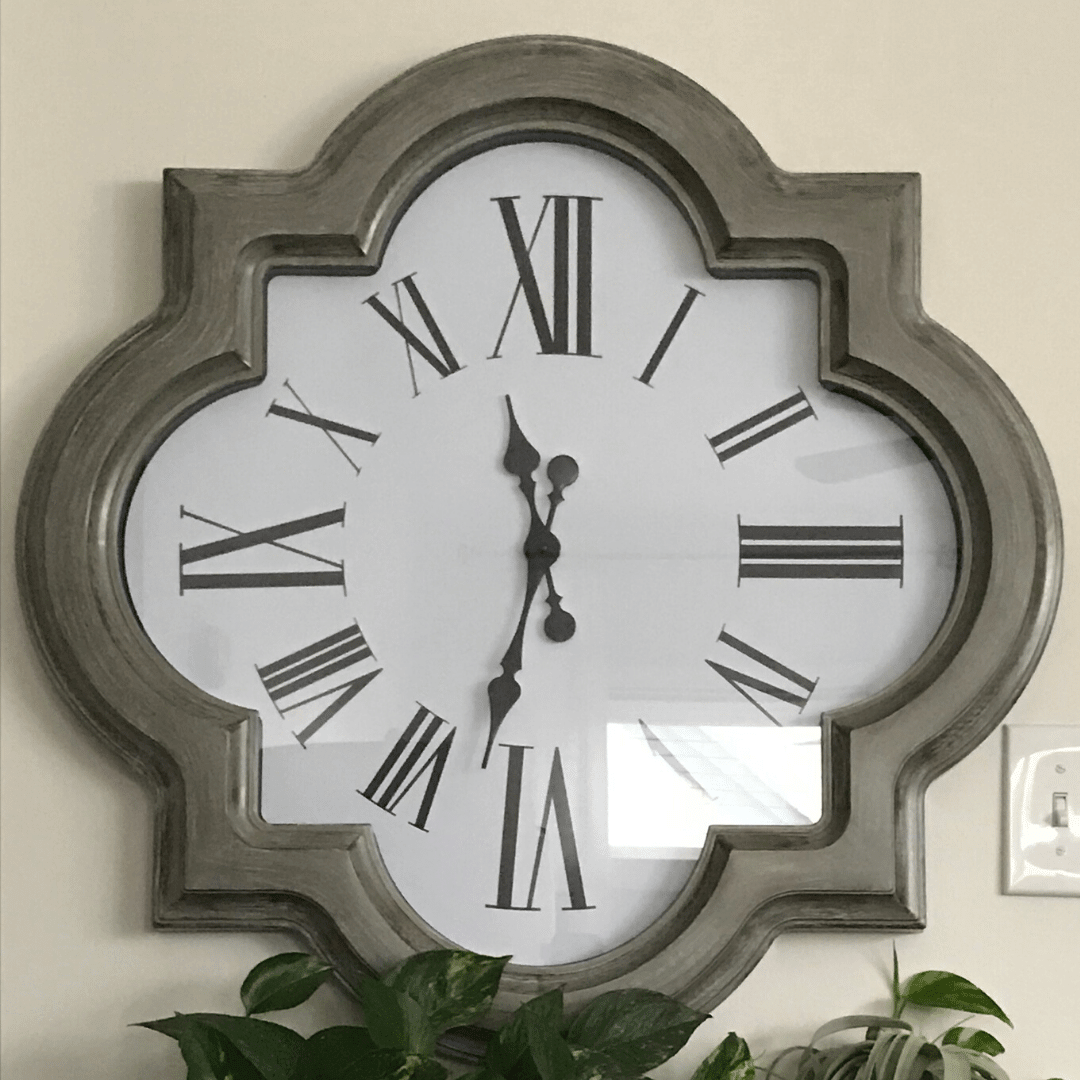
• Break Up Repetitive Shapes: I like to use different, unexpected shapes in my designs. If you have a bunch of square and rectangular pieces in your space, it’s good to introduce different shapes that add interest and depth.
Think about how boring it is to have a rectangular room filled with accent tables and finishes with only right angles. You need to incorporate different shapes to make things interesting. Different shapes make also help your eye to find rest.
6. Break Up Repetitive Shapes
I like to use different, unexpected shapes in my designs. If you have a bunch of square and rectangular pieces in your space, it’s good to introduce different shapes that add interest and depth.
Think about how boring it is to have a rectangular room filled with accent tables and finishes with only right angles.
You need to incorporate different shapes to make things interesting. Different shapes make also help your eye to find rest.
7. Bring in Nature
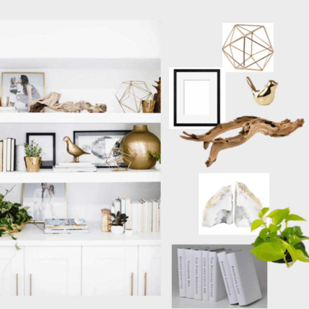
In my first post on this topic I advised on accenting your space with live plants and I stand by that. In my opinion, there is probably no better way to introduce nature than by bringing live plants into an accessory project. But you don’t have to stop there. There are lots of natural décor pieces that can add texture and visual appeal to your space. I love to bring in things like crystals, wood and stone to accent a space. Natural décor is will always work for any style. You can have the most Industrial space and introducing a tree stump accent table will immediately make the space feel warmer and special. Natural décor accents usually have irregular shapes which also add character and dimension to a space.
8. Plan a Color Palate
This is a great adjacent accessorizing tip that can help you plan the look you want for your entire space. The best way to do this is to create a mood board to keep with you when you’re out shopping. This can help really keep you on track when you’re looking for specific pieces to go in your space or, if you happen across a piece that you find on the fly and you want to make sure it will fit the look and feel you’re going for. I have a mood board saved as a pdf on my phone for all the projects I’m working on. This keeps me right on track because I can quickly access it anytime I’m out. Keep in mind: sometimes it helps not to have a specific thing in mind.
Being open to things you find in thrift stores, estate sales as well as specialty shops can be an adventure. You could find the perfect thing that matches exactly to your mood board. If you only stick to things that you plan on, you could miss a fantastic surprise that can make all the difference, so stay open to inspiration from unexpected places. (That’s actually a tip in itself).
9. Add in Your Books
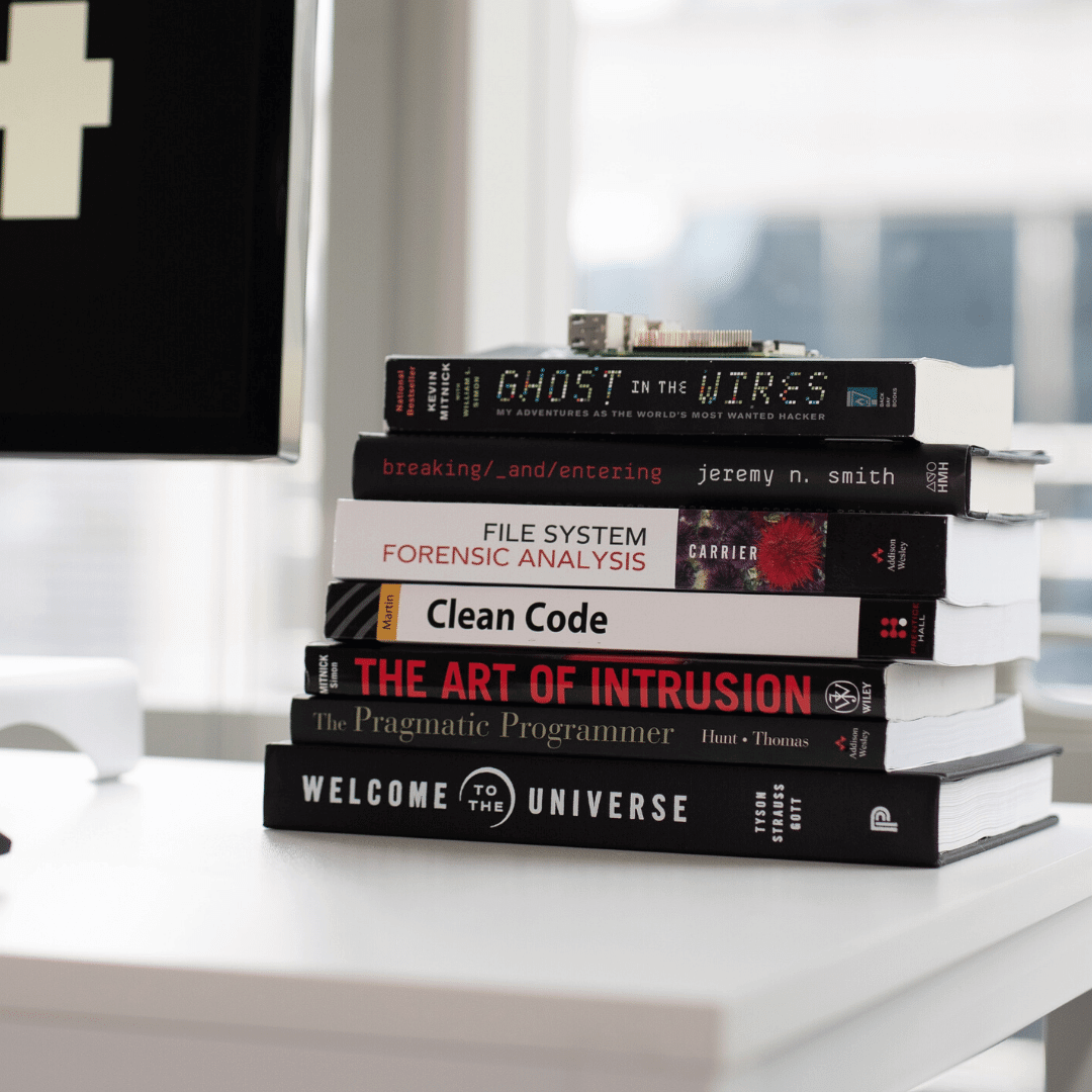
stack them, display one large coffee table book, fan them out, arrange them by color, you can do so much with them and they go with ANY décor style.
Books add height and dimension to a group of items. I love to stack books and add in a my decorations on top and around them. This is a great way to vary the height and lines of your accessories.
Varying the height and line of your accessories is also a tip from the first post I did.
10. Don’t Go all in on the Latest Trend
We all love new, exciting and innovative but don’t fill up your entire space with wicker and macramé or matte finishes just because they’re hot right now.
Chances are you may even be reading this when these trends are out of style.
Invest in a few trendy pieces. That way, when it’s time for the next must have accessory you aren’t having to redecorate every inch because you went all in on a particular style du jour.
Conclusion:
There you have it, 10 more tips to accessorize your home like a pro:
Add Mirrors to Your Space
Don’t Forget About Lights
Add Patterns
Curate Your Collections
Use Negative Space
Break Up Repetitive Shapes
Bring in Nature
Plan a Color Palate
Add in Your Books
Don’t Go All in on the Latest Trend
This is not an exhaustive list by any means, but they are techniques that I utilize for all my finishing touches. I’d love to hear how you’ve used these tips or others that you’ve found success with. Feel free to leave a comment below. I love to hear from you so don’t be shy. 😊 If you have a friend who could use these tips, share it with them. You can share this post and all my others by clicking on any of the share buttons on this page.
Need a little inspiration at the beginning of your decorating project? Check out my 11 Secrets Only Designers Know to Make Your Space Rock. It’s a short but detailed pdf that shows you 11 quick tips to get a HUGE impact in your house right away! These secrets will help you get that Pinterest WOW factor for any room in your house without wasting time or money. Most of the tips in this guide won’t even cost a single penny! Now that’s amazing!
When you sign up, you’ll be the first to know when I post a new blog each Friday at 1 PM. It’s the perfect post lunch read and you might even get some inspiration to tackle a weekend project or two!
Plus you’ll get even more decorating tips, tricks and a resources that I only share with my friends on the list, so don’t miss out!
Thank you so much for reading! I am so grateful that you stopped by. I love to share my knowledge with you and if you’re enjoying it, give it a like by clicking the heat below so I know. I hope you’re having an amazing day and don’t forget to follow me on Instagram and Pinterest where I share daily inspiration. Until next week, stay amazing and keep your dreams big for your small space!
Here’s What to Read Next:
How To Accessorize Your Home Like A Pro
What Is The Golden Ratio, And Why It’s Important For Decorating Your Home
Don’t make this expensive common mistake in your small space.
Michael is Principal designer and blogger at Michael Helwig Interiors in beautiful Buffalo, New York. Since 2011, he’s a space planning expert, offering online interior e-design services for folks living in small homes, or for those with awkward and tricky layouts. He’s a frequent expert contributor to many National media publications and news outlets on topics related to decorating, interior design, diy projects, and more. Michael happily shares his experience to help folks avoid expensive mistakes and decorating disappointments. You can follow him on Pinterest, Instagram and Facebook @interiorsmh.

