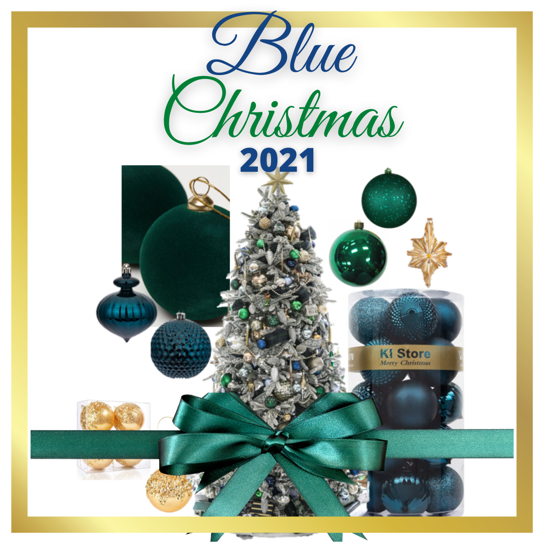
Did you get the memo about blue being one of the most popular holiday decorating colors this year? I know, I was kind of surprised too.
All I’ve heard since summer was that Christmas 2021 was all about going back to traditional colors. In my book, that meant red, gold and green. Did you think the same thing?
It’s interesting to find out that blue – in various hues and shades – was searched for as a traditional Christmas color story. I blame Elvis, lol!
But it makes sense because the color stories that kept coming up for me in my research were not strictly blue. In other words, it wasn’t all blue and nothing else.
This ‘new traditional’ way to incorporate blue into holiday décor is all about mixing it with other colors.
And, the funny thing is, I did end up getting the memo because I too incorporated blue in holiday décor this year as well. It wasn’t completely intentional, but it made total sense for the decorating scheme I went with.
This post is all about inspiration.
If you’re on the fence as to what colors you should incorporate this year, let me show you how to have a new traditional, blue Christmas for 2021!
Blue and purple
Traditional means a lot of different things to different people. Where some may be all about the reds and greens for Christmas, others will take a different route.
This room is super traditional, I mean look at the chesterfield sofa and the tufted queen Anne chair. The new traditional aspect comes in with the color story.

Decoholic
The wall color shows up literally as the ribbon color. I love the purple secondary color, so chic!
This is pure impact and a true definition of using your existing home décor as inspiration.
The walls, ceiling and trim are all a dusty teal blue. They added the magenta purple to accent and, bam-o, a vibrant Christmas color combination that is very now.
Want the same color scheme without committing to the full-scale decorating around teal? Here’s a great alternative that will bring in the highlights while all the rest of your décor stays the same.

Christina Chalifoux
Take this up a notch by adding in a chunky garland all the way up the stairs and incorporate the same colors throughout it.
Don’t forget to pepper the blue and magenta in the rest of the house as well.
You must commit when you go bold, right?
Here’s a tree that showed up on HGTV. It’s bold, jewel toned and grand.

HGTV
You can definitely go a little over the top with this color combo and that’s good, even with a contemporary treatment.
I love the use of sprays, picks and ribbon to tie the look together.
Tip: updating the ribbon color can often spike a creative direction.

HGTV
Think about going the simple route. It’s a less is more look but still gets the color scheme across.
Don’t forget to coordinate your gift wrap and other décor like stockings, runners, and bows. Love it!
Here’s a traditional magenta and blue treatment where the colors are the only colors.

Art & Home
That’s the beauty of all white décor, you can accent it any way you like.
Here they created a jewel tone focal point. It’s impactful because it’s the only color in the room and it works well because of the contrast.
The tree is opulent and full while the rest of the décor is subtle and tone-on-tone.
These people really committed. It’s very traditional, with peacock feathers and hints of magenta. It’s dripping with texture and color, and they incorporated all the surrounding greens with the same color.

Decoholic
Going with a theme can really amp up the traditional elements of your Christmas décor.
So, embrace themes and commit to the design. As you can see, traditional can be way more varied than just reds and greens.
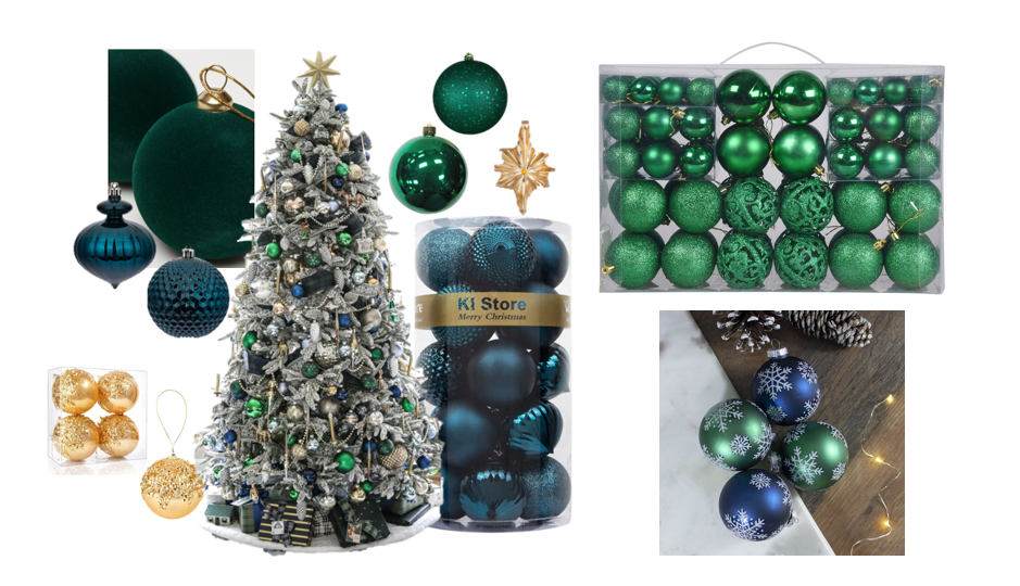
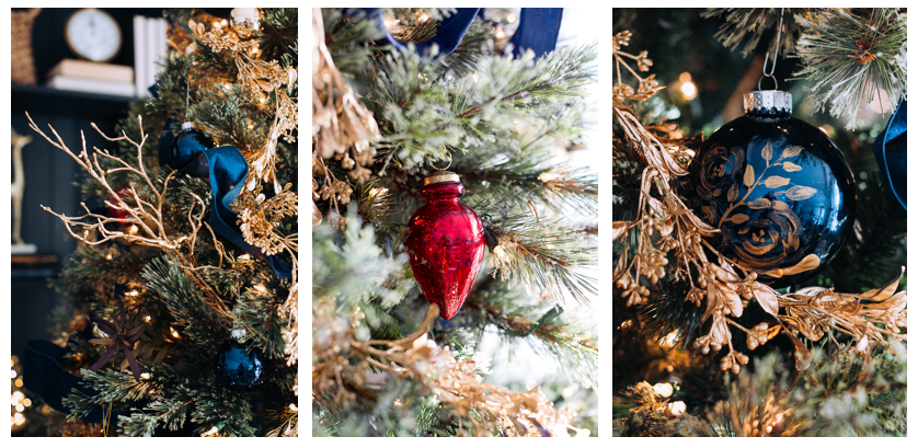
Green and Navy Blue
This gorgeous flocked tree has beautiful depth with a blue and green plaid ribbon, strings of jewels that look like diamonds! So good!
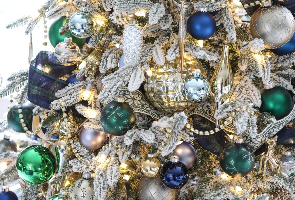
Inspired By Charm
The mix of matte and mirrored navy and green ornaments is stunning.
Don’t forget to pop in a few metallic finishes, gold, silver, copper, would look amazing with this combination. Heck, mix all three! If you can’t go over the top for Christmas, when can you, right?

Inspired By Charm
In a more neutral room, this color story can lean contemporary, the tree and the ornaments become the focal point. How beautiful, right? It’s polished and pulled together.
This design also takes the existing furniture and décor into account so that the color scheme coordinates together and makes sense. It’s another great example of how you can scale back a bit and still be super coordinated and festive.

Inspired by Charm

kelleynan.com
Hints of green show up in the glass decanters on the shelf and she pairs that same green with gray blue and navy ornaments with gold ribbon accents. Stunning!
There’s tons of ornaments on the tree, but the shapes are mainly round baubles. That’s a perfect way to keep things simple while making an impact with a color story.
The overflow ornaments show up in the bowl on the shelf as a way to bring the color and shape to the other side of the room. Very well done!
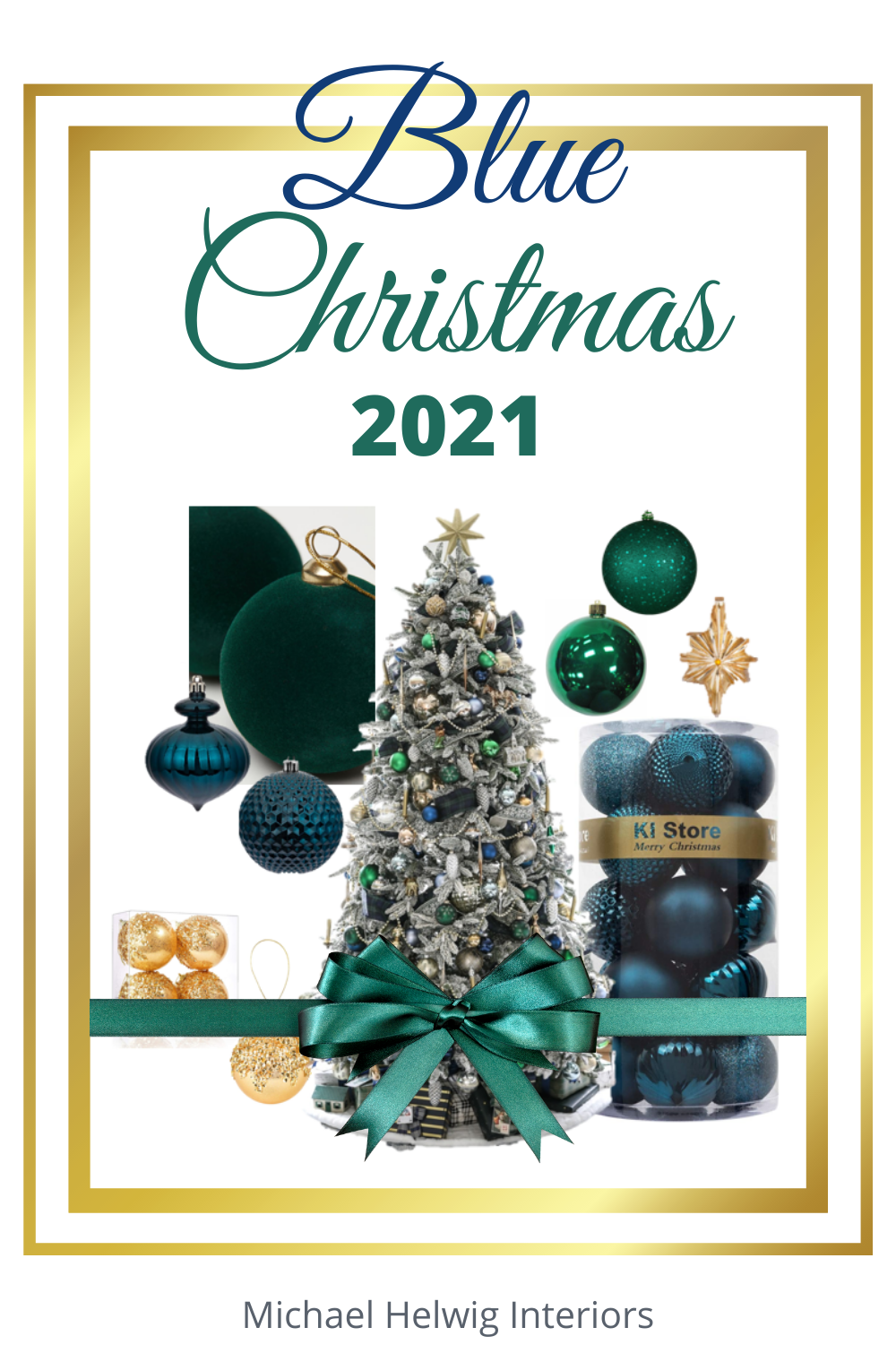
Michael Helwig Interios
Here’s how to pull this navy blue and dark green color story together in a new traditional way.

Frontgate
Mix up the shapes and add in gold metallic accents.
You can see the hint of the navy window treatments in the background, so that indicates that the décor is beautifully tied together with the rest of the room, not like in contemporary designs where the Christmas colors stand alone in contrast to the rest of the room.
The variation of different shapes and subjects like the humming bird, deer and dragon fly give this design dimension.
It makes for an interesting story because it begs an admirer to look at each ornament because there’s a narrative. Different shapes and elements create the story and that is what traditional is all about, you know?

shelterness.com
So good, very traditional styling. The blues are in the fore front and the dark green comes in with the tree itself and a few baubles.
There’s a hint of copper – so beautiful! And natural sticks and picks to embellish.
The ribbon, that ribbon is so good!
That’s how you do a traditional navy and dark green color story, yum!
Another masterful way to decorate with navy and dark green in a traditional way.
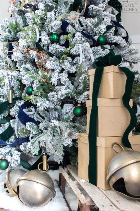
sawdust2stiches.com
She incorporates those jewel tones in the entire room.
The base décor is super neutral, whites and creams. The infusion of the darker colors is phenomenal, and it creates a winter wonderland of texture and richness.

sawdust2stiches.com
You have to check out this blog because the Christmas home tour she shows is stunning.
You will come away with tons of more insight and inspiration for how to make this color scheme work.
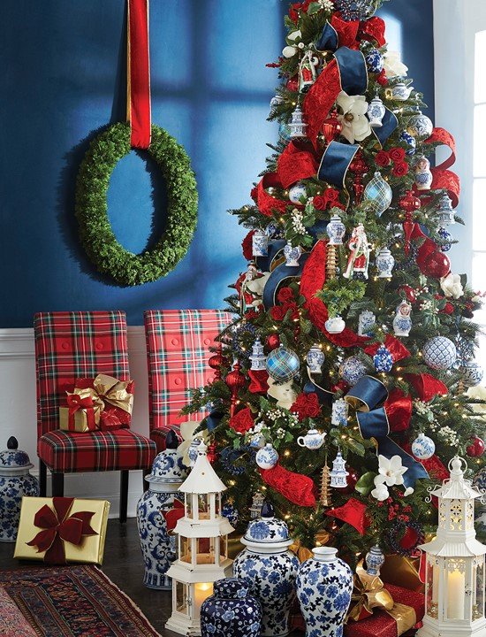
Red, Gold, and Navy
Who says you can’t mix an uber traditional red with navy blue. Heck, I did it this year and I LOVE it!
This color story is so festive and full of impact because it’s a focal point in an otherwise neutral space.
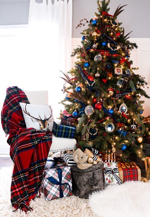
Craft Berry Bush
It’s color, texture, variation in shape and scale, it’s new traditional to the core!
Speaking of layering in a variation of shapes, and textures, check this color story out.

Craft Berry Bush
I actually had this on my Christmas mood board for this year because I loved the depth I saw in this picture.
The dark shelves create the perfect back drop for all the wonderful texture and layering you see. And, you don’t have to overload the shelves with stuff to get the impact. A few well chosen and curated pieces will add just the right amount of relatability to the Christmas narrative you want to create.
Craft Berry Bush
Also, it seems like she didn’t swap every bit of décor for ‘Christmas stuff.’ The basket, books and clock feel like they’re always in that spot, which goes to show, you don’t have to disrupt your entire every day decorating scheme to make Christmas work.
From 2019, but still trending very well. The traditional delft pottery ornaments, mixed with reds and gold. The white background of the delft brings the intricacy to life!
It’s got hints of vintage but in a very current application. The colors are vibrant and rich. It’s saturated in the best way possible!
The Jolly Christmas Shop

The Jolly Christmas Shop
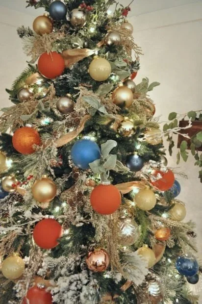
Orange and Blue
I’ve always loved the way the colors blue and orange look together.

Jennifer Rizzo
There’s a joy to it, I can’t describe it. They’re opposite colors on the color wheel and, you know what they say, opposites attract. In this case, opposites are a smash together.
It’s not a color combination that most would gravitate towards, but it’s fresh and unexpected.
Look at the lush tree here. There’s all kinds of texture, natural twigs, picks, sprays… Then the orange and blue baubles… They are similar in size and all round – which gives this design a very updated new traditional feel.
Jennifer Rizzo
I love the blend of gold, orange and blue. I always say, blues play very well together so mix them up. Go with dark blues, medium, and lights all together. Vary the sheen of all the ornaments and add one metallic to give the color scheme definition.
Here’s a more contemporary application.

This looks like it could be a commercial space, so the impact is all on the tree and the décor and the rest of the space stays untouched.
Do this for a more “contemporary” look in your home, especially if your décor is very neutral because it will be a showstopper!
Here the orange and blue is really amped up. It’s a beautiful version, a little boho, a little eclectic, such great color impact.
Amanda Louise Interiors
This is a wonderful example of using your existing décor to influence the holiday decorating.
The wall art, accessories and other décor totally influenced the color story here and it couldn’t be more perfect!

Amanda Louise Interiors
A variation on this orange and blue color story is the navy and rose gold route.
This theme is super soft and very coordinating.
1111lightlane.com
The rose gold reads soft orange.
I can see the color represented in the wood of the mantle and in the other wood objects like the end table.

1111lightlane.com
The colors work beautifully to add warmth and character to the space.
If you want to go a little more saturated, mix in different shapes, organic elements and different sheens and you have a beautiful color scheme.

Balsam Hill
Another variation still is adding in some white or cream white accents.

Inspirations Wholesale
This works especially well if your everyday décor is primarily white or off white.
Teal and White
Some call it, Tiffany blue and let me tell you, it’s stunning.

Buzz Feed
For sure, this hue of blue reads cool, much more cool than say a navy, which feels very warm when paired with other warm tones. Here, the teal and white are spot on winter wonder land, dare I say ‘Frozen’ inspired.
It feel fresh and crisp, but also sophisticated and glam too.
I love that this version goes coastal.

It picks up the existing décor in the room and runs full on with the theme. (Notice the oar on the wall.)
A brilliant way to marry your everyday décor with Christmas.
The coordinating wrapped gifts tie it all together and makes the room pop!
Don’t think a skinny tree can make in impact?
Well, I dare you to look at this version and think that.

Canadian Home Trends
In smaller spaces, I love a skinny tree that works so well with the décor.
The placement of the ornaments shows restraint (something I struggle with for my Christmas decorating, but the argument for showing that restraint is so strong here.)

Canadian Home Trends
The whole scene is spectacular, don’t you think?
This color story works well with flocked, lightly flocked or unflocked trees.

Worthing Court Blog
Here again, the tree is the star, and the color story is unique to the room.
It reads more contemporary because the décor is centralized on the tree and very minimal everywhere else.
It’s just a touch of color and that makes this so perfect.
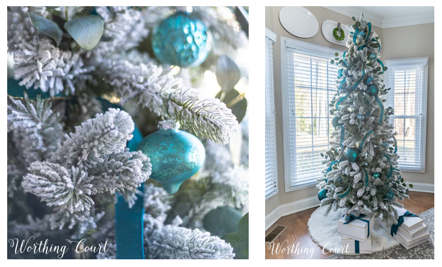
Worthing Court Blog
But then again, if you love teal and white, why pump the breaks?
Go bold and embrace the drama of the color story.

Poundland
This looks like a set or a commercial space (it’s actually an ad for Poundland stores in the UK), but you can definitely translate the look and feel of this to your own space by playing off an existing teal wall color.
I love the scale of the ornaments and by adding just a few, the room still feels special and not overdone.
There you have it, how to have a new traditional blue Christmas in 2021!
Whether you like grand, opulent, and over the top, or minimal and scaled back, there’s a new traditional way of decorating for everyone who’s drawn to this
I’s love to hear if you’re going with a more traditional Christmas color story or if you’re embracing a bold and unique choice for this year?
Do you have an all time favorite, and do you decorate with that color story every year?
Leave me a comment below and tell me all about it.
Join the Fun!
If you enjoyed this post and you want to keep seeing my weekly blog, the best way to do that is to subscribe.
You can subscribe by downloading my 11 Secrets Only Designers Know to Make Your Space Rock. If you’re curious about how decorators and designers make a home look magazine ready, you’ll love taking a gander at these 11 secrets. You’ll learn how to style your room from the floor up and it will work for ANY space you have.
I write about small space design and decorating, sustainable furniture options, positive self care and a variety of do-it-yourself home décor.
I’d love to connect with you!
“Michael Helwig was top-notch, very professional and responsive to my needs. He allowed me time to explore ideas and try out a variety of combinations until we found the perfect fit. Michael provided detailed information and offered beautiful ideas to make my dream living room become a reality. The furniture he sourced has totally transformed my living room space. Everyone that has seen my new living room has one word, WOW! A special thank you to Michael for a wonderful experience.”
“Michael was very knowledgeable and guided us, with great patience and good humor, through the process of designing our dining room and helping us find the perfect sleeper sofa. He offered really helpful advice when we asked questions - which was often - but at no time did we ever feel pushed. He helped me when I felt like I couldn’t make one more decision. When my new furniture finally arrived I realized everything down to the pillows was perfect. I couldn’t be happier!”
Michael is Principal designer and blogger at Michael Helwig Interiors in beautiful Buffalo, New York. Since 2011, he’s a space planning expert, offering online interior e-design services for folks living in small homes, or for those with awkward and tricky layouts. He’s a frequent expert contributor to many National media publications and news outlets on topics related to decorating, interior design, diy projects, and more. Michael happily shares his experience to help folks avoid expensive mistakes and decorating disappointments. You can follow him on Pinterest, Instagram and Facebook @interiorsmh.