If you’ve been scrolling through Pinterest or Instagram lately, you might have noticed a growing trend: dark trim with light-colored walls.
Now, if you’ve been a reader of my blog for some time, you’ll know that I usually advocate for minimizing trim in small, tricky, or awkward shaped rooms. That’s because I usually advise you that it’s best to keep wall color consistent, so you don’t run the risk of making your room’s “challenges” more challenging.
But there comes a time to get a little spicy with decorating and to try new things.
So, if you’re working with a smaller room, you might be wondering how to pull it off without making the space feel even smaller. Don’t worry—I’ve got you covered!
How Dark Trim Impacts Small Rooms
So, let’s start with the basics. Dark trim against light walls creates a really dynamic contrast.
Imagine your room with crisp white walls and deep navy or charcoal trim—suddenly, all those architectural details like your baseboards and crown molding aren’t just there; they’re making a statement.
In smaller rooms, it’s like giving your space a bit of a magic trick.
The dark trim actually draws your eye to those cool details you might otherwise miss.
It makes things like your tall ceilings or charming moldings pop, and suddenly, your small room feels a whole lot more interesting and expansive.
It’s almost like the room is saying, hey, look at me—I’ve got some cool features! And that’s exactly what we want, right? To make the most out of every inch and add a little personality to our space.
2. Techniques to Highlight Room Features
Tall Ceilings:
Got a small room but with a bit of height? Dark trim can work wonders here.
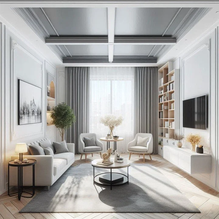
Try painting the ceiling trim a darker shade to accentuate how high your ceilings are.
It’s like giving your room a little lift, making it feel taller and more open. If you’re into the vertical look, you can even add vertical dark trim accents to elongate your walls. It’s a sneaky trick to make your space feel a bit grander.
Pencil Molding:
If you’ve got pencil moldings or any other detailing on your walls, dark trim can make these features stand out beautifully.
Dark trim around these moldings gives them a bit of pop and helps them become a focal point.
3. Subtle Contrast with Dark Trim
Now, here’s a little secret: you don’t have to go all-in with stark contrasts.
If you’re not ready to dive into the deep end with your trim color, you can totally go for something a bit softer.
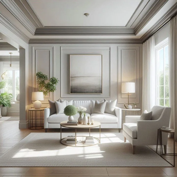
Think of a trim that’s just a few shades darker than your wall color.
This softer approach still gives you that dynamic look, but in a more understated, cozy way. In bathrooms, pairing dark trim with WPW wall panels can create a luxurious, spa-like atmosphere while offering both style and durability. The same concept can be applied to living rooms, wherein wall panels can bring depth and sophistication to the space.
Achieving Balance:
The key here is balance.
A trim that’s only a few shades darker than your walls keeps things feeling harmonious and elegant.
This approach is about creating a space that feels warm and inviting, rather than stark and jarring. So, if subtle contrast is what you need, this balanced technique will work well to make your room feel sophisticated.
4. Complementary Design Tips
Balance with Light Walls:
Even with a darker trim, keeping your walls light is important. It prevents the room from feeling boxed in and maintains that airy feel.
You want the contrast to be a feature, not the entire vibe of the room.
Color Coordination:
When choosing your trim color, make sure it complements your wall color.
Even with subtle contrasts, you want the shades to work together smoothly.
Choosing the Right Dark Shade:
Picking the perfect dark shade can make or break the look.
It should enhance the features of your room, not overpower them.
Tip: Test your paint colors. I always recommend picking up maybe 3, small tester size paint colors to see how they look in different light sources from morning till night.
Paint at least 2 feet of the trim, opposite a bright window.
Then look at the colors at different times of day, and with artificial light, to see if/how the color changes.
This is a great way to really make sure you like the color before spending the money on larger quantities of paint.
5. Practical Considerations
Maintenance:
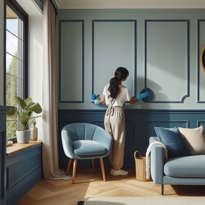
Dark trim might show dust and fingerprints more than lighter colors, so be prepared for a bit of upkeep. But, if you love the look, a little extra maintenance is a small price to pay for that stylish contrast.
Visual Illusions:
Remember, dark trim is like your secret weapon for playing with how your room feels. If you’re working with a small space and want it to feel a bit larger or more defined, you can use the trim to work some visual magic.
Maybe you use it to accentuate high ceilings or to create a frame around certain feature.
It’s kind of like having a design tool that helps you tweak the proportions and make the room feel just the way you want it.
Conclusion
Dark trim with light walls isn’t just a trend—it’s a game changer for making any room, especially small ones, feel more dynamic and special.
Whether you’re going for a bold contrast or just a hint darker trim, a contrast between the wall color and the trim color can help you create balance in the room, highlight certain architectural features, and possibly make your small room look bigger!
Experiment with the shades, keep those light walls light, and have fun highlighting your room’s unique features.
Read next:
Transform Your Blah Bedroom into a Street Style Vibe
Ready to transform your bedroom into a vibrant street style retreat? Whether you're drawn to bold graffiti art or minimalist chic, unleash your creativity to let your bedroom reflect your unique personality. From color palettes to decor tips, explore how to infuse urban vibes into your room to make it a true expression of your style.
Join the Fun!
If you enjoyed this post and you want to keep seeing my weekly blog, the best way to do that is to subscribe.
You can subscribe by downloading my 11 Secrets Only Designers Know to Make Your Space Rock. If you’re curious about how decorators and designers make a home look magazine ready, you’ll love taking a gander at these 11 secrets. You’ll learn how to style your room from the floor up and it will work for ANY space you have.
I write about small space design and decorating, sustainable furniture options, positive self care and a variety of do-it-yourself home décor.
I’d love to connect with you!
“Michael Helwig was top-notch, very professional and responsive to my needs. He allowed me time to explore ideas and try out a variety of combinations until we found the perfect fit. Michael provided detailed information and offered beautiful ideas to make my dream living room become a reality. The furniture he sourced has totally transformed my living room space. Everyone that has seen my new living room has one word, WOW! A special thank you to Michael for a wonderful experience.”
“Michael was very knowledgeable and guided us, with great patience and good humor, through the process of designing our dining room and helping us find the perfect sleeper sofa. He offered really helpful advice when we asked questions - which was often - but at no time did we ever feel pushed. He helped me when I felt like I couldn’t make one more decision. When my new furniture finally arrived I realized everything down to the pillows was perfect. I couldn’t be happier!”
Michael is Principal designer and blogger at Michael Helwig Interiors in beautiful Buffalo, New York. Since 2011, he’s a space planning expert, offering online interior e-design services for folks living in small homes, or for those with awkward and tricky layouts. He’s a frequent expert contributor to many National media publications and news outlets on topics related to decorating, interior design, diy projects, and more. Michael happily shares his experience to help folks avoid expensive mistakes and decorating disappointments. You can follow him on Pinterest, Instagram and Facebook @interiorsmh.


