Let me start by saying, decorative moldings can be beautiful.
They add character to a home, especially if the home is of a certain period.
The thing that doesn’t work is when you have a small room with tons of ornamental trim. It can be very distracting, and it might even contribute to highlighting some things you’d rather diminish attention to as well.
Mitchell Luo
This absolutely doesn’t mean you should rip out beautiful, historic trim. There are many ways to “soften” the appearance while still honoring the heritage of your home.
However, if you’re unsure of how to treat trim moldings and architecture like soffits, vaulted ceilings and dormers, this post is for you.
Here’s how to minimize architecture and trim in small rooms.
Let’s start at the ceiling.
Trim that’s wider than 4” will make a room feel shorter.
This is a tough order for rooms with “average” height walls, say in the range of 7’ to 9’.
The fix for chucky, wide trim is to paint it the same color as the wall. That will literally add the 4” back to the height of the wall, making them appear higher.
Michael Helwig Interiors
4”is not significant in actual dimensions, but it is very noticeable in visual perception.
Flip this around: Wider ceiling trim painted the color of the ceiling subtracts the perceived 4” from the wall, thus making the wall look shorter.
It’s absolutely an optical illusion, but if your goal is to add visual height, you’ll want to pay attention to this rule of thumb.
And, just to clarify wall trim, as I’m describing here, is the molding or crown molding trim that is installed just below the ceiling, where the top of the wall meets the ceiling itself.
Soffits, Tray Ceilings, and Vaults
These are the interesting bits of architecture that may be featured in many types of homes.
Soffits
They’re the box like wall features that hug the ceiling, Mostly, you’ll see them in the kitchen or bathroom.
In many older homes, they were used to encase plumbing or HVAC ducting.
In some newer homes, they’re added as an architectural feature to mimic the look of the more utilitarian purposes of years gone by.
Also, in many finished basements, you’re sure to see soffits that encase the plumbing and HVAC ducting for the floors above.
In small rooms, it’s best to paint the soffit the same color as the wall.
Tip: A good thing to remember is, any surface that is below the top-level ceiling is wall.
That means soffits, although pressed up against the ceiling, are part of the wall. So, treat them as the wall, not the ceiling. That includes the bottom of the soffit, which can be confusing because it looks like a lower ceiling. The truth is, that bottom part is still the wall…
This will work much the same way as the trim being the color of the wall. Covering the soffit with the same material as the wall: paint, wallpaper, etc., will make the room look taller.
Tray Ceilings
Sidekix Media
These are the decorative beamlike structures on a ceiling.
They can be used to run conduits for electricity or could contain recessed lighting, but mostly, they’re an architectural embellishment.
If you have a choice in the construction of your small room, I’d leave them out. Although they’re beautiful and decorative, they are more suited for larger spaces with naturally high ceilings.
If you’ve inherited trade ceilings, it’s best to treat them as you would a ‘normal’ ceiling. That means, paint them all the same color as the top-level ceiling. Leave out the pops of color in between all the squares and keep the color consistent throughout.
Trust me, you won’t lose the detail or what makes them special, you’ll enhance the visual height of the room.
Vaulted Ceilings
Steven Ungermann
You’re likely to find these in a lot of Mid-Century style homes, where one side is angled taller than the other side.
Because of the time frame when many of the homes were built, there was a trend that stylistically limited the use of ornate trims and intricate architectural embellishments. So, most likely, you wouldn’t naturally have them added.
If, by chance, you do have them installed after the fact, you’ll want to paint the trim the color of the wall so that the lower side feels higher to visually balance the higher side.
Now, say you’ve converted an attic space into living space and your walls are vaulted or you have dormers, you’ll want to treat those as one continuous wall.
In this way, you’ll make the space monochromatic, where the ceiling and walls are all treated the same.
This will blur the lines between the radically different heights in the space.
I would avoid installing dark paneling or wallpaper in a space like this because it will highlight the many different heights and angles.
Dormers are the roofed structures that often contain a window that projects beyond the face of the house, or beyond the pitch of the roof.
Michaela Murphy
On the inside of the house, they create nooks that can be beautiful architectural features but can also be a bear to make useful because they’re often tight and short spaces.
In all these examples, it’s best to minimize the unnecessary trim embellishments that will certainly make the space feel congested.
So, paint can work miracles in smaller rooms with trim.
If you have the choice, keep trim simple in small rooms. That means be conservative with profiles.
Go with simple trim profiles over detailed ones.
Avoid Detailed Moldings
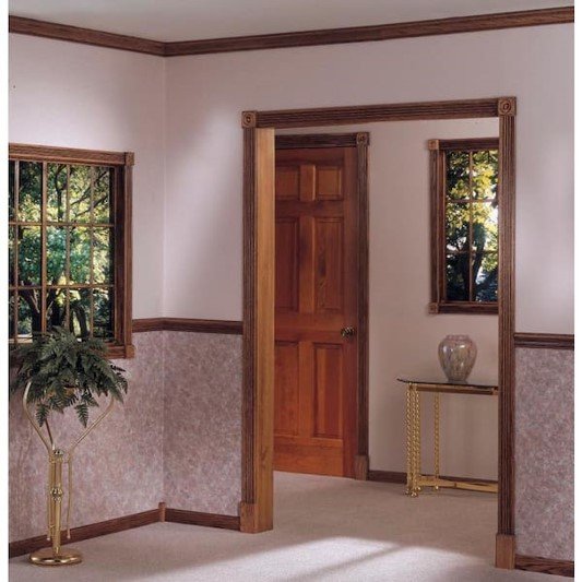
Fussy trims like dental molding can make a small room feel very heavy. It’s best to avoid these and opt for contemporary moldings that have a smooth or minimal profile.
No Intricate Carved Details
Home Depot
Avoid things like rosettes and shield trims. These are gorgeous in rooms with epic tall ceilings and jaw dropping architecture. In smaller homes, they look very over done and heavy. They will overpower and shrink smaller rooms for sure.
Keep Your Trim Sizes Smaller (especially for average sized ceilings: 8’)
As I mentioned at the beginning, keep your trim sizes on the smaller side, 2” to 3”. Anything larger than that will being to make your average height ceilings feel shorter.
Keep Trim Consistent in Color
Paint the wall and trim the same color to make your room look taller.
Avoid painting the trim a stark white like the ceiling.
When in doubt, remember, any surface below the final top ceiling should be treated the same as your wall. If your wall is turquoise, paint your trim turquoise as well.
Don’t Mix Multiple Trims in the Same Room.
Layering different trim to build up a “custom” look can work beautifully in large, older homes.
Doing this in a newer home with modest or scaled back architecture will look out of place.
Think of it this way, trims and moldings are like adding definition to walls. The more you add the more defined and broken up the room becomes.
The last thing you want in small rooms is segmentation.
It interrupts visual flow and causes you to stop at each segment.
This will do nothing for a comfortable feel in the room. It will cause you to feel more uncomfortable.
Save the chair-rail trim for the dining room, leave it out of family rooms, living rooms, bedrooms, and bathrooms.
Nadi Lindsay
As a rule of thumb, chair-rails are utilitarian trim.
They prevent the back of the chair from damaging a wall in a dining room.
In rooms where you don’t have dining chairs that move back and forth, you don’t need chair-rail trim.
It will make the room feel shorter because it visually cuts the height of rooms in half.
This is especially true if you treat the bottom half of the wall, below the chair rail, with a wallpaper or paint that is darker than the treatment above the chair rail.
Keep the entire wall the same color to make the room feel bigger. That means keep it all one dark hue or all one light hue. Don’t mix them.
Up Next
These 6 rules will help you arrange and define a seating area, make the best use of certain types of furniture, and utilize the height of your walls like a pro. You’ll also learn how to avoid a common small room mistake so your room will feel larger immediately.
Join the Fun!
If you enjoyed this post and you want to keep seeing my weekly blog, the best way to do that is to subscribe.
You can subscribe by downloading my 11 Secrets Only Designers Know to Make Your Space Rock. If you’re curious about how decorators and designers make a home look magazine ready, you’ll love taking a gander at these 11 secrets. You’ll learn how to style your room from the floor up and it will work for ANY space you have.
I write about small space design and decorating, sustainable furniture options, positive self care and a variety of do-it-yourself home décor.
I’d love to connect with you!
“Michael Helwig was top-notch, very professional and responsive to my needs. He allowed me time to explore ideas and try out a variety of combinations until we found the perfect fit. Michael provided detailed information and offered beautiful ideas to make my dream living room become a reality. The furniture he sourced has totally transformed my living room space. Everyone that has seen my new living room has one word, WOW! A special thank you to Michael for a wonderful experience.”
“Michael was very knowledgeable and guided us, with great patience and good humor, through the process of designing our dining room and helping us find the perfect sleeper sofa. He offered really helpful advice when we asked questions - which was often - but at no time did we ever feel pushed. He helped me when I felt like I couldn’t make one more decision. When my new furniture finally arrived I realized everything down to the pillows was perfect. I couldn’t be happier!”
Spacejoy
Michael is Principal designer and blogger at Michael Helwig Interiors in beautiful Buffalo, New York. Since 2011, he’s a space planning expert, offering online interior e-design services for folks living in small homes, or for those with awkward and tricky layouts. He’s a frequent expert contributor to many National media publications and news outlets on topics related to decorating, interior design, diy projects, and more. Michael happily shares his experience to help folks avoid expensive mistakes and decorating disappointments. You can follow him on Pinterest, Instagram and Facebook @interiorsmh.


